Unionized Art-Buying…Kind Of… and Text-and-Image Abstract Painting Actually Done Well
More like collective buying power...but unionized sounds catchier!
Ever wonder why you walk into an exhibition and every single work already has a red dot? In the world of art, galleries like to make their best patrons feel very important. One way they do this is by offering exclusive access to new work by their artists before the rest of the lowly art-buyer-wannabes get to see it. Life ain’t fair, folks. If you patronize and support a gallery, they will love you back. This is one reason why having an art advisor behooves the novice buyer. An art advisor is basically a union rep for their whole clientele giving each client the collective buying power of the whole. That is certainly the case for my clients for a variety of reasons.
First of all, none of my clients are spending millions or even hundreds of thousands of dollars on art, nor do they have important last names (no offense y’all). And secondly, being new collectors, they have not necessarily found a gallery that they would want to patronize so heavily that they would gain exclusive access to previews. But when I combine the collective buying power of 10 to 15 clients, all of a sudden I gain access to everything they want on their behalf. See how that works?
The problem for me is that I have access to all of this incredible work that I would love to place, but with only 10-15 clients, not everything is for every taste. Honestly, this is the main reason I started this Substack. I am betting that there are TONS of would-be-art-buyers out there that do not even know this art exists, but if they did, they would love it, and they would buy it!
One such example is…
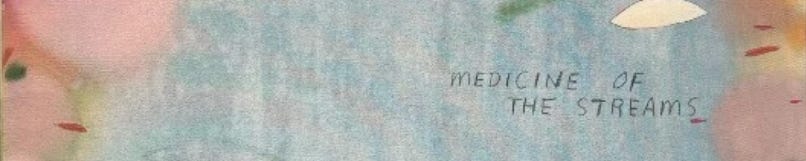
Heath Wae (b. 1989, Melbourne, AU)
Yall, I love Heath Wae. And I really, really love his new body of work that is opening in a cool new show at London gallery The Dot Project on October 23. The Dot Project is dedicated to emerging artists and the next generation of collectors. Their mission and my mission are essentially identical so I love them.
Using text in art is really hard, like really, really hard. It can so easily get cheesy or cheap-looking. Sometimes, when done poorly, it just feels like the easy way out for an artist to get their message across to the viewer. But Heath Wae uses text to great effect, eliciting a particular feeling in the viewer but not necessarily answering any questions or making the work’s meaning more accessible. With his words and phrases, he sets up a framework within which the viewer can meaner and explore. More labyrinth and less road map.
I would really love to see this whole body of work (except the one that is already sold, of course) stay together and hung down a hallway or in a cluster…Somebody do it please!


What do you think? Do these totally transport you to a different time and place? Let me know where your mind goes!
Every collector has a type.
A default way of engaging with art — and a default reason they walk away from something they should have bought. Find out yours in two minutes.
Take the Quiz →Already a member? This week's new additions to The Collection are waiting.
Explore The Collection →