How Do I Look At Art and Some Really High Quality Surrealism
Sometimes we end up with more questions than answers
Well, the answer to the first question is easy. Use your eyes!! JK…sort of. On the one hand, looking at art is easy. Just look at it. But on the other hand, it is hard because you really should be engaging all of your senses and your imagination. Taste? Yep. Touch? Totally (well imagined touch. Don’t actually touch the art…unless you are instructed to do so.) Sound? You betcha. Smell? Yes sir.
Using your imagination to engage all 5 senses is one of the best ways to find your way into a piece of art about which you know nothing. I always tell people that they should stand in front of a work of art long enough to be able to say five things about it. (In case you missed it, that is the key takeaway from today’s lesson. Well that and don’t touch the art.) If after that, you are still not feeling it, then you can move on. But, a good way to get to 5 things other than listing the colors you see is to imagine what the scene might feel, taste, smell, and sound like. This even works with abstract art and takes you on a little non-substance-fueled acid trip. You should try it.
Another strategy is to imagine why an artist made the decisions that they did. If you think about it, every mark, brushstroke, line, swoosh, splash, splotch (a technical term), crosshatch, gradient, the material, the size, every single aspect of a work of art was a decision made by the artist. Together all of these decisions coalesce to (hopefully) convey what the artist is trying to say. So maybe your 5 intelligent comments are imagining these decisions and why they were made. You could even take it a step further by asking yourself how the work might change if the artist had made a different choice. Would it be more or less effective? Would your perception of the meaning or message have shifted?
Let’s practice on this week’s artist recommendation! She’s so good and has a waiting list, but I’ve got the secret sauce…
Aniela Preston (b. 1998, Coventry, UK)
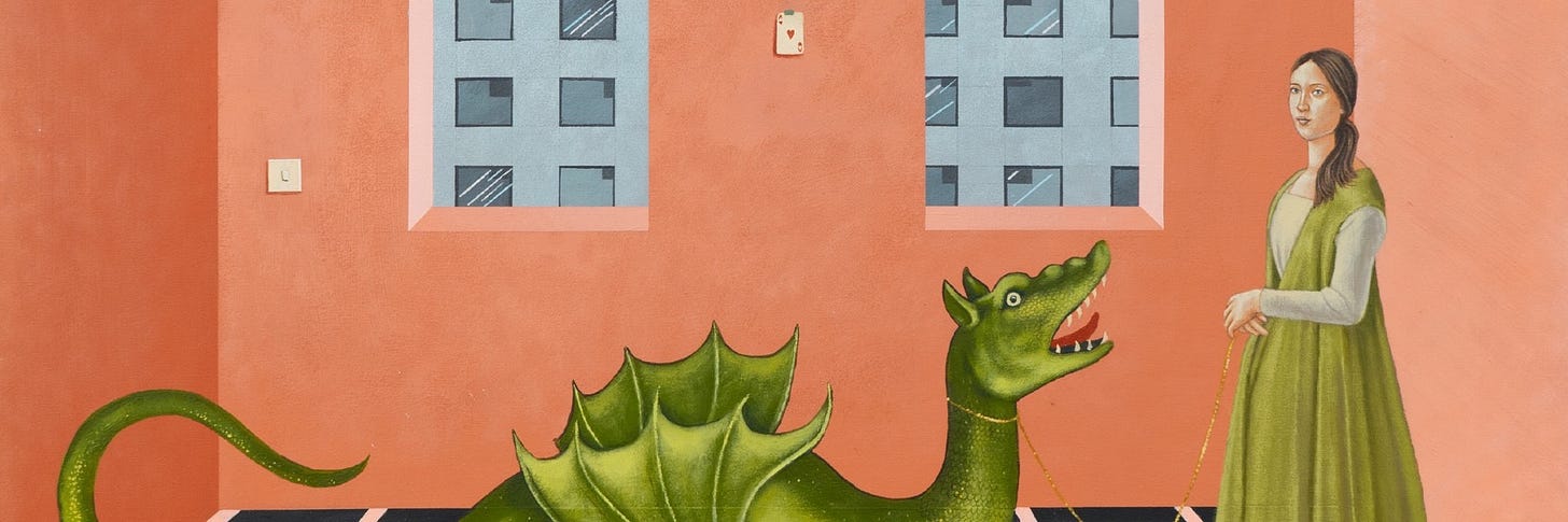
Picture this: You walk into an exhibition by an artist about whom you know nada. The images on the wall are at once familiar and foreign, whimsical and onerous, cheery yet eerie. What do you do? First, take a stroll around and drink it all in. Are there any recurring figures or symbols? Do you see a character show up in multiple compositions? What’s the color palette got going on? Do you feel uncomfortable? What makes you want to keep looking? How did the paint get to the substrate? Can you see the brushstrokes? Can you see piles, pools, or puddles of paint (impasto is the technical term) on the surface? Do the images remind you of anything else you have seen?


Here are my five thoughts:
- The architecture and compositions definitely have an Early Renaissance feel to them, when artists were just figuring out linear perspective, but here the perspective is amiss. It is like she wants you to think of Renaissance perspective but also recognize that this is not that. This is not an attempt to render the world as accurately as possible as we see it, but perhaps it is the world as we feel it, experience it, or dream it. This is not physical reality but the metaphysical, emotional, experiential, or internal reality.
- A lot of big cats. Why the big cats? They are not fearsome or aggressive here but symbolically they perhaps serve as a harbinger of danger.
- The hexagonal pool and the style of the lillies and trees in Veil of deception giving me major Ghent Altarpiece vibes. The Ghent Altarpiece is a masterwork by Jan Van Eyck, the Northern Renaissance master who taught us everything we know about minute detail. Why does she want me to go there??
- So many questions about the colors. Millenial pink e’er’where. I feel like I’m in Florida with all the turquoise and peach. But it’s working for me. I like the color palette because it feels calming in spite of everything else in the composition presenting a giant question mark.
- There are “bodies of water” in each painting— a tub, the blue rug and turquoise carpet, that maroon situation with a night cityscape in the far distance, the pool, the water and ship—and I feel like there is a thread here. Perhaps some aspect of environmentalism?
Ok, here’s the takeaway: Even when you know nothing about a work of art or an artist, you can start to identify details and make connections that will help you understand it. Some works evoke more questions than answers, and that is okay!
Aniela Preston graduated with her Fine Art BA at the University of Leeds in 2021 after completing her Foundation Diploma at Central Saint Martins. In 2022 she was selected as a finalist for the Ingram Prize, and most recently, she has been selected as a finalist for the Royal Society of British Artist’s 2023 Rome Scholarship. Aniela’s paintings blend the contemporary with the classical in a hyper-realist style, offering both quiet glimpses into intimate moments and gesturing towards wider societal, political and environmental issues. Her paintings, therefore, not only provide social critique but draw on the concept of traditional formality that mythologises the mundane. Painting primarily in acrylic, she hopes her paintings are not just aesthetic objects but rather invitations to consider the impact of our actions.
She has recently had solo shows at LUPO Gallery in Milan and Black White Gallery in London. Her work will be show at the Westbund Art Fair in Shanghai in November 2024. (Most of the paintings are already sold out! Let me know if you are interested and I can connect you with the gallery.) Aniela Preston will graduate from the Royal College of Art in 2025.
Every collector has a type.
A default way of engaging with art — and a default reason they walk away from something they should have bought. Find out yours in two minutes.
Take the Quiz →Already a member? This week's new additions to The Collection are waiting.
Explore The Collection →