EXPO Recap: Trojan Horses
It's pretty, it's interesting, and it has something to say...
Another day trip to Chicago for EXPO has come and gone. I, unlike many of my colleagues, am a fan of ye old EXPO. Despite the fact that this fair was purchased by the Frieze folks last year and they did some re-org’ing that had many a panty in a wad, I quite like it. It has a bit of a midwestern feel to it—not too hoity toity, not overdressed, a bit more practical…Geez, I am not a midwesterner but I guess I’ve lived in Cleveland long enough to appreciate the region’s quirky traits. Aaaanywho…
I’ll be honest with yall, the market ain’t great right now. Shocker, I know. Everyone is just tired and no one wants to think about their next 5-figure expense. Add the shipping delays caused by the confusion-inducing tariffs to the mix and you’ve got a recipe for a lackluster market. But, I’ll lean on some good business sense here—the time to grow is in the down times. Moreover, its when times is tough that the best art gets made. Let’s take a jaunt down memory lane.
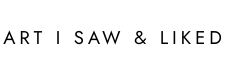
This painting by Frederic Edwin Church is an example. One of the most iconic American landscape paintings was made on the eve of the Civil War. Times were tough.
Marcel Duchamp’s Fountain was an artist’s attempt to understand the global chaos around World War 1. Times were tough.

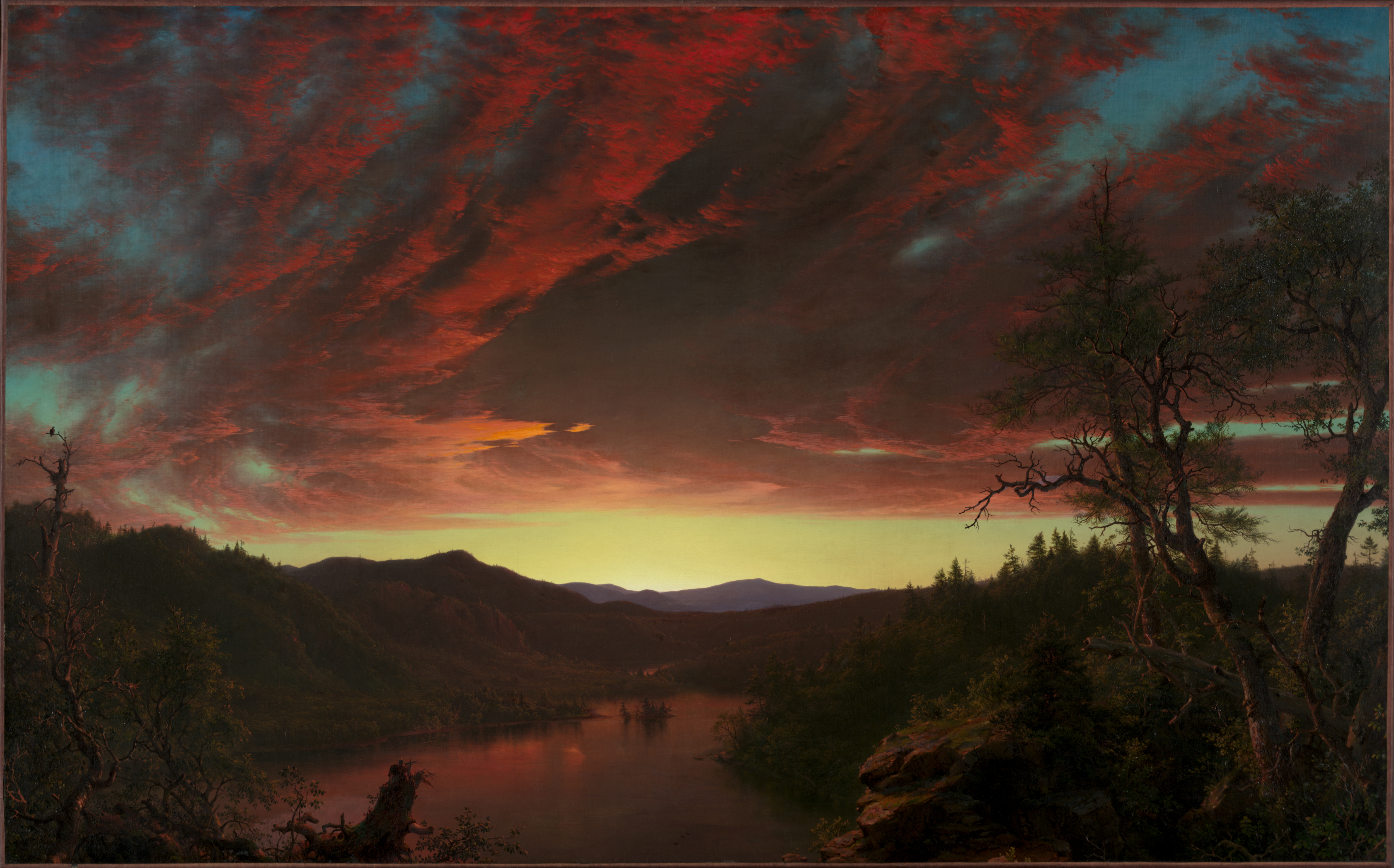
Michelangelo’s David was a show of Florentine strength when the surrounding city-states wanted to conquer it. Times were tough.
In 2025, no matter on what side of the aisle your comfort zone lies, there is so much in this world that needs responding to and the artists shoulder the burden of helping us understand it. So artists are making really meaningful stuff right now and galleries are looking for their next meal, so….I say BUY BUY BUY!
But back to the point of the burden that artists bear in our society. I recently ‘grammed a query to this effect and received some really great responses. The unifying theme was that artists look at the world and provide a perspective usually with a bias. Maybe you share their perspective and it hones your point of view. Maybe you disagree with them but it helps you understand and appreciate an alternative belief. Either way, artists are critical to our society’s survival and future because they help us communicate our differences and, ideally (pie in the sky), work toward a solution that fits everyone.
I understand not everyone wants to live with art that makes them think about current events. Even the fieriest among us don’t want Elon Musk burning in effigy or an homage to Marjorie Taylor Green over their mantle, but we might want work that marks a moment in time and offers perspective on that moment in a subtle way, like all 3 of the aforementioned examples. Here is some work from EXPO that I found particularly relevant to this goal. (Note: None of the work featured today is actually political. Fret not, my friends!)
Here is my list of Trojan Horses, if you will. These are all artworks that are beautiful to look at, interesting to ponder, and make a statement relevant to current events. (Disclaimer: Not all works featured today fall in the sub-$10,000 category.)
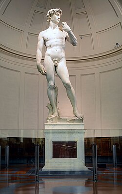
Richard John Seymour (UK, b. 1989)
This was literally the first thing I saw upon entering the fair. There were several works by him and I loved them all. He calls these works his Landsat series, which Seymour describes in the following way:
[this is] a series of large format artworks using the public domain data captured by Landsat 8, borrowing from industrial false-colour imaging techniques that can be used to reveal geological properties of our planet’s surface otherwise invisible to the human eye.
The resulting large format images are at once a statement regarding the role technology plays in the surveillance and subsequent manipulation of our environment, but also an attempt to reveal the sublime through the technological gaze.
If the climate crisis, environmental issues, or nature are important issues, then this work is for you!
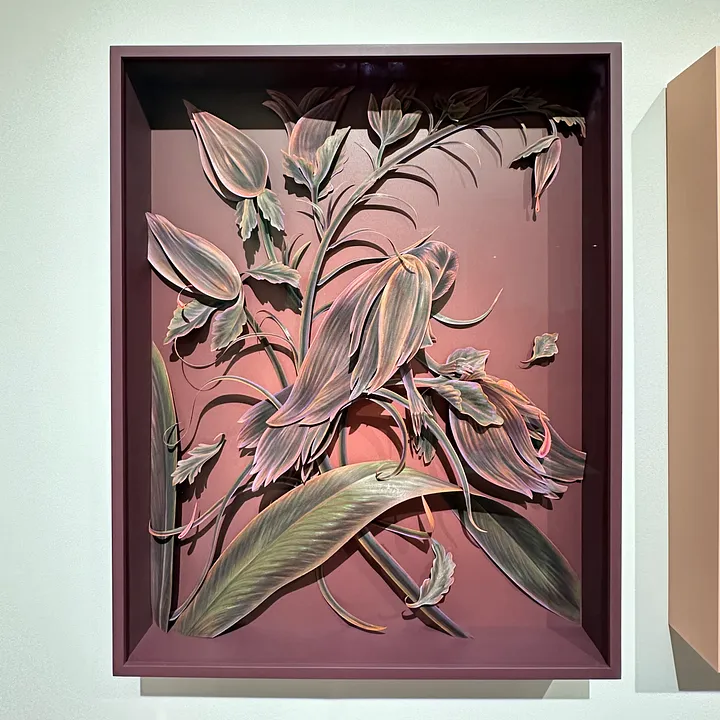
Winnie Truong (Canada, b. 1988)
I have been watching Winnie’s work for several years; and, I’m pleased to see how they quality and craftsmanship have arrived at a new level. She seems to have reached a certain comfort level with her medium—colored pencil on paper—such that she can manipulate both the color and the substrate with masterful precision. In my view, the work addresses issues of feminism and the way in which toxic masculinity has had disastrous affect on both women and Mother Nature. But also, her surrealist, almost escapist, dioramas also address the digital age and how we enter and exit these digital alternate universes multiple times per day. How do we exist in two places simultaneously, being more connected and more lonely than ever before?
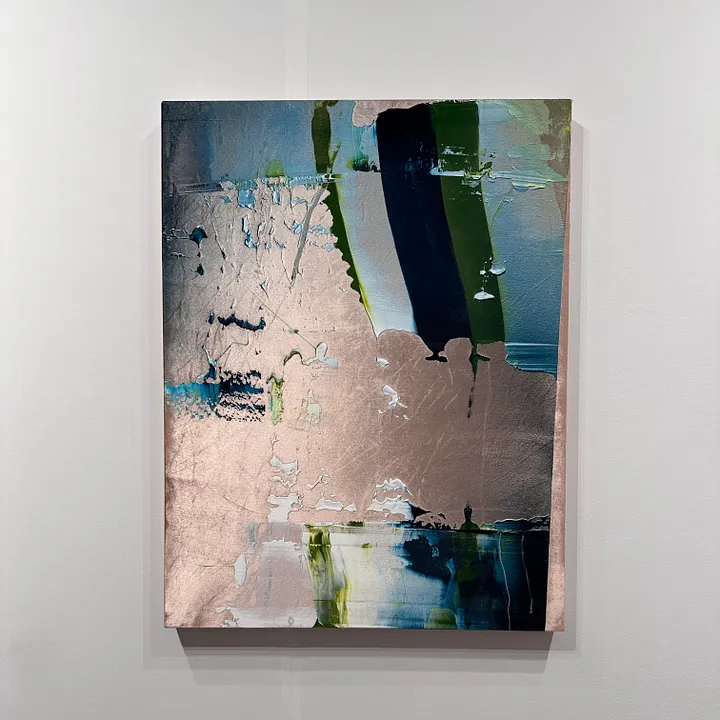
Rémy Hysbergue (France, b. 1967)
Rémy Hysbergue was among my top favorites of EXPO last year and he continues the streak this year. It is really hard to communicate the depth and luminosity of these works in photographs. They are paintings on silk velvet. Ostensibly, Hysbergue is working against and within the legacy of abstraction, but I find them to be subtly more nuanced. The way he lays down thick swaths of acrylic and adds gentle layers of spray paint on top really plays with the eye. Sometimes there appears to be texture and depth where there is none and sometimes the texture appears flattened when it is actually thickly applied paint. What you see is not always what you get. That mantra can be applied to so many aspects of our contemporary lives that I won’t even begin to count the ways.
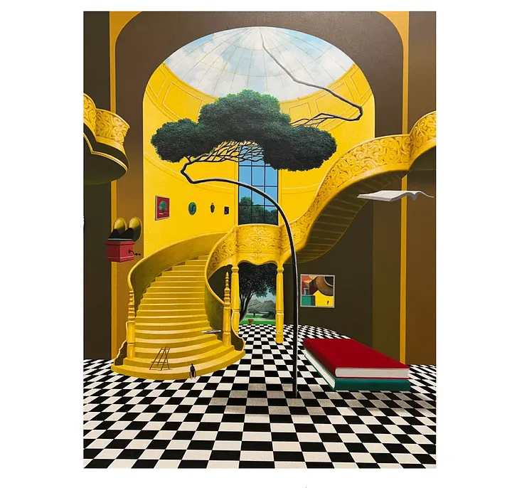
Yoo Suntai (Korea, b. 1957)
You Suntai is Korean but trained in Paris and these paintings definitely reflect the influence of both of these cultures, which is probably why I am so drawn to them. As an aside, the Koreans CAME TO PLAY at Expo. There were so many Korean galleries showing. Booth after booth I found myself really drawn to the precision and sophistication of these artists. This was not news to me though. I have known about my affinity for Korean contemporary artists for a while. I’m also on a major yellow kick right now and I love Magritte so these works just spoke to me. But the reason they made it on this list is because of the very faint overlay of Korean calligraphy that blankets the composition. You can’t really see it from far away but up close you can see all of those tiny lines. Those are Korean characters. There is not a message but it is just a jumble of words, or so I’m told. You could read the work as a comment on language barriers, or globalization, or mixed messaging, or the way words don’t always capture meaning, or a picture is worth a thousand words. Take your pick.
So, there you have it. Obviously this is not a complete recap of all the art I saw and liked at EXPO but I wanted to keep it tight and thematic. I discovered so many new artists and I will be sharing them with you over the coming weeks and months.
As always, thank you for reading and supporting my work. I’m glad you’re here.