
Miami Art Week 2024 Recap
All Access
It's a marathon. No, it's a sprint! No, it's an ARTATHON!!!!
There is nothing quite like the furor of Miami Art Week. The opportunity to see this much contemporary art all at one time is rare and I seized it with abandon these past few days. I learned the hard way that one must go into the week with a plan, leave room for some flexibility, and be realistic about what is actually accomplish-able! With comfy shoes, my extra phone battery, and an open mind, I hit the ground running on Tuesday and have not stopped until right this second as I sit on the plane home to Cleveland.
I am sure that if you subscribe to this newsletter, you also read a myriad other publications that have given you the scoop on the general mood of the week. Mildly subdued, generally optimistic, a little bit slower paced, and perhaps a return to fundamentals. No gimmicks, no bombastic, splashy antics. Just strong presentations by some really great galleries from around the world. And I am happy to report that Cleveland put her best foot forward this week! We had a strong cohort of collectors and arts professionals on site and there will be some great work coming into Cleveland collections, both public and private, after this week.
Here are some of my top picks, and since this a publication dedicated to finding great art under $10,000, that criterion still applied, except for one category. Here we go:
Favorite New Artist Discovery (>$10k, <$20k)
Araminta Blue from Gallery Rosenfeld at Untitled takes this one! Her work stuck in my mind above the rest. What can I say? I am a sucker for anyone who has even a hint of Helen Frankenthaler going on! But beyond pushing the boundaries of abstraction and figurative painting, Araminta’s story resonated with me because she is a brand new mom and also a full time working artist. This body of work is about the balance she has struggled to find over the past couple of years since giving birth to her son. Many of the paintings were made with her baby strapped to her chest. Somehow the work feels both light and ethereal even though they are about both the joy and difficulty of new motherhood and being a working mom. She is daring in her mark-making and brushwork, takes risks in both the application of color, and demonstrates a great deal of restraint to leave so much canvas bare. Ultimately the balance she finds pays off big time. While her large scale works clock in over $10,000, she has some smaller work available that would be more budget friendly.

Favorite New Artist Discovery (under $10k)
Amanda Seibæk was a great find at NADA in Patricia Fleming Gallery’s presentation. Her work encourages the viewer to join her on a journey through whimsical and mythical landscapes that she has imagined as places in which one might contemplate how to foster a kinder, more empathetic society. Using the artistic trope of the wanderer and nature as metaphor for society, the paintings both resist clear definition and offer just enough detail for the viewer to find some footing. Painted on transparent voile, they also function as windows or scrims into another world.

Favorite New Gallery Connection
One of the great things about these fairs is the opportunity for relationships and connections to happen that would not otherwise. I always love visiting friends and colleagues from other cities whom I don’t see often (but email with frequently), but I also really cherish the new relationships formed at each fair. This year I was so pleased to meet and connect with Red Arrow Gallery in Nashville. While I already knew about their program thanks to Cleveland-based artist Dana Oldfather, I was excited to meet them in person and see Emily Weiner’s work IRL (which totally holds up as well in person as it does on the ‘gram BTW).

Honorable Mentions
Here are some presentations and singular works that caught my eye:
Jakub Tomas at Asya Geisburg Gallery gave us a glimpse into a world run by AI. He is Czech and apparently they are far beyond the US in terms of their use of robotics. But I also found another layer in looking at this particular painting. I see a commentary on beauty culture where conformity is rewarded and individuality is demonized. In other words, when we, particularly young girls, let TikTok and the ‘Gram dictate what is beautiful and don’t stay true to our individuality, we end up as Frakenstein’s monster—a mish mash of ill fitting parts that don’t allow what’s real to shine. His painting says it better than my words can.

Crystal Liu at Morgan Lehman Gallery’s booth at Untitled caught my eye at the very end of the day on Thursday, thus the subpar photos. Plus when work is glazed, getting pictures in awful fair lighting is virtually impossible to do on the fly. Anyway, I think the beauty and delicacy of these paintings comes through nevertheless. They are gouache, watercolors, ink and collage on paper, the collaged parts being the marbled paper she makes and then applies. She has some very large scale work that might be out of the budgetary boundaries but these smaller works are fantastic, quiet reflections on her experience in Japan. I find them to capture the allure and mystery of that country so well. For anyone who has travelled to Japan, I imagine you would love living with one of these.

And one more piece of eye candy for your viewing pleasure, Krista Louise Smith’s altarpiece to femininity is not only a stunning piece of craftsmanship, but also an exciting next steps in the artist’s practice. Her work historically has been of comprised both intimate and monumentally-scaled ethereal paintings in buttery pastel colors that she would describe as “internal skyscapes.” Her colors hold personal meanings of safety and comfort and she applies them to images of clouds, moons, and suns. Her paintings have taken on the look and shape of chapel niches and apses of late, so gallerist Jennifer Carvalho has been encouraging Smith to explore altarpieces as a next step in this evolution. (I can vouch on personal experience that when Jennifer says to do something you should do it because she is brilliant.) So, here the artist created a reliquary that celebrates feminine beauty through the ages. The handles are inspired by the Nike of Samothrace and the half-face is taken from a favorite Egyptian object in The Met, reconfigured as a self-portrait, and covered in 23k gold. As a reliquary, this object holds and protects that sacred power of the feminine but also reminds us to recognize and protect the self, whatever that may mean for the viewer. Perhaps that means staying true to one’s values when it is difficult. Perhaps that means letting go of toxic relationships. Perhaps that means pursuing a dream or saying no to someone when you are feeling overwhelmed.

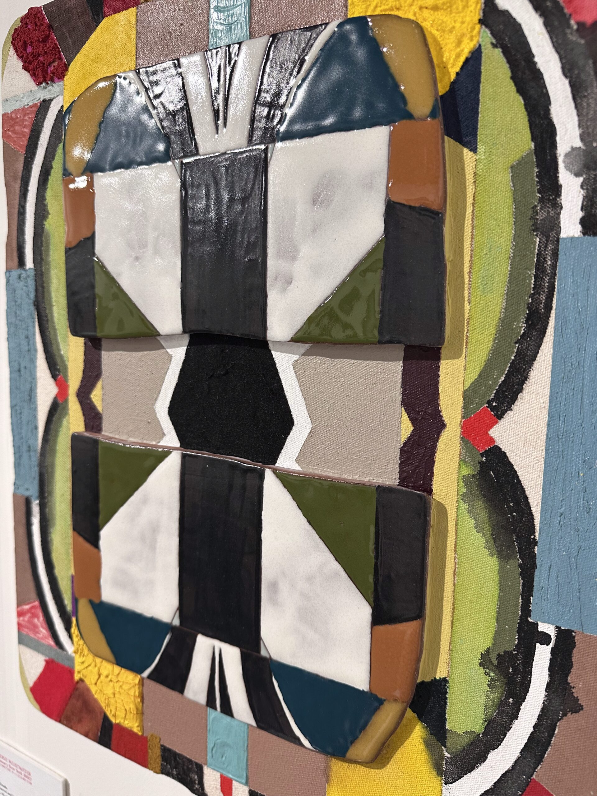
Okay, okay, now one more, Kevin Umaña at Sperone Westwater (but he also has a show at Romer Young right now) was a study in duality. The tablets, as he calls them, fuse materials, styles, and forms to create these wonderful pieces that show us that life can be more than either/or. We can exist in a state of both/and. How very Post-Modern of you, Mr. Umaña! Born in El Salvador, and recently delving into the traditions and legacy of the Pipil people, Umaña has discovered a visual language of contradiction that speaks to the spiritual connection his people have with the land and the lessons we can learn from Nature.

Thanks for reading my recap! For more art I saw and liked in Miami and beyond, make sure to visit the Chat. You’ll find lots of new suggestions posted each week with all the details you need to find out more and even make a purchase. Feel free to reach out with questions, and remember sharing is caring so forward this to a friend or family member who would enjoy seeing all the art I saw and liked!


Fair Game
All Access
They don't call it the Super Bowl of the art world for nuthin'...
The week after Thanksgiving for most Americans signals the official start of the winter holiday season, except for the masochists in the art world. We like to squeeze in our biggest week of the year right after Thanksgiving but before the winter holidays. What, like it’s hard?
For those of you unacquainted with Miami Art Week, it is the Super Bowl of the art world. The big kahoona art fair Art Basel Miami Beach (ABMB for those in the know) will be going on, along with countless others like my favorite Untitled, also in South Beach, as well as NADA (New Art Dealers Alliance). I also adore Design Miami, which is a design-focused fair. It is such a respite and brain break for me to just wander around, admire the incredible furniture and design, and dream about how I would style it in my own home with my art collection.
If you think it is all footloose and fancy-free fun, you are wrong. Roundabouts mid-November, galleries start sending out preview PDFs and links so collectors and advisors can start strategizing and prioritizing how they will spend their time and dollars. I have over one hundred previews in my inbox that I will diligently survey for my clients and then send them curated groups based on their interests, needs, style, and budget. If a work or an artists strikes them, I will then communicate their interest to the galleries so we can place a hold or at the very least throw our hats in the ring to potentially be granted a placement. Oh yeah, that’s the other thing, if you are after a hot up-and-coming artist, galleries “gather interest” before “making placements,” i.e. they see who all wants to buy and then choose who gets one. It’s fun to beg to spend money, right?! And yes, this all happening now, well before a single PJ touches down in The Magic City. (And no, I am not flying private but many fair attendees certainly are!)
But I digress. The previews are a big part of making the most out of a fair-going experience. Often time decisions have to be made very quickly and if we have already discussed an artist or a work, it makes the trigger-pulling part much easier. I go to the fair, see the work IRL, vouch for quality, probably spend some FaceTime minutes with the client, hem and haw a bit, and boom bam done. Art bought! Easy…peasy…? Then I arrange shipping and installation and the clients never lift a finger, except to tap in a credit card number.
Last year, 5 works found their way back to Cleveland and into my clients’ collections. (Now looking at all of these pictures together, it appears my clients have a penchant for tan grasscloth wallpaper…)


Read on to learn more about some of the presentations I’m stoked to see IRL this year. Of course everything featured here will be under $10k. Paid subscribers will also see everything I am seeing and liking while in Miami over in the Chat!
Anna Erickson Presents
Anna always does an incredible job and this year is going to be just as good. She’s doing a two-person presentation of painter Lacey Stoffer and ceramicist Sachi Moskowitz at Untitled.


Massey Klein
I really cannot say enough good things about the wonderful couple behind Massey Klein. Ryan has an unparalleled eye for emerging talent that is ready for primetime. She and her husband Garrett have built a powerhouse program for collectors across the spectrum. This year they are presenting Bethany Czarnecki at Untitled and her painting is so dang good.

Abattoir Gallery
Sure, let’s go all the way to Miami to see some great work from a gallery in Cleveland. Makes perfect sense! But in all seriousness, Lisa Kurzner brings her decades of experience in the New York and London art scenes to Abattoir Gallery, which uniquely imports national artists voices and dialogues them with the trove of Ohio-based talent she unearths. (Man, I need to get a hold of my run-ons…) At NADA Abattoir will present Eleanor Conover. These sculptural, dimensional, multi-media canvases are everything I need in my projects and I would really, rEaLly, REALLY like for a client to acquire one.

Sperone Westwater
Sperone Westwater’s presentation for ABMB is packed with heavy-hitters that orbit in a stratosphere outside the budgetary realm of most folks. But don’t let that scare you! There are often hidden gems to be found with smaller works by big-time artists, like Jim Gaylord (left) or Amy Lincoln (right). I love Jim’s supple forms in graphic compositions and Amy’s dreamy, whimsical landscapes are always a delight. I can’t wait to check these out IRL!

Nicelle Beauchene
The Tribeca-based gallery is presenting some of my favorites at ABMB including but not limited to Violeta Maya, who has a distinctly Frankenthaler-esque thing going on and who’s prices have risen quite a bit since I started following her (another example of why clients should listen to me when I tell them to buy!), and Quentin James McCaffrey, whom I am featuring here. His paintings are ‘spensive but these little drawings are so intimate and would make an excellent addition to a charming little nook. You could just pack one right up in your suitcase and bring it home, or I could do that for you!

This is a mere snowflake on the iceberg of Miami Art Week previews. If you are a client, you will be receiving personalized recommendations from me while I’m on the ground. If you are not a client, follow along right here and on Instagram for everything I am seeing and liking in Miami. I will be dropping lots into the Chat as well. Let me know if something strikes you!

Risk + Reward When Buying Art
All Access
Raise your hand if you decorate with neon.

Hallmarks of a professionally designed space reveal themselves in the unexpected details—pops of shocking color in an otherwise neutral living room, loud art on top of wallpaper, a tiny painting on a large wall or an oversized painting squeezed into a smaller space, an eclectic mix of furniture styles, juxtapositions of architectural styles and decor eras, etc… When you don’t really know what you are doing, you tend to play it safe, but when you hire a professional or feel comfortable in your decision-making capability, you will often swing for the fences. I love it when clients swing for the fences because a sophisticated art collection is often one in which the collector has taken some risks.
In one recent example, a client replaced a dark and tonal abstract work she had collected on her travels to Bali with a bold choice by Sarah Ann Weber. This was our first purchase together and the result was nothing short of transformational. Here are the before and after photos.


The colored pencil on paper drawing by Sarah Ann Weber practically glows against her very traditional lavender sofa. I had really always envisioned something bright coral or neon yellow in this space but did not think this first-time-art-buyer would follow me down the neon yellow brick road. Knowing what an impact such a choice would have here, I went out on a limb one day and sort of side-texted her, “Hey, what about this…” and showed her some examples of SAW’s work, which I had seen and loved many times over. To my shock and surprise and very much to my client’s credit, she immediately went nuts for it. She was planning to be in LA so I arranged for her to meet Sarah in person (thanks to the wonderful Amanda McMorran at Anat Ebgi) and see several available options. Of course they knocked her socks off in person and here we are!
Beyond the visual impact the new work has on the space, the client reports that its presence has actually transformed the way they live in their home as well. Now, she loves to sit in this room while her oldest daughter practices piano. Her two younger daughters often join her because they love looking at this work with its endless array of details to discover and discuss. Her life insurance agent even said to her, “This is not my style at all but I love this work of art!”
The family still discovers new details every day and the journey of living with this piece has helped them understand how deeply rewarding it is to visit and revisit a work of art over and over by living with it.

Bright, bold, and nontraditional colors are one way to take a risk with your art and develop a more sophisticated collection. Here are some others…
The bottom line here is that variety is the spice of life. And here are three ways to add variety to your collection that may seem risky but will ultimately yield exciting visual reward.
3-Dimensional Art or Sculpture
Just because you have a flat wall, it does not mean you have to have flat art. I love to put sculpture or three-dimensional wall-dependent art in a single space to add visual interest. Here is an example of a rendering I did for a client who is exploring her risk profile, shall we say:


I chose these three works because first and foremost they tell the story of the family who lives in this home, but secondly, because they look awesome in this beautiful, historic Cleveland home. Se Yoon’s sculpture is all about the balance and importance of giving children a solid foundation while also nurturing their ambition and confidence to achieve their goals. Hildur Jonsson is a Cleveland-based artist and this family are native-Clevelanders so it is fitting to have her represented in their collection. And finally, Stephanie’s Join is made out of mattress quilting and I love that it encapsulates the spirit of this massive dining room where the family routinely hosts dozens of people. She describes her home as wanting it to be the place where her children and their friends want to hang out, a soft place to land, so to speak! She is still deciding how daring she wants to be in this room, particularly against the very traditional decor, but we shall see…
Juxtaposition of styles or media
This one is not terribly different from the one above but I want to highlight one particular aspect, and that is that you should not put a painting on every wall. It is really important to mix in a variety of media. If you can’t get there on hanging a sculpture on a wall, think about drawings, pastels, watercolors, or prints as alternative 2-dimensional media to add to a space. I recently worked on a project in which every wall has a painting on it. The client and I felt it was really important to add variety in terms of both subject matter and media with the final acquisition. She has paintings on 4 walls, a photograph on one, a sculpture (!!) on the floor, and so we added a series of watercolors that lead up the stairs. They are being installed next week, but here is a rendering:


And this leads me to my final point:
Scale
There is a rule of thumb that the art should be 57-75% of the width of wall on which it hangs. This is really helpful when you are just starting to consider a space. But it is also really fun to throw it in the garbage and think differently! In the example above, to some degree we chunked the rule book out the window. These little water colors are small. Like 11×8” and 8×5”…on a massive double height foyer wall. We played with doing a salon-style hang and covering the wall ceiling to tread with art. We played with a large single piece hung front and center. But we ultimately settled on these small, intimate watercolors because they resonated so deeply with the client and her love of travel. By going small, we are giving each object its moment, and in a way, recreating the experience of exploring far away lands. As the viewer progresses up the stairs, they will be invited to pause and ponder and then move on. It will be a slow, contemplative experience rather than a loud, overwhelming one.
As always, thanks for being here and for reading my newsletter. I have really enjoyed this new platform and am looking forward to continuing. Have a great weekend everybody!
The Veteran Collector's Secret to Owning Art by the Masters and Prints are Not Posters
All Access
It's easier than you think.
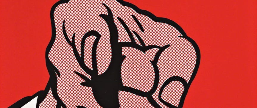
Have you ever wondered how a semi-regular ol’ Joe has a Lichtenstein hanging in his living room or a Matisse in her master bedroom or a Katz in the kitchen or a Banksy in the bathroom? Friends, they are called prints. And no, they are not posters.
Many of the greatest painters from Rembrandt to Ruscha made fine art prints alongside their painting practice. A fine art print, in contrast to a poster, is a reproducible image made in a limited edition. A lot of collectors just call them prints or editions or multiples. To make it a little confusing, because we are art people after all, the term edition also refers to the number of prints struck from a single plate. So if you go to Phillips’ website, for example, you will see a category called “Editions.” This refers to the works the auction house sells that are not unique. Some houses call their print departments “Prints and Multiples.” They all mean the same thing.
I get so many questions about prints and print collecting, so I’m going to do a little FAQ:
Q: How is a print different than a poster?
A: A poster does not have a set edition number. It can and usually is produced in an unknown quantity, it is probably not using high quality or archival materials, and often the artist has nothing to do with its design or production. A poster is temporary and a print is made to last. Artists have been making prints since forever, like the Han Dynasty in China, and the reasons for printmaking have remained largely unchanged. Printmaking is a relatively fast and inexpensive way to more widely disseminate information, images, and text.
Q: Why would I want to buy a print? There are dozens of copies of it.
A: If a big time artist really resonates with you, owning a print by that artist may be the only way you will ever be able to acquire a work by that person. Take Rembrandt. Rembrandt was a PROLIFIC printmaker. Alexander Hamilton : writing :: Rembrandt : printmaking. I think we all know that there are very few Rembrandt paintings still held in private hands. Translation: Almost all of his paintings are in museums. But Rembrandt prints hit the auction block every single season. Some people only collect Rembrandt prints. The catalogue raisonné of his work is vast and the quality of the objects themselves varies significantly. But if you love Rembrandt and only have a few hundred bucks to spend, you could acquire a print made by the master’s own hand. It may not be unique but it surely demonstrates the artist’s process, technical prowess, experimental spirit, and artists genius.
However, when it comes to contemporary printmaking, someone might acquire a print rather than original, unique work because maybe the artist has a really long waiting list or the price of a unique work has already skyrocketed beyond their budget or they are really drawn to this particular medium or art form.
Q: What is a monoprint and a monotype?
A: They sound synonymous but they are not. A monoprint is when an artist uses the same plate or block to produce the same image but makes changes to the final print either directly on the plate between each impression or to the printed image itself. Here is an example of a series of monoprints called Point Reyes by Guimi You. The printed image is the same and then she went back in and hand-finished each one with acrylic overpaint. This is an edition of 25, but here are just 2 examples. I love Guimi’s work but her paintings are usually very large and they have gotten quite expensive. I bought one of these wonderful monoprints instead!


Dream of growing up by Benedict Sheuer demonstrates why it is sometimes difficult to discern monotype versus monoprint. You can see that the images are largely the same but the colors are different and the compositions have some variation. Were they struck from the same plate?Who knows…and honestly who cares. He made 4 monoprints in this series. I own one and a client owns the other and I LOVE it!


A monotype is an image made using printmaking techniques but is totally a one-off, like Cleveland-based artist Corrie Slawson’s work. She is the consummate printmaker and her technique is off the charts, but all of her images are totally unique. A monotype is usually considered a unique work rather than an edition but I imagine there have been heated discussions in some very erudite circles on this topic.

In the image above, Corrie has layered printmaking technique over acrylic painting, spray paint, stenciling, all sorts of media to create this finished work on paper. Is it a painting? Yes. Is it a print? You could probably argue as much. Check out more of her work here.
Q: Ok, cool, but how do I buy a Warhol? And why are the prices all over the board?
A: The short answer is at auction. Decide on the image you like and want to acquire and then watch the auctions for one to come up. You could also buy them from print dealers but the print dealers probably bought them at auction so you might as well go straight to the source. Prices vary based on rarity, condition and desirability. Obviously, low editions make a particular print more rare. Condition refers to the state or quality of the object. Does it have creases or tears or light damage? And of course desirability is how many other people want to acquire this same image. Some prints are more iconic than others and thus, more expensive. You know willing seller, willing buyer, and all that jazz. If you don’t know how to buy at auction or want to better understand the print market for major, iconic artists, feel free to drop a comment below or send me a message.
That feels like enough info for you to digest at the moment.
Key takeaways:
Buying prints is a fantastic way to quickly and easily build your art collection and add some variation to your collection. If you look around at great design, you will likely observe that variation is the key. When every single piece of art is a painting on canvas, it gets boring. Framed prints (almost always behind glass or plexi) change it up a bit. I always like to put prints in high traffic areas where I want art but do not want that unintentional shoulder bump against my unprotected painting or in a child’s room where an errant ball might hit the art.
As always, thanks for being here and for reading what I have to say. Your support means more than you know!
Why Substack + Some Nature-Inspired Art That Is More Than Sunsets and Flowers
All Access
I came on strong with my shift to Substack. Let me tell you why.
I have had many people ask me why the sudden and relentless shift to Substack? I don’t blame them. It happened quick and I came on strong. There are so many reasons why I dove into Substack head first and with reckless abandon and am so, so happy about it.
The most important reason why I started a Substack is because I miss long-form posts about art and the art market. I started Art I Saw and Liked with longer posts about art I saw and liked. It was really that simple. But as my business grew, we came out of Covid, and life happened, my IG became something else and IG itself became something else. Reels happened. Gah, I hate Reels. The algorithm changed, or continually changes all the time, which leads me to the second reason why I joined Substack.
IG is hard to keep up with. It is hard to build a real community. And IG is no longer about the visual. I don’t really know what it is about these days but I know it is a time suck, a mood suck, a joy suck, a productivity suck, etc… You get the gist. It sucks. But it also does not really do all that much for my business. Outside of a handful of engaged followers who are really interested in what I have to offer, I am not sure how it really moves the needle for my business. That makes me sound like a capitalist pig, but I have to be choosey about how I spend my time and a key criterion is that everything I do has to be absolutely necessary or have very high impact, and that leads me to my third reason.
I want to use Substack as platform to reach many more people than I can under my current business model. Don’t get me wrong, I absolutely love that I do, which is helping novice art collectors find and collect art that speaks to their soul. I love watching clients discover an artist or work that brings them closer to a fuller expression of who they are. I really want to be able to do that on a larger scale. I currently work on a one-to-one basis and I will always do that. But I would love to add a one-to-many branch to my business. My hope is that my Substack becomes a place where many novice art collectors from across the country can go to access my eye, my knowledge, my network, and my expertise. I believe there is a huge group of people out there who want to live with fantastic art from real, working artists that inspires their minds, their creativity, their families, and great conversation but they just don’t know where to go to get it and don’t feel confident in their choices. Displaying art in your home and in the spaces you occupy makes you vulnerable. I have found that people want to make choices that make them feel safe, confident, seen, and understood, even if they are visually risky. It’s a weird balance and I want to help folks find it.
That is the purpose of my Substack newsletter. Spread the word. Share it with your friends, family, neighbors, and colleagues. Please take a moment to forward this newsletter to one person who you think would enjoy reading it. And if you know of any great artists I should feature, please drop me a message!
And now on to some great art all under $10,000…
Benedict Sheuer (b. 1992, American)


I love these silk wall-dependent sculptures from Benedict Sheuer. They flutter when you walk by them. They are so gentle and graceful and vulnerable. I really want to hang a cluster, or dare I say, flock, of them asymmetrically on a large wall.
Corinne Slade (b. 1998, Montclair, NJ)


This new body of work from Corinne Slade deals with the act of deadheading—the practice of pruning flowers to encourage new growth—a powerful metaphor for personal renewal and transformation. Her new exhibition opens TODAY (!!) at COL Gallery in San Francisco. Slade is a young artist but has shown at Frieze London and Felix Art Fair, and the work is still under $5k!
Josh Callaghan (b. 1969, Doylestown, PA)


Josh Callaghan has recently come on my radar and I find his work so elegant in it engagement with the human-environment relationship. His Twig Index series takes us into the fourth dimension as it harkens to human evolution while his Root Ball asks us what future humans and future Nature might look like if we continue on our current trajectory. Callaghan’s work masterfully looks back and forward simultaneously to helps figure out what we should do in the now.
How Do I Look At Art and Some Really High Quality Surrealism
All Access
Sometimes we end up with more questions than answers
Well, the answer to the first question is easy. Use your eyes!! JK…sort of. On the one hand, looking at art is easy. Just look at it. But on the other hand, it is hard because you really should be engaging all of your senses and your imagination. Taste? Yep. Touch? Totally (well imagined touch. Don’t actually touch the art…unless you are instructed to do so.) Sound? You betcha. Smell? Yes sir.
Using your imagination to engage all 5 senses is one of the best ways to find your way into a piece of art about which you know nothing. I always tell people that they should stand in front of a work of art long enough to be able to say five things about it. (In case you missed it, that is the key takeaway from today’s lesson. Well that and don’t touch the art.) If after that, you are still not feeling it, then you can move on. But, a good way to get to 5 things other than listing the colors you see is to imagine what the scene might feel, taste, smell, and sound like. This even works with abstract art and takes you on a little non-substance-fueled acid trip. You should try it.
Another strategy is to imagine why an artist made the decisions that they did. If you think about it, every mark, brushstroke, line, swoosh, splash, splotch (a technical term), crosshatch, gradient, the material, the size, every single aspect of a work of art was a decision made by the artist. Together all of these decisions coalesce to (hopefully) convey what the artist is trying to say. So maybe your 5 intelligent comments are imagining these decisions and why they were made. You could even take it a step further by asking yourself how the work might change if the artist had made a different choice. Would it be more or less effective? Would your perception of the meaning or message have shifted?
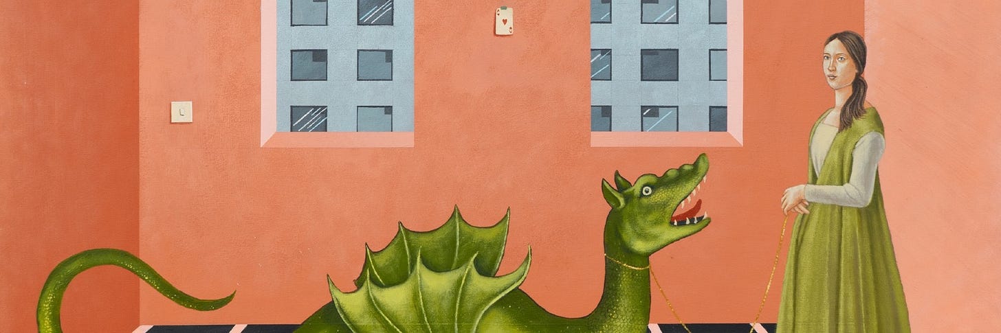
Let’s practice on this week’s artist recommendation! She’s so good and has a waiting list, but I’ve got the secret sauce…
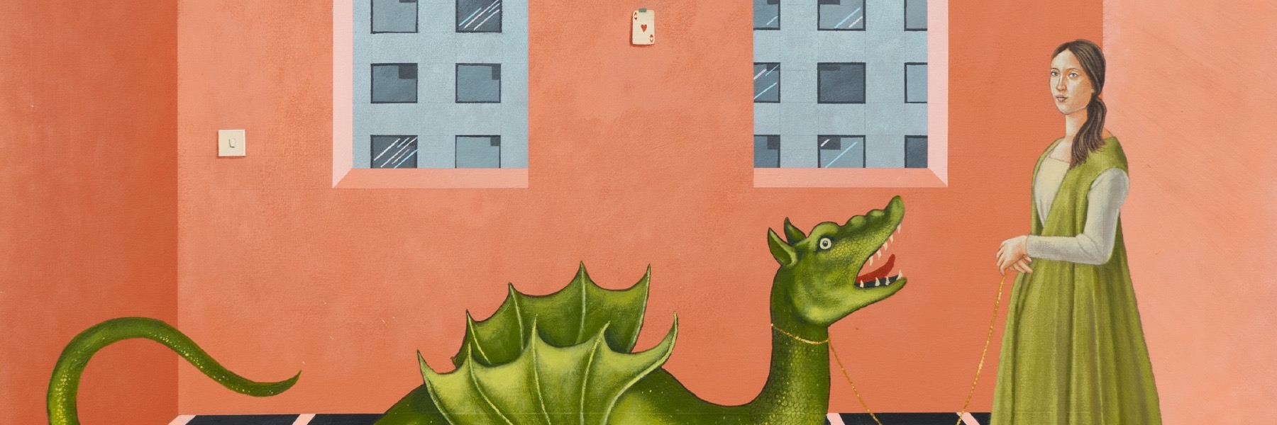
Aniela Preston (b. 1998, Coventry, UK)
Picture this: You walk into an exhibition by an artist about whom you know nada. The images on the wall are at once familiar and foreign, whimsical and onerous, cheery yet eerie. What do you do? First, take a stroll around and drink it all in. Are there any recurring figures or symbols? Do you see a character show up in multiple compositions? What’s the color palette got going on? Do you feel uncomfortable? What makes you want to keep looking? How did the paint get to the substrate? Can you see the brushstrokes? Can you see piles, pools, or puddles of paint (impasto is the technical term) on the surface? Do the images remind you of anything else you have seen?


Here are my five thoughts:
- The architecture and compositions definitely have an Early Renaissance feel to them, when artists were just figuring out linear perspective, but here the perspective is amiss. It is like she wants you to think of Renaissance perspective but also recognize that this is not that. This is not an attempt to render the world as accurately as possible as we see it, but perhaps it is the world as we feel it, experience it, or dream it. This is not physical reality but the metaphysical, emotional, experiential, or internal reality.
- A lot of big cats. Why the big cats? They are not fearsome or aggressive here but symbolically they perhaps serve as a harbinger of danger.
- The hexagonal pool and the style of the lillies and trees in Veil of deception giving me major Ghent Altarpiece vibes. The Ghent Altarpiece is a masterwork by Jan Van Eyck, the Northern Renaissance master who taught us everything we know about minute detail. Why does she want me to go there??
- So many questions about the colors. Millenial pink e’er’where. I feel like I’m in Florida with all the turquoise and peach. But it’s working for me. I like the color palette because it feels calming in spite of everything else in the composition presenting a giant question mark.
- There are “bodies of water” in each painting— a tub, the blue rug and turquoise carpet, that maroon situation with a night cityscape in the far distance, the pool, the water and ship—and I feel like there is a thread here. Perhaps some aspect of environmentalism?
Ok, here’s the takeaway: Even when you know nothing about a work of art or an artist, you can start to identify details and make connections that will help you understand it. Some works evoke more questions than answers, and that is okay!
Aniela Preston graduated with her Fine Art BA at the University of Leeds in 2021 after completing her Foundation Diploma at Central Saint Martins. In 2022 she was selected as a finalist for the Ingram Prize, and most recently, she has been selected as a finalist for the Royal Society of British Artist’s 2023 Rome Scholarship. Aniela’s paintings blend the contemporary with the classical in a hyper-realist style, offering both quiet glimpses into intimate moments and gesturing towards wider societal, political and environmental issues. Her paintings, therefore, not only provide social critique but draw on the concept of traditional formality that mythologises the mundane. Painting primarily in acrylic, she hopes her paintings are not just aesthetic objects but rather invitations to consider the impact of our actions.
She has recently had solo shows at LUPO Gallery in Milan and Black White Gallery in London. Her work will be show at the Westbund Art Fair in Shanghai in November 2024. (Most of the paintings are already sold out! Let me know if you are interested and I can connect you with the gallery.) Aniela Preston will graduate from the Royal College of Art in 2025.
I'm tapped out at $5k but I really love some more expensive artists. HELP!
All Access
I can help you solve this problem.
First of all, congratulations on joining the expensive taste club. We are a fun bunch! If you spend enough time around great art, you’ll soon notice that it can be difficult to set limits on how much you are willing to spend on a piece you love. But there is a budget. There is always a budget. If you have found an artist you love but just can’t afford one of their signature pieces, there are some workarounds…
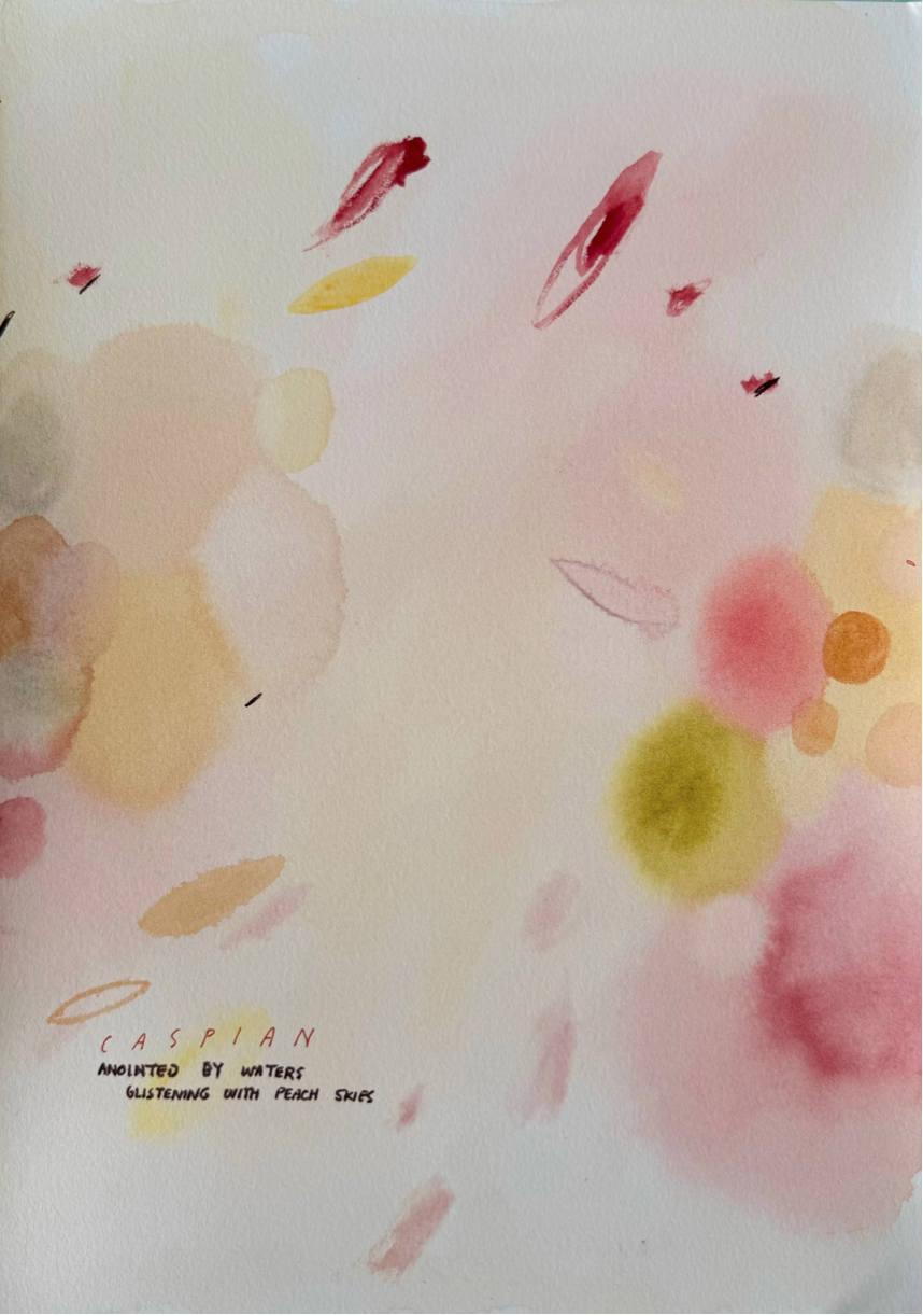
- Consider purchasing a smaller work, a work on paper, a study, or a print (if the artist produces prints). Here is a gorgeous little ink drawing by Dora Maar up for auction next week and the starting bid is only $500…
- Watch charity auctions on Artsy. Many emerging artists will donate works to charity auctions to support causes about which they are passionate and to help gain exposure to art-loving audiences. There are often good deals to be had.
- Identify what it is about that artist that resonates with you and look for artists working along similar lines. Is it the theme? The colors? The artist’s story? This is a big part of what I do so feel free to ask for help.
- And I know you don’t want to hear this…but you could always save toward it. It’s good to set goals!
Here is 1 charity along with 4 artists who’s work sells for more than $10k (and in 1 case WAY more…) but their smaller works under $5k are just as wonderful, or might be even better, but definitely have something to offer…
Museum of Contemporary Art Detroit Benefit Auction
The auction is live now on Artsy and lots will start to close on October 28 at 12:00pm EDT. Here are some favorites:


Hank Willis Thomas (b. 1976, Plainfield, NJ)
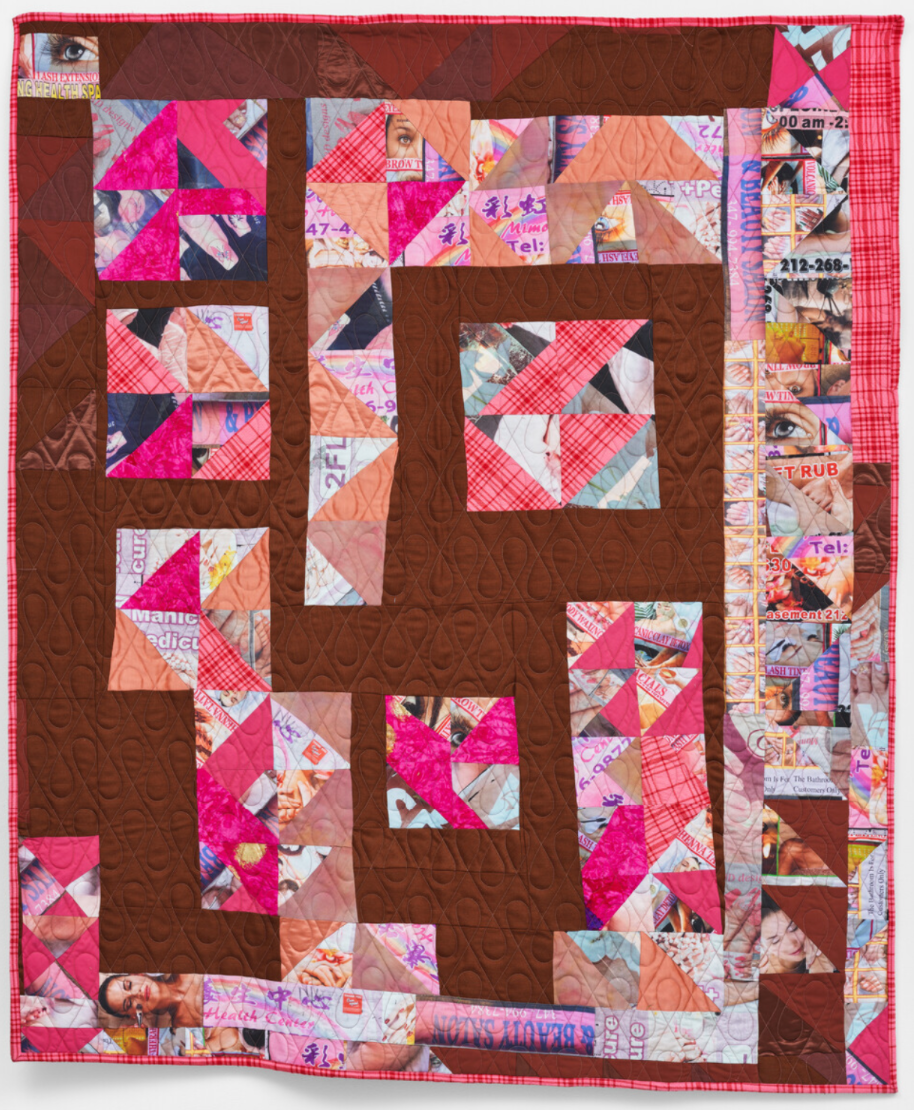
Yes, you read that right. THE Hank Willis Thomas of The Embrace in Boston Commons. His work, like his quilts and large sculptures, sells solidly in the 6 figures and he has blue chip representation but he has a print practice that makes his work really attainable. I typically am not drawn to overly political art, its just not my thing, but Hank’s elegant touch always gets me and I am so enthralled by his new series of monoprints (or as the studio is calling them, unique variations) that remind us all how important it is to protect our democracy. I like how the works can be read in a variety of ways and from multiple viewpoints, depending where on the spectrum the viewer falls politically. In the end, Hank reminds us that we all share a common goal and that is to protect our freedom. These are listed at $10,000 each, which falls slightly outside the scope of this newsletter, but they are too good not to share considering his work is often well into the hundreds of thousands. Here are 2 of the unique variations.


Gudmundur Thoroddsen (b. 1980, Reykjavik, Iceland)
I had the distinct pleasure of seeing Gudmundur Thoroddsen’s show at Asya Geisberg in September. It was one of those shows that I saw first from the sidewalk and it beckoned me in to the gallery before I even realized what gallery I was entering. Once I realized I was in Asya Geisberg, I was not surprised as I always love her program. But I digress. This show was a knock out and these works whether small or large have such visual impact on a space. The paintings, while abstract, give the viewer a true sense of the Icelandic landscape in all its oxymoronic glory. The jagged edges of cliffs meet the soft moss covered rocks. The volcanic lava flows butt against icy glaciers. The island itself was formed from nothing into something but the beauty of the country stems from the fact that it is so untouched. You literally get the feeling that no one has ever been there before. I felt all of this standing in front of these paintings. The show closes in a couple of days but here are a few favorites under $5k.


Harminder Judge (b. 1982, Rotherham, UK)
I had the distinct pleasure of meeting and sharing a meal with Harminder a few months ago in Cleveland. It was refreshing to hear him rave about our fair city, so I automatically liked him, but also hearing him talk about art was transcendent, much like his artistic practice, which is grounded in an extended exploration of pigmented plaster as an artistic medium. “His alchemical process involves layering pigments into pools of wet plaster. The plaster sets – freezing a record of its creation in time, and the surface is then worked, polished and slowly worn away to reveal layers of colour, texture and movement beneath. Culminating in expansive modular panels and ineffable shapes which seem to hover off the wall, colour, forms, and compositions are allowed to reveal themselves and intensify over time. The results are sensual and seductive, with surfaces appearing sleek and shimmering. They have an illusory quality, seeming to hover in front of the wall, suggesting depth, evoking the idea of a portal or doorway and inviting the viewer to stay with them in contemplation.” -from the artist’s CV and bio
Prices range from GBP 30,000+ for his most ambitious multi-panel works down to around GBP 4500 for the smaller panels and he is represented by London Gallery The Sunday Painter.

Saba Farhoudnia (b. 1987, Tehran, Iran)
Saba was born in the midst of war. Her paintings are monumental in scale and explore the challenges facing the human condition. Saba merges the art of drawing, painting, language, and verse, through brushstrokes, geometric forms, calligraphy, and gestural marks to evoke drama, pain, humor, and beauty. The forms are intended to plumb the depths of the grotesque and elevate the humor in beauty. Her work explores humanity poised on a precipice: facing an insecure present and an uncertain future. She is represented by Fou Gallery in New York.

So there you have it and this is just scratching the surface. It was hard to narrow it to just 4 artists to feature but stay tuned for more posts like this. And if you see something you like, let me know and I can share more details.
Unionized Art-Buying...Kind Of... and Text-and-Image Abstract Painting Actually Done Well
All Access
More like collective buying power...but unionized sounds catchier!

Ever wonder why you walk into an exhibition and every single work already has a red dot? In the world of art, galleries like to make their best patrons feel very important. One way they do this is by offering exclusive access to new work by their artists before the rest of the lowly art-buyer-wannabes get to see it. Life ain’t fair, folks. If you patronize and support a gallery, they will love you back. This is one reason why having an art advisor behooves the novice buyer. An art advisor is basically a union rep for their whole clientele giving each client the collective buying power of the whole. That is certainly the case for my clients for a variety of reasons.
First of all, none of my clients are spending millions or even hundreds of thousands of dollars on art, nor do they have important last names (no offense y’all). And secondly, being new collectors, they have not necessarily found a gallery that they would want to patronize so heavily that they would gain exclusive access to previews. But when I combine the collective buying power of 10 to 15 clients, all of a sudden I gain access to everything they want on their behalf. See how that works?
The problem for me is that I have access to all of this incredible work that I would love to place, but with only 10-15 clients, not everything is for every taste. Honestly, this is the main reason I started this Substack. I am betting that there are TONS of would-be-art-buyers out there that do not even know this art exists, but if they did, they would love it, and they would buy it!
One such example is…
Heath Wae (b. 1989, Melbourne, AU)
Yall, I love Heath Wae. And I really, really love his new body of work that is opening in a cool new show at London gallery The Dot Project on October 23. The Dot Project is dedicated to emerging artists and the next generation of collectors. Their mission and my mission are essentially identical so I love them.
Using text in art is really hard, like really, really hard. It can so easily get cheesy or cheap-looking. Sometimes, when done poorly, it just feels like the easy way out for an artist to get their message across to the viewer. But Heath Wae uses text to great effect, eliciting a particular feeling in the viewer but not necessarily answering any questions or making the work’s meaning more accessible. With his words and phrases, he sets up a framework within which the viewer can meaner and explore. More labyrinth and less road map.
I would really love to see this whole body of work (except the one that is already sold, of course) stay together and hung down a hallway or in a cluster…Somebody do it please!


What do you think? Do these totally transport you to a different time and place? Let me know where your mind goes!
Quickie Read: Jess Bosworth Smith
All Access
On Tuesday evening, I unwrapped a new painting that we recently purchased from Shaheen Gallery’s exhibition of new work by Antwoine Washington. Maybe they have been groomed or maybe their excitement is genuine, but my sons love it when new art arrives. They have opinions on where it should go and why; and, it is the most fun to hear all about what they are thinking. After we settled on the fact that the painting really aligns most closely with my younger son and that it should hang in his room, we took it in there to figure out which wall. There is a lot of bright art in his room and this particular painting is also bright. I held it up and my older son declared, “That does not excite my eyes.” He is 7 and he was exactly right. When I asked him why it does not excite his eyes, giddy with glee that he had articulated his opinion so clearly and concisely. He observed that the colors in the new painting are too similar to the other work on the wall and so it all just gets lost.
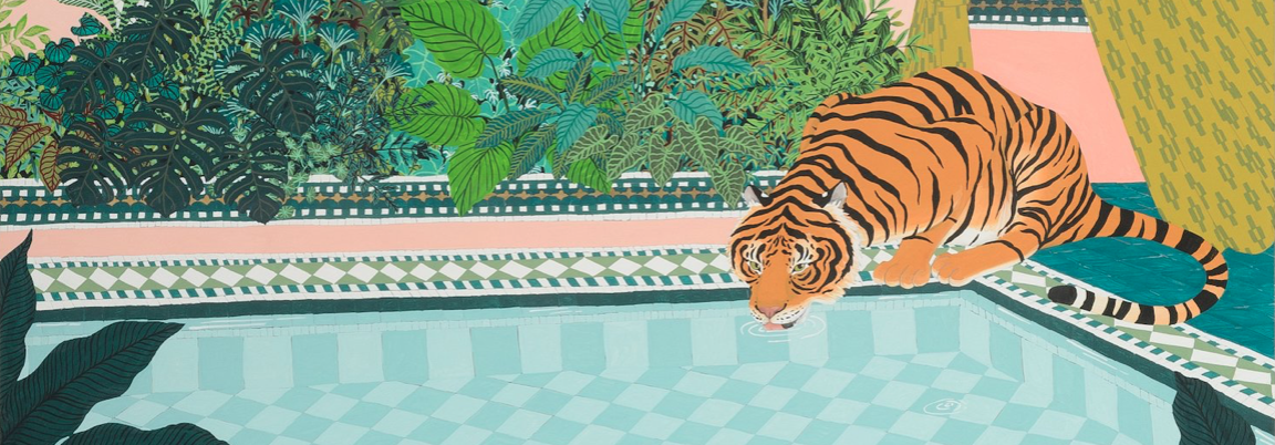
Exhibition promotional emails for 131 A Gallery’s current exhibition of Jess Bosworth Smith have hit my inbox a couple of times now and I like the work every time. Here is a favorite that happens to still be available.

Advertised price is R 38,000 or about $2100-2200.
I love 131 A Gallery’s program in Capetown, South Africa. They place emerging artists next to established artists and have a keen eye for high-quality work.
Have a great day!
(Banner image: Jess Bosworth Smith, I’ve Got Better People To Leave on Read (detail), 2024, gouache on board, 118 x 87.5 cm)
City Feature: CLEVELAND
All Access
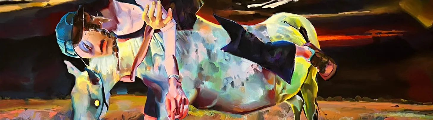
Great art does not have to come from New York and LA
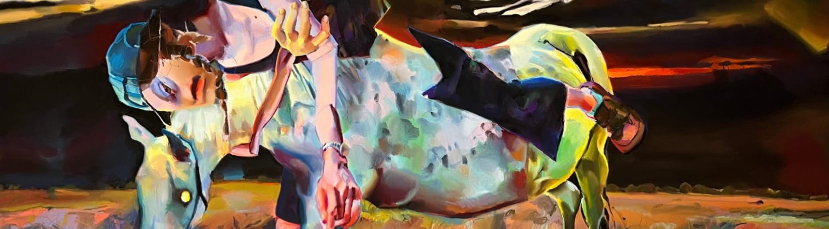
Yes, many of the great American artists live and work in New York City and Los Angeles. FACT. But, if you live in the middle of the country, aka not in one of the aforementioned coastal cities, you know that there are so many wonderful artists living and working across our great nation.
HOT TIP: NYC and LA costs of living are exorbitant so artists outside of these huge markets enjoy much lower COL, and thus their art is much less expensive, but often just as high-quality as what is coming out of the emerging market in NYC and LA. That was a run-on sentence but I don’t care. I digress.
So, let us turn our attention to CLEVELAND. Say it in an Oprah voice, “CLEEEVELAAAANNNDDD!!!”
Honestly, Cleveland is a really dang cool city. Unlike the radically dad-sounding previous sentence, Cleveland is dope and has lots of great, world-class, might I add, cultural institutions, including but not limited to the Cleveland Orchestra, Cleveland Museum of Art, Museum of Contemporary Art Cleveland, SPACES, Rock and Roll Hall of Fame, etc… While our big arts and culture organizations are fabulous, we have but just a handful of galleries in our small but mighty arts ecosystem. So many of the artists who live and work here have to seek representation outside the city or are independent.
But, we’ve got a guy. There’s always a guy, right? He has been in the art biz since he could crawl and knows everyone, like everyone, in the art world. And he has a phenomenal gallery that marries the best of our local talent with all-stars of the century like Alex Katz and Frank Stella. His name is Brett Shaheen. His gallery is Shaheen Gallery. And a few of the amazing local artists to whom he has introduced me and I am now sharing with you are:
Rose Haserodt


TR Ericsson

Neil MacDonald


Do you live in a city filled with amazing local artists? Let me know where you live and maybe I will feature your city next!
As always, thank for being here!