Galleries That Get It: Charles Moffett Gallery
All Access
Art Drop #04
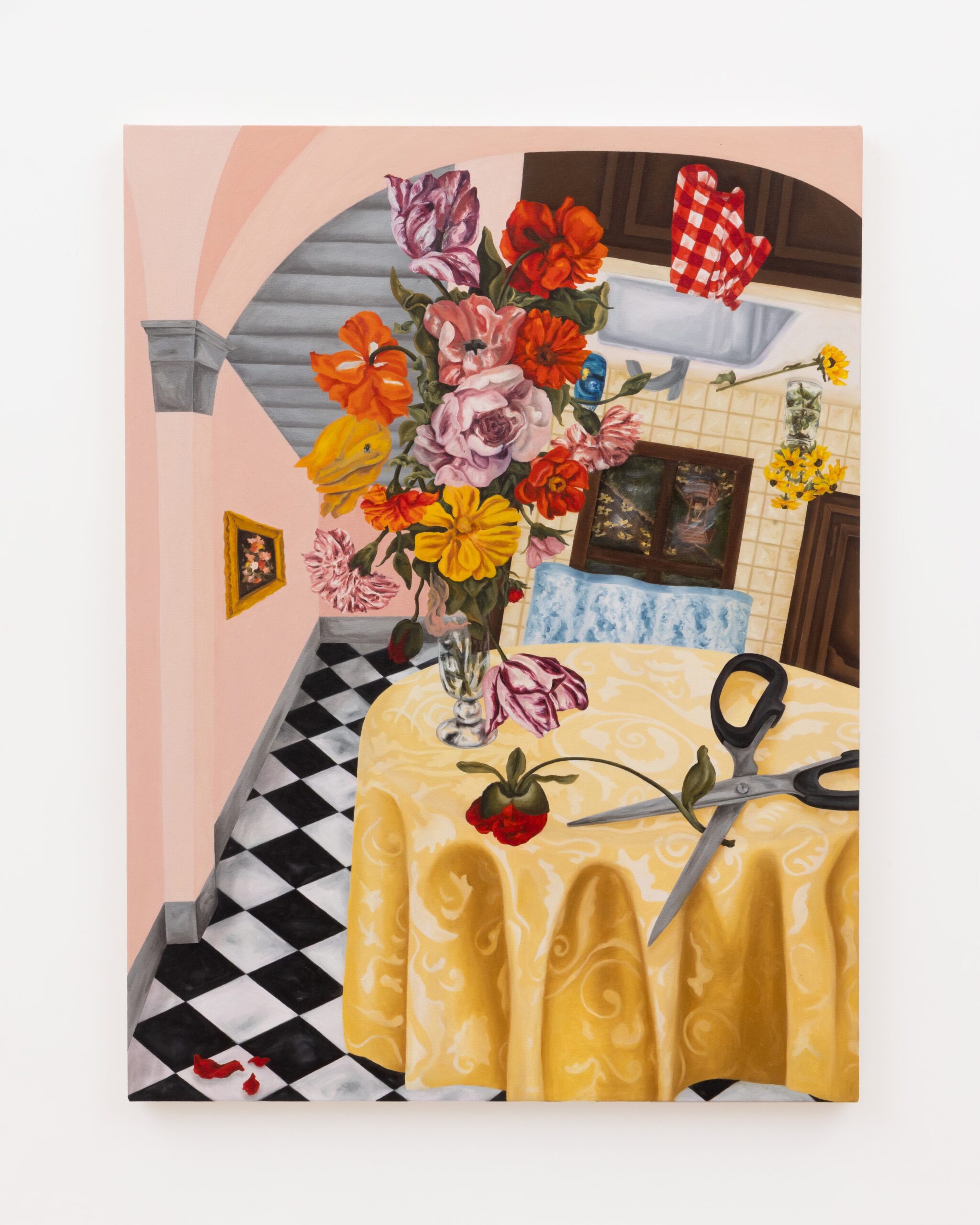
I’ve admired the program at Charles Moffett for several years, but it was only recently that I really developed a relationship with them because of one gallerist who gets it–Hannah Root. To be honest, I don’t really know how Hannah found me but she piped up in response to one of my more fiery Substack posts (pretty sure it was this one). After exchanging some DMs of solidarity on ye’ old IG, we decided we needed to have brunch to hash it out further. It was at that teeny table at Balthazar that I shared with her my vision for Art I Saw & Liked. It felt so good to speak it out loud and Hannah listened so intently, offered up some critical thoughts and suggestions, and became the very first AISAL cheerleader. She has really walked with me every step of the way and provided invaluable feedback and support. So, THANK YOU HANNAH!!
Now, more about why YOU also need to know Hannah. If ever there was a go-getter, changemaker, get-it-doner in the art industry, it is Hannah. She recently transitioned to Charles Moffett after nearly a decade at Pace. Not only does her rolodex run deep, but she welcomes new people and ideas with wide open arms. On paper, she may have cut her teeth on doing things the mega-gallery way; but after one conversation with Hannah, you will instantly learn that she approaches the business of selling art with her own fresh verve. Getting behind the idea of a subscription-based art advisory service? Yep. A mahjong night at the gallery? Do it. Growing her audience on Substack? Sign her up.
She’s the most unpretentious, well-connected person you’ll ever meet. She does pilates in basketball shorts, plays basketball on her days off, and has an incredible eye for emerging talent.
If you’re in New York, you should absolutely make Charles Moffett a stop on your itinerary. In the mean time, read on to hear Hannah’s thoughts on being a gallerist and advice she has for new collectors plus peruse the newest additions to The Collection all from Charles Moffett.
Q & A with Hannah Root
How do you see your role as a gallerist?
Being a gallerist means being an educator first and foremost. Whether it is educating a collector about an artist, clarifying art world jargon for a novice, defining what a gallery is, or elucidating how to start a collection, nothing is out of bounds in this role. Each time a question is asked, the art world grows because it is another mind who feels empowered to remain curious. We are the conduit of information between the collector and the artist, which of course is a job you can’t take lightly!
What is an aspect of your job that most people might not consider?
One of the most overlooked parts of working in a gallery is the opportunity to learn about individuals to help them find an artist they love or the right artwork. Somebody opening up about their aesthetic inclinations can be really personal, so understanding what a privilege it is to create a space where people feel comfortable sharing is a great way to create honest dialogue about artists and artwork.
Do you have any advice for someone wanting to start collecting art?
For people who are interested in beginning their collections, I encourage you to not be bashful in asking the question on your mind. I love when people ask the price, because it means they are figuring out how the piece could work in their lives. Maybe it is a work that you could buy in the moment, or maybe it’s a good artist to earmark for future budgeting. Either way, you are educating yourself as to how to live with artwork that you love.
I am grateful to Hannah for her time in sharing with us and for cheering me on for the sidelines as I have developed this platform and continue to grow it!
Now, to the art!
Sam Bornstein
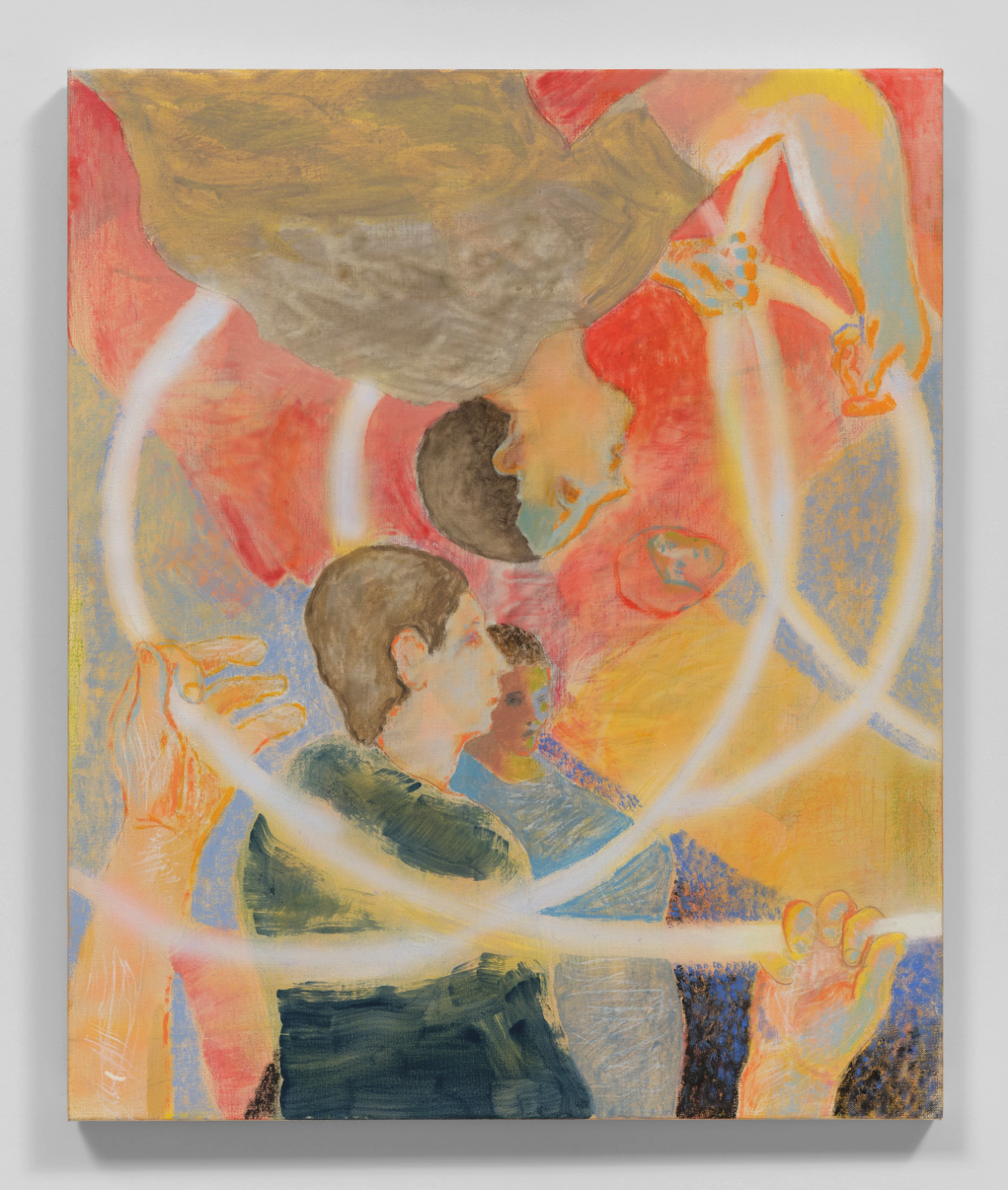
If you have been here long enough, you have probably picked up on the fact that I am not usually drawn to figurative art (meaning art with people in it). And when I do find figurative work I like, it is usually because the people populating the composition are not immediately in and of my own space. I suppose I personally need an element of separation between me and the figure and I think that happens in Sam’s work. I also find the color palette charming and bright but acidic and overpowering.
Gianna Dispenza
I like Dispenza’s openness to change and unpredictability. The work is abstract and for me the meaning lies in the making. Her additive process fundamentally alters the paint in ways she both understands and can’t anticipate. I find it to be a good metaphor for life. I also think she has a unique sense of composition that feels responsive to the altered state of her materials.
Maggie Ellis
Maggie clearly knows her art history. This one painting makes two obvious references to Edouard Manet’s Dejeuner Sur l’Herbe and George Seurat’s Sunday on La Grande Jatte. In her version though she updates the scene, the composition, and the color palette to feel like it was screen-grabbed from Instagram. In Ellis’s hands, the central theme of isolation from Seurat’s magnum opus is recast as the ubiquitous glowing screen that is shattering the relationship-building skills of young people across the world. The recumbent nude figure in the foreground occupies a similarly obscure role as her counterpart in Manet’s painting; and, I can only surmise that viewers should bring their own interpretations to this familiar yet elusive work.
Keiran Brennan Hinton
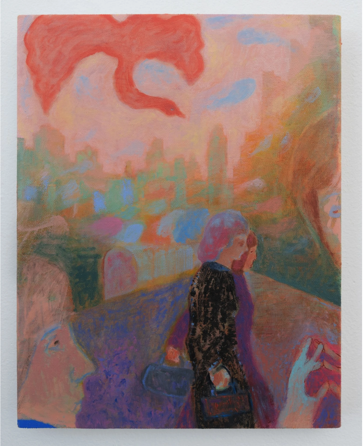
Hinton is a master of melding universal familiarity with nostalgia for a particular place. I often feel a longing or kindred connection to the places he depicts even if I don’t know exactly where they are. He documents the feeling a place gave him rather than the way it looked and that is my favorite kind of representational painting, whether it’s a landscape, an interior, or otherwise.
Silvia Heyden
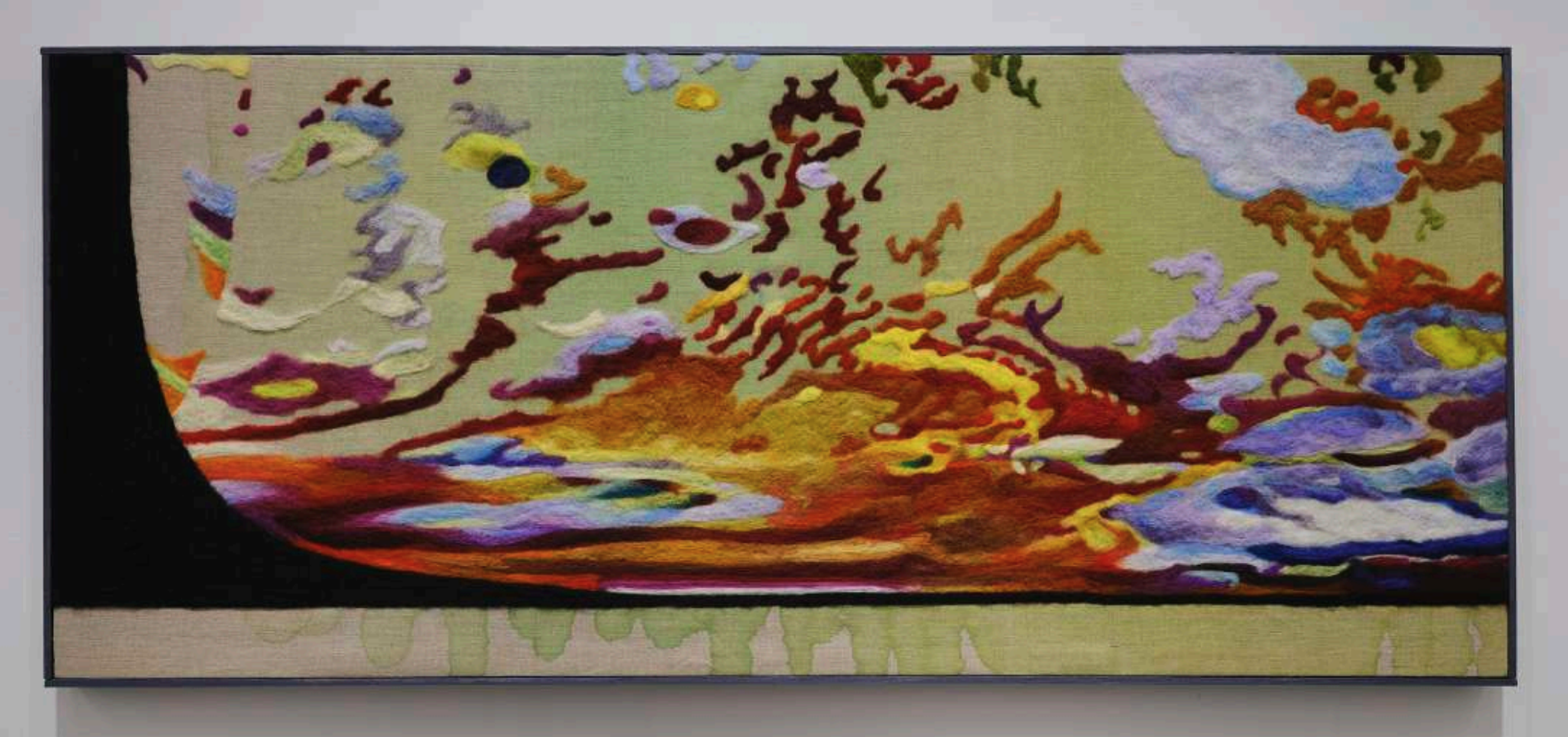
I love a good opportunity to give due to an artist who deserved more attention than they got during their lifetime and Silvia Heyden is just that. While she gained some notoriety, particularly in the American Southeast, she should be better known than she is and I love that Charles Moffett is bringing attention to this 20th century textile artist.
Hopie Hill
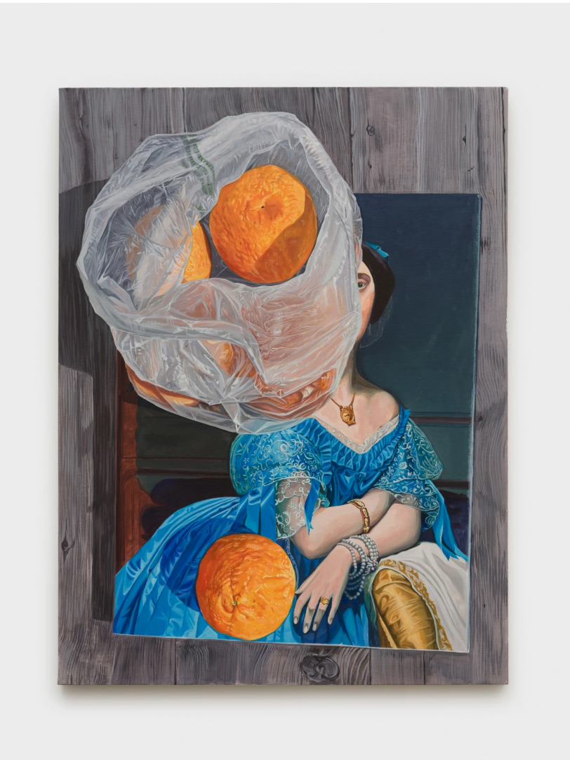
Another artist who knows her art history, Hopie Hill carries on the tradition of symbol-rich still life painting of the Dutch Golden Age. Recasting familiar objects like citrus fruit, eggs, or snails, Hill reflects on her own personal journey and offers an opportunity for connection with the viewer as she opens up about her struggles.
Julia Jo
Jo’s work jumps back and forth between figuration and abstraction and deals with the miscues, missteps, and lost-in-translation moments she felt growing up between Korea and states across the US. Each mark is carefully calibrated to reveal and conceal. This work totally stands up in the three areas of evaluation I discussed last week!
Melissa Joseph
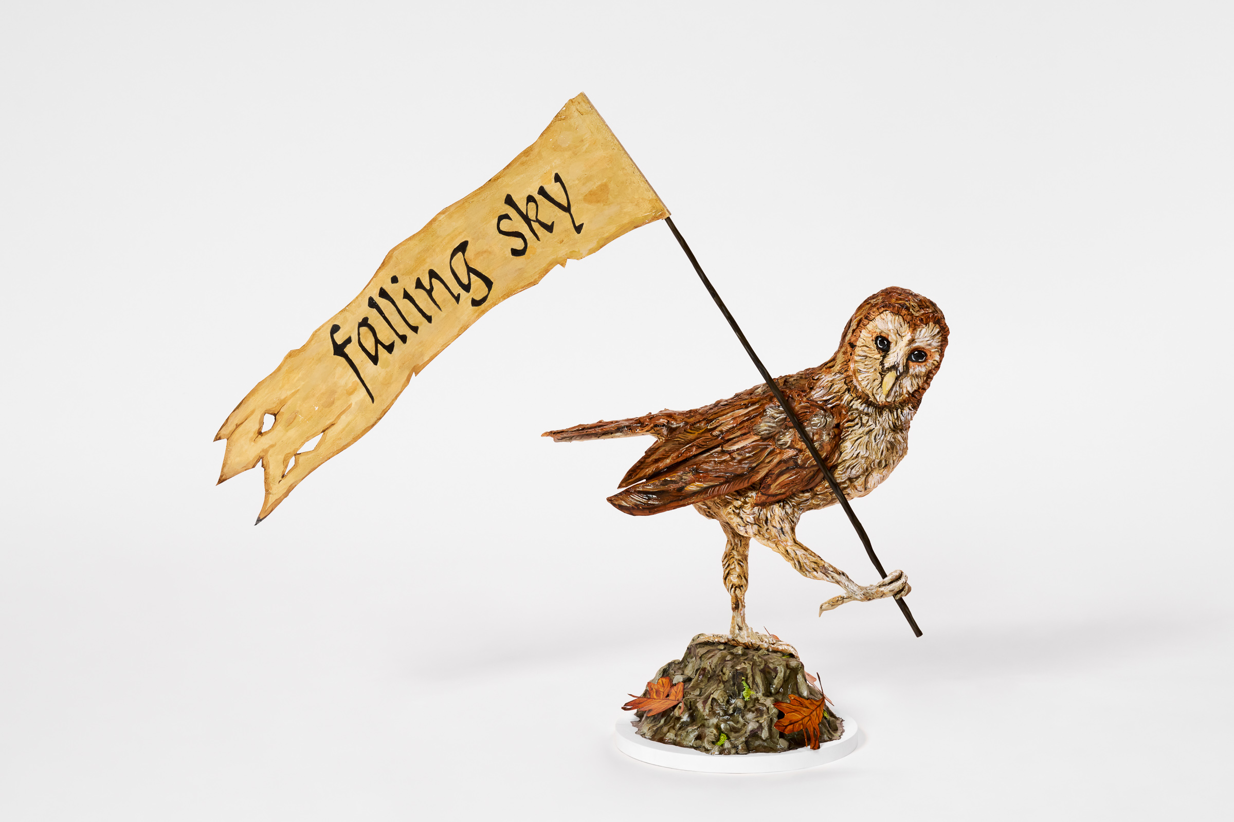
Another artist dealing with memory and family history, Melissa Joseph looks at how we occupy space, the labors of women, and the experience of being a second-generation American. Her work has a sculptural, almost-DIY quality to it but it is very much intentional and not for lack of skill. It feels vintage and close to home, telling intimate stories with unique materials She was also listed in the Artsy Vanguard 2025, so there’s that background check for ya!
I hope you have enjoyed reading all about one of my favorite NYC galleries and gallerists this week. It takes years of dedication and discernment to develop these relationships and I am so grateful to all of the gallerists who have worked with me along the way. Truly, galleries are essential cogs in the art industry machine. They spot and nurture great talent and help artists manage the business of being artists so that artists can do what they do best–clarify the world for the rest of us! The art industry can not survive without them, so find the ones that resonate with you and support them!
Thanks for being here!
Featured Art



Until Next Week–

Casey Monda | CEO & Art Advisor

What Makes The Cut?
All Access
Art Drop #03
Good Sunday, my fellow art-lovers! I had a whole post about a favorite gallerist almost written for this weekend but I never got to finish it because I went to an art and design entrepreneurs retreat last week (a post on art for personal growth forthcoming) and time just got away from me. So, I am going to save that post for next week as I really would like to give her the time she deserves; and instead, this week, I’m going to give you a peek into how I decide what makes it into The Collection.
The headline here is that everything in The Collection is something that I would personally buy for myself or recommend to a client. In essence, every work gets the art advisor’s stamp of approval for one reason or another. If you see something that resonates and decide to pursue an acquisition, you can trust it. That is really what Art I Saw & Liked is all about–it’s about providing a platform for inspiration and discovery outside of the doomscroll as well as accessible art advisory services for a segment of the market that is historically underserved. But that’s the elevator pitch. Let’s dig in to how we get to the rubber stamping.
Quality
Quality is the first and most important criterion. Assigning a quality judgment to a work of art can be subjective, but I look at so much of it that I can instinctively judge if a work stands up or not. What goes into determining quality? Well, it has a lot to do with presentation. Does the work feel ready to be in the world? Do the marks feel intentional? Does the final product look the way it looks because the artist made a concerted decision to make it so? I find that asking these questions helps me keep my evaluation rooted in objectivity rather than if I personally like a work. As an advisor, I have to be able to see through the eyes of clients which requires that I take my personal opinion out of the equation.
Visual Analysis
Secondly and adjacent to quality is visual analysis. This is something we learn as students of art history to help us take an artist’s decision-making into account as we read a work of art. It helps assess intention and objectively evaluate whether or not an image is “working.” We look at the formal components such as line, color, shape, texture, form, and space as well as design elements like composition, balance, movement, emphasis, and proportion. In doing so, we can answer whether or not an artist is doing what they say they are doing. In other words, when I read an artist’s statement and then look at their work, do I see the connection? Do I see why an artist made the choice they did to arrive at a particular conclusion?
I think visual analysis also helps root out talent. Artists are visual storytellers. Some only work in a single language, while great artists are able to translate their stories into a universal language that transcends individual taste or style. I am not saying that every work in The Collection is going to make it to that level, but I do think the artists represented here have some element of transcendent storytelling. Will they all be Picasso or Rothko? No. Do I think they achieve what they ostensibly set out to do according to their statements? Yes.
Background
Finally, I consider an artist’s background. This one can get tricky because some artists are self-taught. You do not want to automatically toss out an artist just because they don’t have a fancy MFA and a CV riddled with big-name galleries. Plus at the sub-$15k end of the market, you are not often going to find the traditional markers of success, yet. When this is the case, you have to rely heavily on your quality assessment. Typically though, an artist in The Collection will have at least a group show at a reputable gallery under their belt or maybe even a solo show. They will have found their way into the company of more established artists somehow. They might not yet have representation but galleries are starting to notice them and see how their work resonates with their audience. This is why it is really important to find gallerists you trust.
To put it into practice, here are the five artists I added to The Collection this week and why:
Mary Finlayson
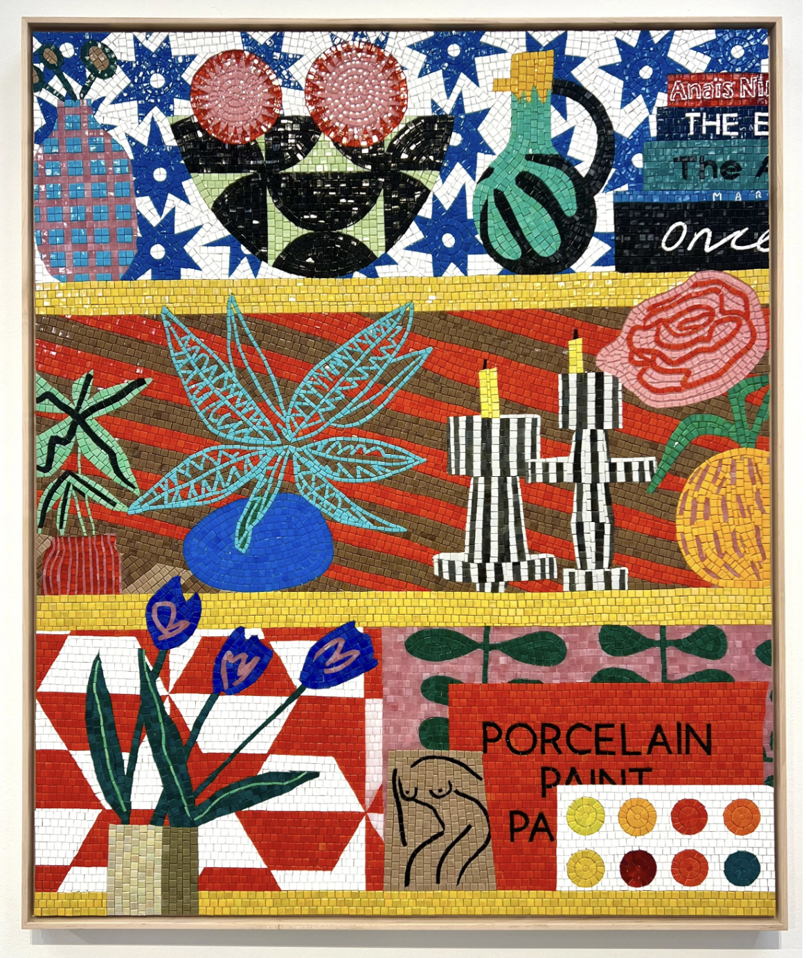
I like Finlayson’s work because the bright colors and simplified forms harken to nostalgia and memory. As time passes and events become memories we recall, the details fade but the contours remain. Moreover, I find the application of mosaic in some works to be apt to describing the joy in the everyday. The teeny tesserae (art-ese for tiles) are the minutiae that make up the tableau of our lives.
Du Chau
Du Chau ticks all of the boxes of quality, visual analysis, and artist’s background. The work is superbly executed and will withstand tests of time. You might say it is archival quality. Visually, the work stands up to the artist’s objectives of trying to create a quiet and contemplatively charged space. Contemplative and charged are not typically words you find to describe a single work of art and yet here it works.
Eleanor Conover
I have loved this work for several years and I think it is getting better and better. Any work that riffs with Helen Frankenthaler is going to grab my attention. In Conover’s case, she often brings physical dimension to the work making it more sculptural by bowing the stretcher bars and adding pieces of slate or granite to her abstract forms.
Katie Paterson
If you have asked me lately who my favorite artist is, I probably said Katie Paterson. She is a deep thinker and if you try to get on her wavelength, your mind will blow up. Her work invites the viewer to both consider our environmental reality as well as imagine works of art made out of physically impossible materials from that environment. It’s conceptual and abstract but also very much an object in the present that really couldn’t be anything other than what it is.
Madeline Hollander
Madeline Hollander brings her ballet background to bear on her visual art practice. Using her knowledge of movement and choreography, Hollander creates works that invite the viewer to mentally move through time and space and embody the marks of the two-dimensional works.
Make sure to go check out the rest of what I added to The Collection this week! And don’t forget to share the love: invite friends to join Art I Saw & Liked, heart your favorite works in The Collection, and shoot me an email with questions!
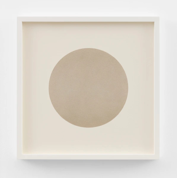
Katie Paterson, O I, Mixed media using pigment ground from the fossilized forms of the first cellular life on earth, 20 1/8 x 20 1/8 in
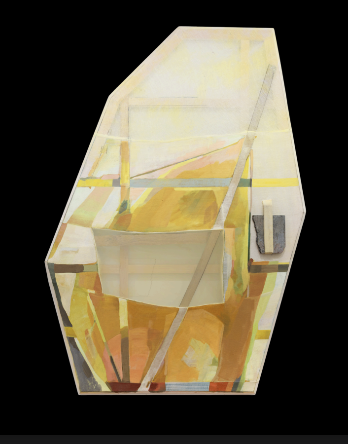
Eleanor Conover, From The Steep Slope, dye, oil, and graphite on sewn linen and polyester with bowed oak, beveled pine, and marble, 63.5 x 43.5 x 4 in
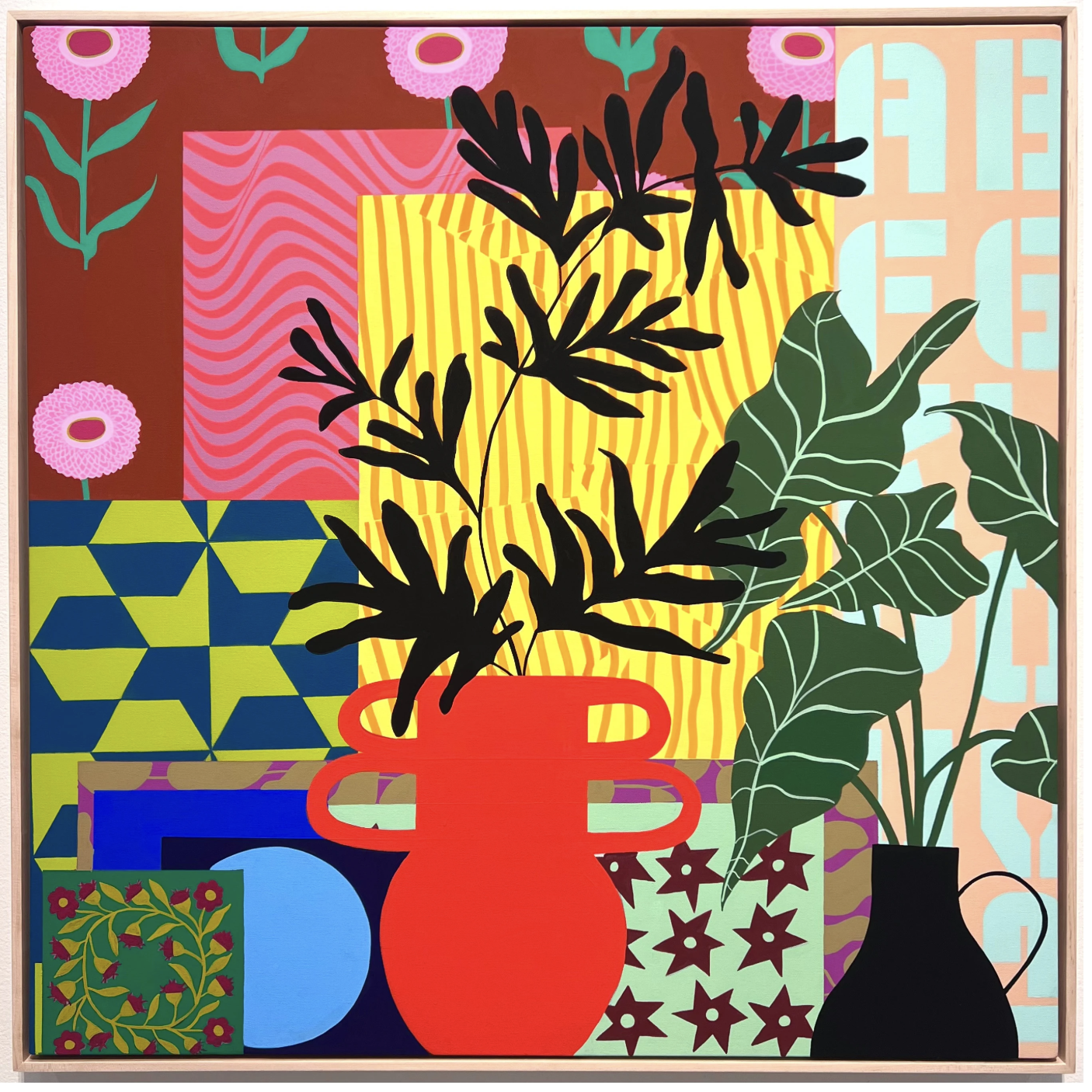
Mary Finlayson, This Must Be the Place, acrylic gouache on canvas, 36 x 36 in
Until Next Week–
Casey Monda | CEO & Art Advisor
The First 20 Seconds
All Access
Art Drop #02
Hi all and happy November! I, for one, am pretty pleased that October and Halloween are behind us; and, we can look forward to the festivities ahead! As we dive into the fastest-paced months of the year, I thought it would be a great time to launch a new series that I’m currently dubbing The First 20 Seconds. I plan to share how different art industry professionals approach art they have never seen before and find a way to engage with it. Today, you get to hear from me! Next time, it will be someone much cooler.
I am sure many of you have read this stat but research shows that the average museum-goer spends about 27 seconds in front of an artwork. 27 seconds! To me, it’s pretty amazing that the information superhighway in our brains can process an image that quickly and decide if it is something with which we want to engage. Since so much of this work is done practically subconsciously, heretofore, I have not spent much time thinking about what really attracts me to a work in those first critical seconds. So, I did a deep dive.
To ascertain what stops me in my tracks, I scrolled back through my photos from art fairs past because that is a pretty good record of what slowed my roll and made me look twice. The first thing I noticed is that the work has to jostle me out of my norm. It is sort of like Mel Robbins’ counting backwards trick. You have to force your brain out of its habit and reroute the thought patterns. Art that makes me stop does just that.
What would be an example of a piece that shakes up the neural pathways? I mean, right, wrong or indifferent, a banana duct-taped to a wall would be one example. But if we’re staying in the sub-$15k realm, then here are three artists that have commandeered my first 20 seconds and why.
I did not have to go scroll back very far to find three stunner artists that illustrate my point perfectly. I encountered all three of these artists at NADA NYC in May. I was actually familiar with two of them before the fair, but the work is just that good that despite its familiarity, I was still drawn to its novelty.
Jude Griebel, represented by Massey Klein, is one of my favorite emerging sculptors working today. The work is an exercise in oxymoron. It’s both playful and dark, simultaneously light and heavy, at once strong and fragile, vociferous yet quiet. It stops me for the reason that most surrealism stops people: something is familiar but not quite right and you want to stop to figure out what. (User tip: if you click on Jude’s name at the top of this paragraph, it will take you to a page where you can learn more about the work and the artist.)
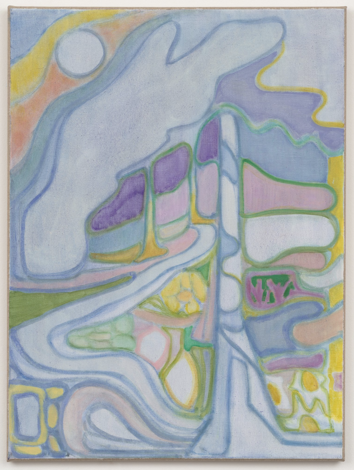
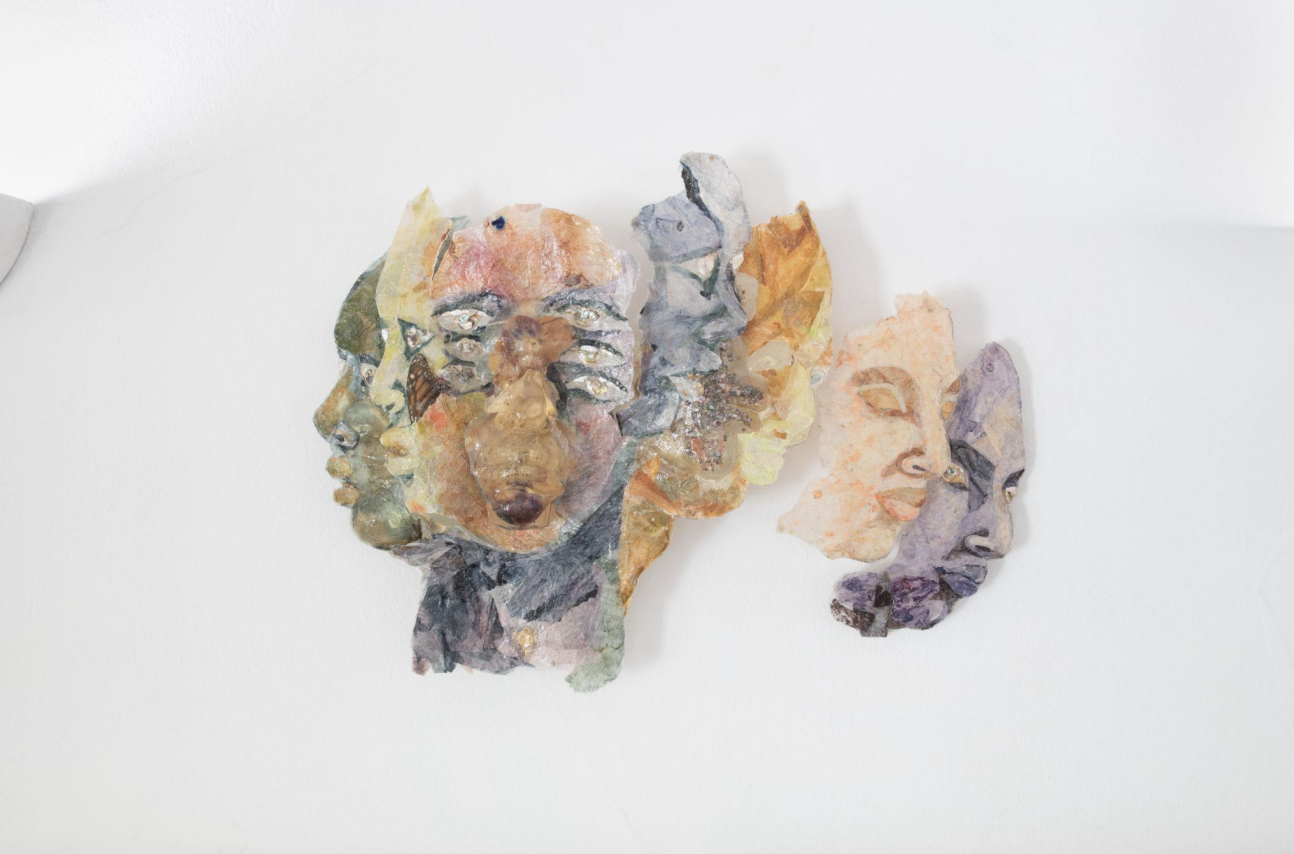
Similarly yet differently (a phrase that would have all my grad school professors screaming at me), Pauline Shaw’s particular brand of abstraction is just familiar enough to make viewers want to think further on it. It has that tip-of-the-tongue quality that makes you want to get there. At least, that was my experience with it when I encountered it for the first time in the booth of Naranjo 141 (now defunct) also at NADA NYC. Full disclosure: I ended up buying one of the works at NADA as my husband and I have a particular penchant for work that has to do with the cosmos. She recently had a two-person show at Each Modern, which is where the two works featured here were exhibited.
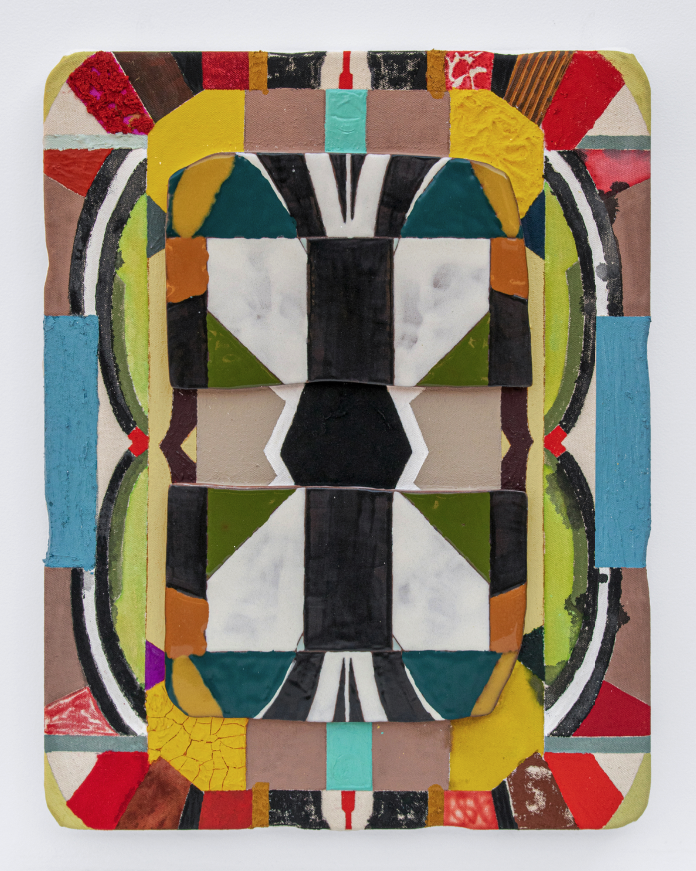
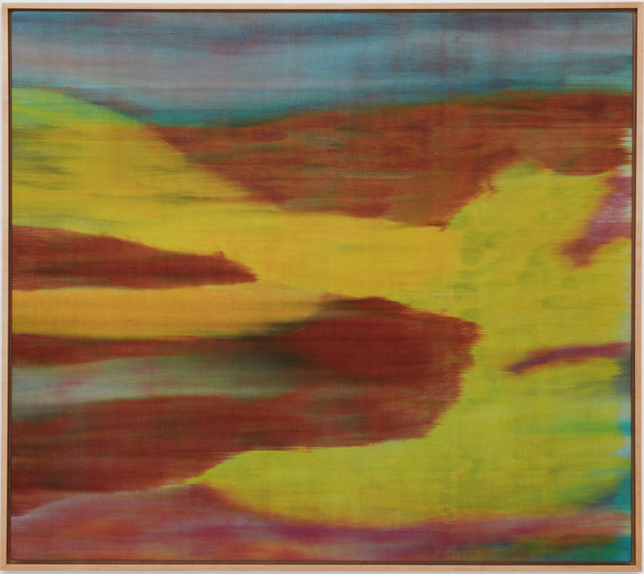
And finally, Kevin Umaña. He is like geometric abstraction meets quilting but its ceramic so neither painting nor textile–how do you categorize that. He defies categorization. (That’s my real-life stream of consciousness in the first 20 seconds, btw.) His work engages with his ancestral heritage, at once paying homage to these people while remaining in an extremely modern visual language. And it just so happens that his show at The Pit LA opens tonight!
So, for me, the first 20 seconds is all about work that wiggles my brain out of its flow like “a stream that meets a boulder.” What makes me stay with it? Well, that is anybody’s ballgame!
Did Pauline, Kevin, or Jude spark your curiosity? Click on images to learn more about each of them or shoot me an email with your questions.
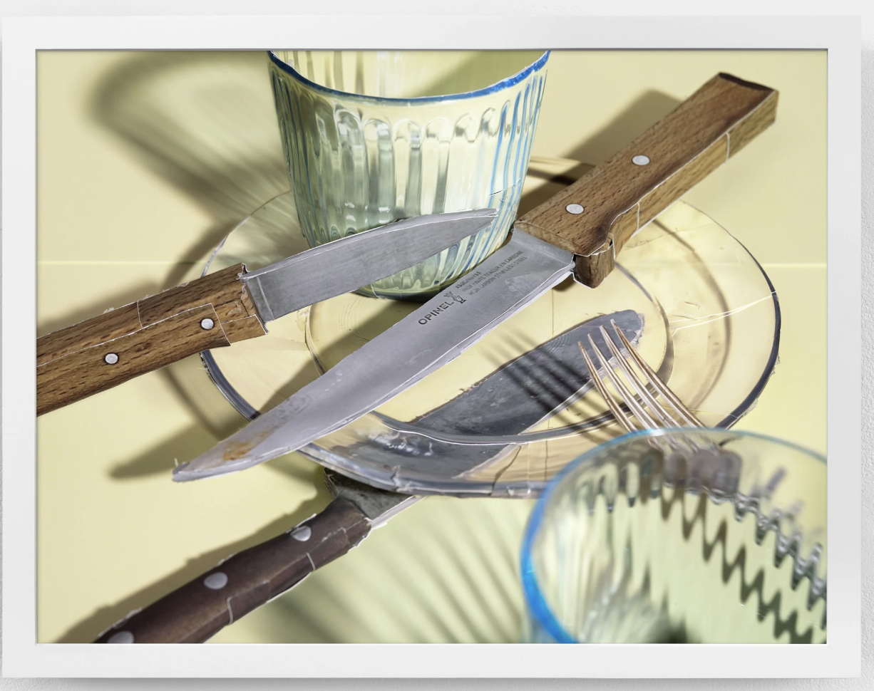
Daniel Gordon, Color Light Study (Knives and Glass Plate), pigment print with UV lamination, 18 x 24 in
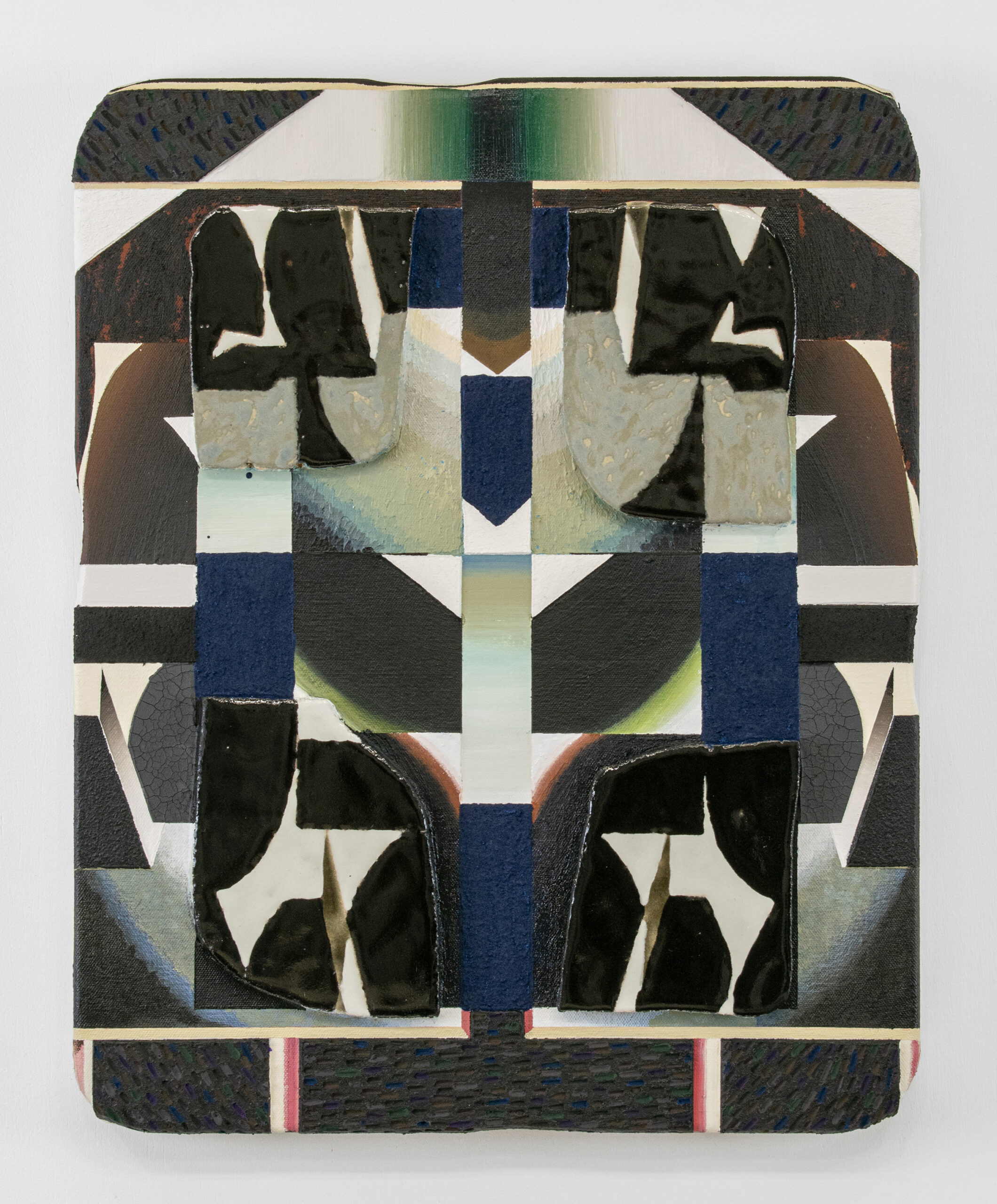
Kevin Umaña, Digging Deep Into Meditation, acrylic, oil, vinyl paint, flock, sand, oil pastel, ink, gouache and ceramics on linen, 16 x 14 x 2 in
Until Next Week–
Casey Monda | CEO & Art Advisor
Ahem, Is This Thing On? Mic Check, 1-2.
All Access
Art Drop #01
Welcome to the new Art I Saw and Liked, the only subscription-based art advisory service that meets novice collectors where they are–at the starting line. I developed Art I Saw and Liked to make art collecting easy, approachable, accessible and inspiring. There are a lot of art platforms out there that enable folks to see a lot of art online. In my experience, scrolling those can be like drinking out of a fire hose and you can never really trust that what you are seeing is actually good and worth your money. Art I Saw and Liked is different. Every single piece of art or artist featured on this site has been vetted by me and is something I would buy for myself or recommend to a client. And just like my policy with my private art advisory service, no artist or gallery will ever pay me to be on this site. Just like my clients pay me for the value I add to every acquisition, subscribers to Art I Saw and Liked pay for my eye, judgement, and opinions.
Moreover, Art I Saw and Liked is about empowerment. It empowers the new generation of collectors to hone their taste, develop their own eye, and be confident in what they like. While the art industry is built on relationships and often rewards those who have been around the longest, everyone has to start somewhere. My hope is that AISAL becomes that place to start. After all, that’s the whole premise. Start with what you like.
Here’s what you can expect from AISAL:
–The Collection – The Collection is the heart and soul of AISAL. It is a sortable, filterable, and likeable database of the art I have seen and loved. We are launching with several dozen selections from my extensive private database that I have built over the past few years. Each week, I will add to The Collection, so what you see now is just a sniff of what you will get.
–Seen & Liked Lately – Seen & Liked Lately is the blog that I’ll publish weekly and send out as a newsletter email. I’ll discuss topics related to the art industry and release the newest additions to The Collection.
-Galleries & Museums Map – Not a lot of explanation is required here. The map is actually a map of galleries and museums around the world that I know and love. I am always adding to it and it updates in real time. This is the tool I wish I had when I started my collecting journey. It is a great place to start if you are travelling and want to see some art.
-Likes/Dislikes – As you are scrolling the database, you will be able to like or dislike any art work. You will be able to see how many others have done the same (but not who has done so!). Then you can go to your Likes list to see everything you have selected. This is a great place to start to see your taste and style in an organic way.
For me, the most rewarding part of this work is helping clients find pieces that spark joy, tell their story, and create lasting connections with the art they love. I wanted to extend my passion, my knowledge, and my services to a broader audience than I could reach as a one-woman show offering one-to-one art advisory services. AISAL is the result of that desire. Thank you for being here— I hope this platform inspires you to explore, connect, and learn more about yourself as you begin your journey into art collecting.
Exceptional Art. Expert Advice. Easy Access. Step into my personally curated world of contemporary art.
Featured Art
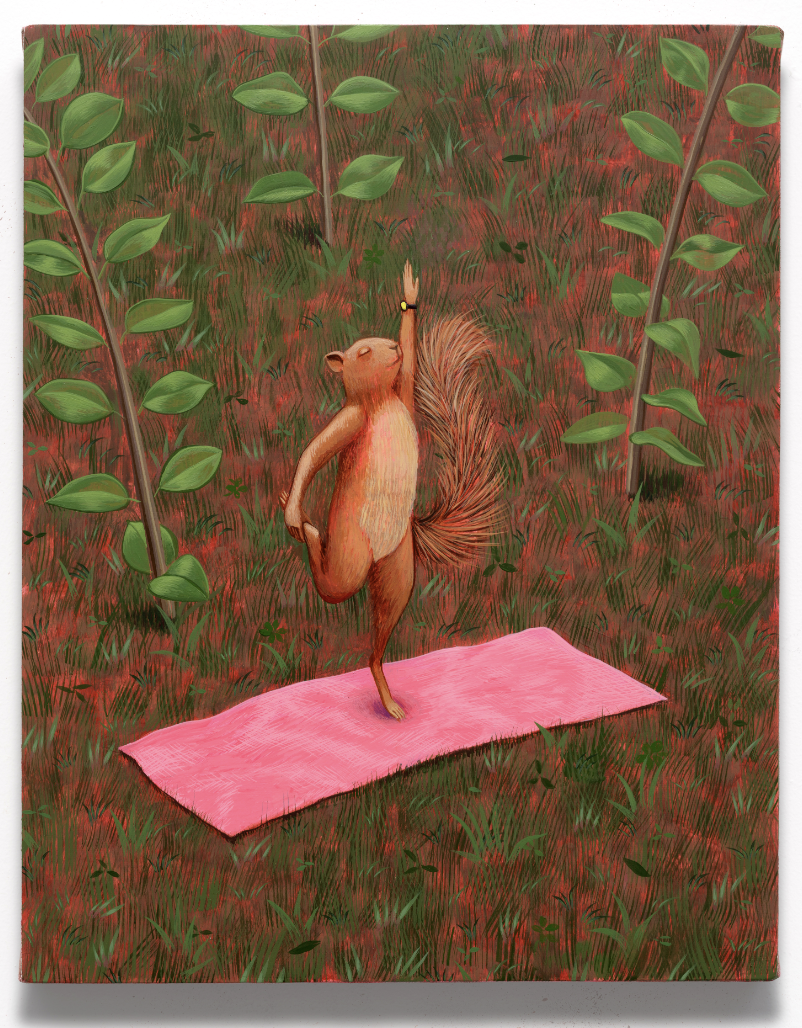
Francisco Moreno, Yoga Squirrel, 2025, Acrylic on canvas stretched on panel, 14 x 11 in, $6,000

Vanessa Wallace-Gonzales, Chrysalis Vessel 3, ceramic, epoxy putty, resin, foraged material, and acrylic paint, 15 1/2 x 14 x 13 in, $5,000
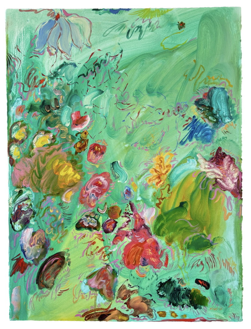
Isabella Innis, A Stream for Fish to Swim, 2025, Oil stick and oil on paper, 30 x 22 in, $3.600
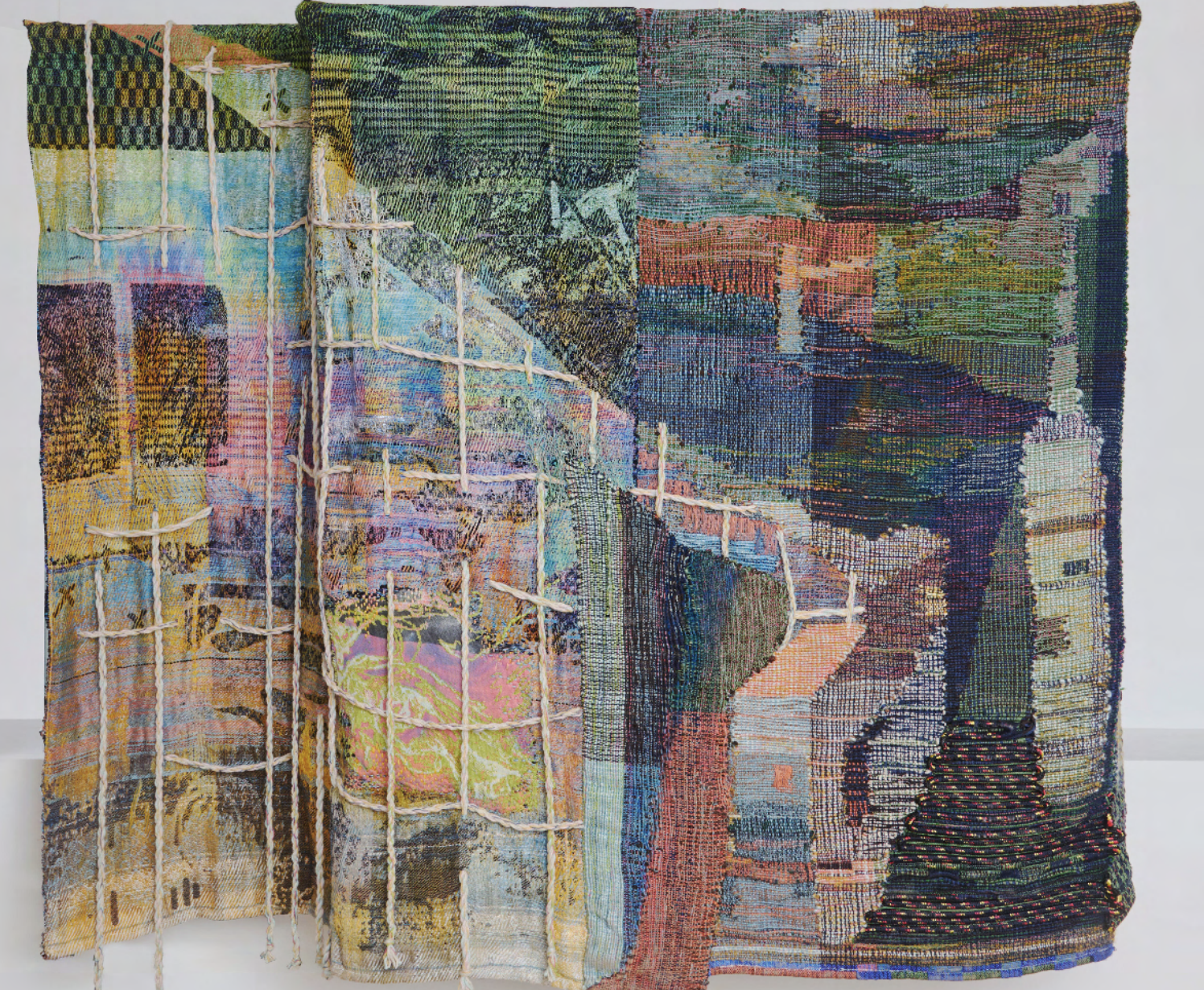
Maris Van Vlack, Storm Descending, 2024, Hand-dyed and wove mixed fibers and rope, jacquard weaving, industrial knitting, paint, 81 x 69 x 20 in, $15,000
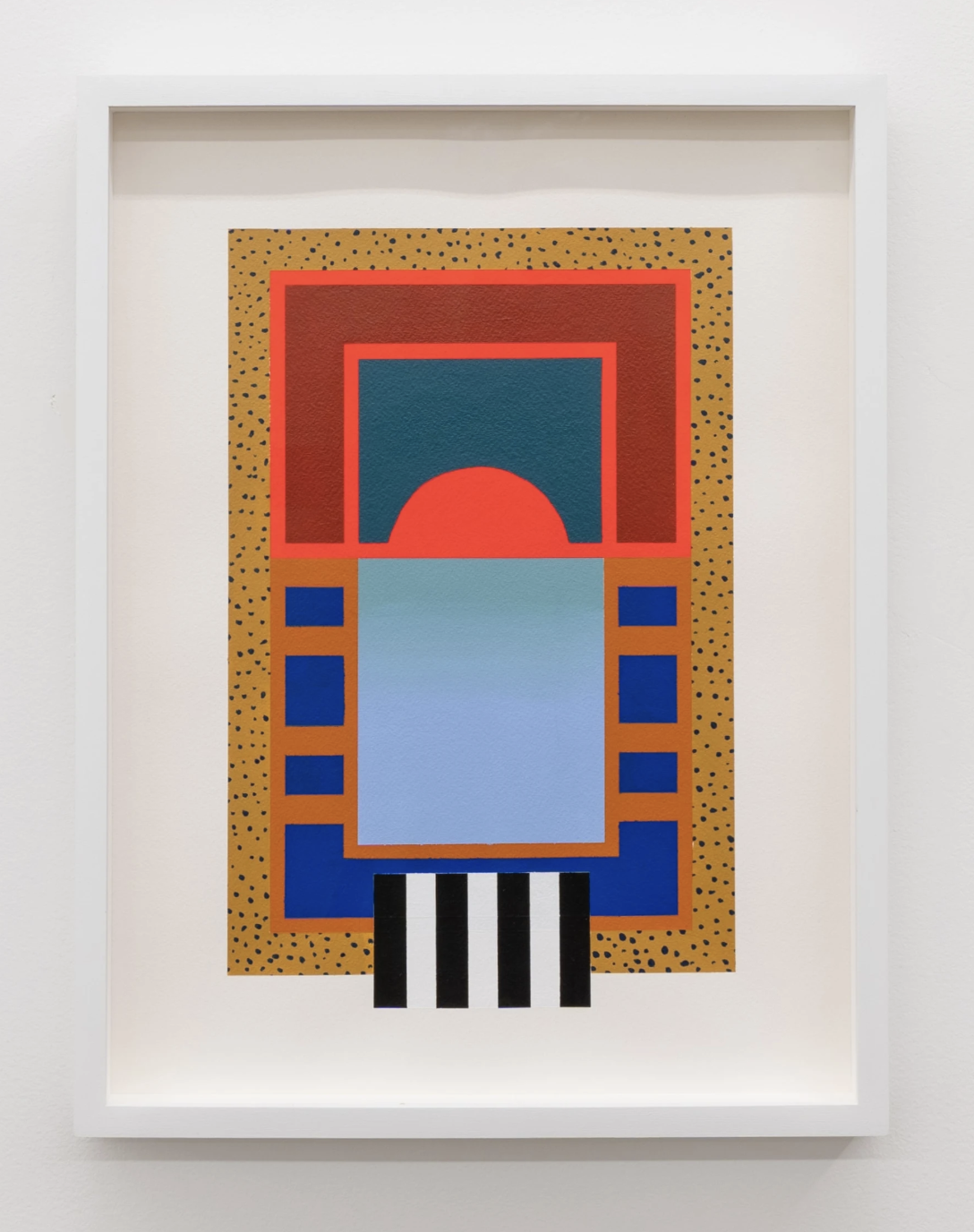
Dahlia Elsayed, Day 22, 2025, Acrylic on paper, 16 x 12 in, $2,200
Until Next Week–
Casey Monda | CEO & Art Advisor
Elitism, BOGO, and Other Problems That Ail The Art World + 3 Works from Untitled Houston That Stuck With Me
All Access
On Tuesday evening, I unwrapped a new painting that we recently purchased from Shaheen Gallery’s exhibition of new work by Antwoine Washington. Maybe they have been groomed or maybe their excitement is genuine, but my sons love it when new art arrives. They have opinions on where it should go and why; and, it is the most fun to hear all about what they are thinking. After we settled on the fact that the painting really aligns most closely with my younger son and that it should hang in his room, we took it in there to figure out which wall. There is a lot of bright art in his room and this particular painting is also bright. I held it up and my older son declared, “That does not excite my eyes.” He is 7 and he was exactly right. When I asked him why it does not excite his eyes, giddy with glee that he had articulated his opinion so clearly and concisely. He observed that the colors in the new painting are too similar to the other work on the wall and so it all just gets lost.
Let me tell you a little story. A month or so ago, I attended a brunch where I met a local quasi-celebrity. Inevitably, our conversation turned to art. He shared with me that he had his eye on a particular painter but had been unable to purchase one of his pieces. This particular artist works in a slow, deliberate manner and does not produce many works. My new friend had been on a waitlist with the artist but then that waitlist got abolished when the artist had a show at a big gallery in NYC. When my friend approached that gallery about acquiring a work, he was told that they are only selling to real collectors.
Yeah…
So I told him, well let me see what I can do. Knowing I could not cold call this gallery, I reached out to a few friends who might have a connection so I could name drop when I sent my email. I was told they had absolutely no inventory but to reach out to another gallery who would be having an exhibition with the artist soon. When I reached out to that gallery, they wanted to schedule a call to discuss the collector and his collection.
I mean, c’mon…
So we had the call. I positioned my client in the best light that I could knowing this gallery wanted a pedigree, but what he had going for him is that he is a brand new collector with connections to high profile arts institutions and is close family friends with the artist. The gallery was not sold. I was told that we probably would not be able to acquire a painting from this show because collectors would be buying a work for themselves and then gifting a second one to an institution. My client was offered a work in an alternative media.
Again, c’mon…
This brings up so many problems, not least of which is the whole concept of the BOGO (Buy one, gift one), which completely dilutes the quality of institutional collections and diminishes the trust we place in them.
But the problem I want to tackle today is that my client–a novice collector–is being turned away because his collection is not prestigious enough and the gallery does not know him. Nevermind that he has been after a painting by this artist for several years, wants to START collecting, and has the means to pay for it! Even when I–an art advisor and vice president of a respected museum board–vouch for him. Plus, he is being edged out by a practice that is suspect at best and deeply problematic at worst.
Can we all agree that this is silly? When a new collector is so passionate about a work that he reaches out to a gallery MONTHS in advance of an exhibition to secure an opportunity to acquire a work and is turned away, it leaves everyone feeling icky. The art world is not the luxury retail market. You can’t force people to buy lesser stuff to make them earn the right to the stuff they really want. We’re not selling Birkins here, folks. Art collecting is about passion, connection, resonance, and storytelling. It’s not a status symbol.
I think Jeff Magid recently summed up this issue really well in his ArtNews article, “If The Art Market Doesn’t Welcome More Participants, It Will Severely Contract.” He wrote:
After decades of exclusion, opacity, and elitism, the art world urgently needs a stream of new buyers, and the luxury retail model isn’t bringing in enough people who want to be part of the elite club to keep them open. I’ve long wished that living with art were possible for more people. Now I know the future of the art world depends on it.
But to be honest, I’m not that concerned with a contracting art market. I had cocktails with a gallerist, an artist, and fellow moCa board member earlier this week. We discussed this topic extensively and all agree that the slumping market narrative is irrelevant. Whether Sotheby’s and Christie’s hit their low estimate totals really bears no import on sales of emerging artists’ works. What is REALLY important is the way galleries do business. If the art world is supposedly the warm, welcoming world of newcomers, outsiders, diversity, and difference, then let’s be that. And if we want to continue in the outdated modes of elitism and exclusion, then let’s be honest about what we are doing.
But an access point, an entryway, an open door, a knowing hand to guide new collectors—this is THE REASON I’ve created ArtISawAndLiked.com. It is the first of it’s kind subscription-based art advisory service, specifically targeted at new collectors who want to start but don’t know how. MOST art newbies can’t hire an art advisor to hold their hand and facilitate their journey like a sherpa or don’t even know art advisors are a thing. I want to change that so that anyone who wants some help collecting art has access to it!
My hope is that subscribers will utilize the platform in a variety if ways. Maybe subscribers will shop, maybe they’ll just find inspiration and hone their taste and eye. Maybe interior designers will use it as a jumping off point to create gorgeous, unique spaces for their clients! No matter how you approach it, it will be a confidence builder, a space where you too can discover what you like, learn about the art world, and become empowered to start your collecting journey. It will be a constantly evolving showcase of art I have seen and liked. Some of it is available for sale through the gallery (I hold no inventory but can certainly help facilitate acquisitions) and some of it is not, but that’s not the point.
Target Launch Date for ArtISawandLiked.com is October 18 so watch your inboxes for an invitation to be founding members plus a coupon code for a free first year. I am so appreciative of each one of you. thank you for supporting me, listening to what I have to say, and spending time in my little corner of the internet.
And now, some art…
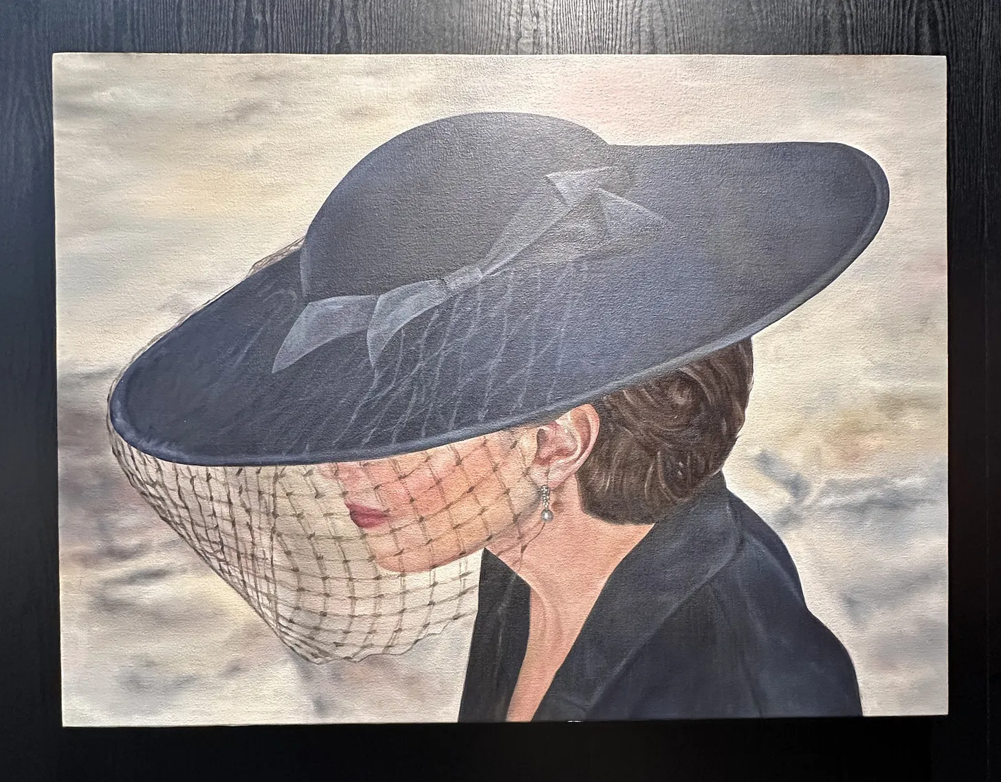
Noelia Towers at de boer

The work is dark, mysterious, cinematic, and downright beautiful. I am not typically drawn to figurative work for my own collection but I’d live with this pretty lady. Why is she wearing all black? Why is her face covered? Is she sad? Is she hiding? Plus the quality of the painting was delicious. Saw this one at Untitled Houston last week and it has stayed with me.
Randy Twaddle at Moody Gallery

This one had a sort of Charlie Brown’s Christmas Tree elegance to it. I’m not sure that’s a thing but there is a poignance to the barrenness and brokenness to which someone paid attention. If you zoom in, you can see little strings tied to the branches. Someone cares about this tree (I realize it is a fantastical tree) and I find that beautiful.
Sarah Williams at Moody Gallery

These little jewels were like siren songs of home. They eminated warmth and nostalgia and presented a stark contrast to the idea of home we see on Pinterest and social media. Nothing fancy, nothing particularly beautiful, and certainly not grand, these homes represent the feeling of being home.
Cheers to the weekend, mes amis!

Setting Intentions For A Paradigm Shift
All Access
And three artists that are still with me two weeks later
As we are all well-aware, I went to NYC a couple of weeks ago for Armory week. It would have been easy to get wrapped up in the cycle of VIP previews, being the first to post favorites, and hoping to place a few works. That’s usually how these things go. But I was anticipating the fairs and shows and exhibitions to be lackluster and so I shifted my intentions. Instead of walking the fairs looking for works that might be well-placed in this or that collection, I simply sought inspiration. I just wanted to see something I hadn’t seen before and engage with art and artists that were new to me. When I was speaking with someone about this change, it occurred to me that the new mindset allowed me to see the art through my own eyes rather than filtering them through the lens of this or that client. That realization really punched me in the gut. Honestly, it made me feel guilty that I had not been allowing myself to fully engage with the art I was seeing with my own trained eye and brain. What have I been doing to myself?!!
Despite the aggressive talking-to I gave myself, the mindset shift really yielded miraculous results, not least of which is that I felt so much calmer and less stressed the whole time, which allowed me to connect more deeply with the art I was seeing and artists I was meeting. But this slowdown also translated into not feeling like I had to get my recap out immediately last week. Instead I decided to sit with it for a bit to see what bubbled to the surface and stuck around in the ol’ brain trap.
And on that note, much to my delight, galleries came to play this fall, y’all. My love for Armory was reified by the stellar presentations the participants put forth. Some of the usual suspects played it safe but I did not bother to engage with them. The ones that stopped me in my tracks were…
Bongsu Park at Gallery Rosenfeld

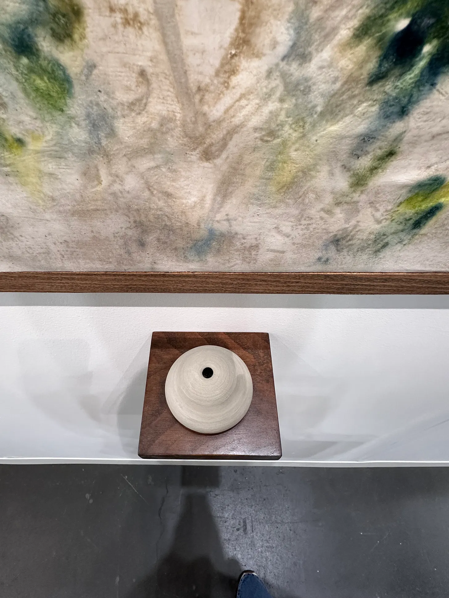
Gallery Rosenfeld out of London is quickly becoming a fair favorite for me. Their presentations have taken the top spot for me, now twice in the last year. In this latest edition at Armory, I discovered Bongsu Park, a thoughtful artist and lovely human. Bongsu’s work engages with nature and memory in a multisensorial, experiential, temporal way. Yeah, she takes flower art to a whooollle new level. She has an incredible garden in London, where she tends and grows flowers and plants year round. These are the specimens she then uses to create her work. But in addition to creating the paintings, she is also interested in the way scent conjures and affects memory. So, after the flowers have yielded their color to the painting, she removes the dried petals and places them in a small ceramic pot (which she made) and then adds a cocktail of essential oils to each pot. With only very small apertures in the pots, one has to get very close to enjoy the smell. With the purchase of the painting comes a vial of the essential oil concoction so the owner can continually add to their pot. And to take it one more step, the artist then provides the owner with the recipe so that they can then recreate the essential oil cocktail on their own, should they so choose.
So many layers here. The aesthetically pleasing visual aspect of the work is really the least of my concerns here. What I really love is how she has found a sensorial way to explore how smell creates and affects our memories. Much like a memory may shift and morph over time, so too does the scent she has created, as she accepts and welcomes the idea that the second and third and fourth versions of the essential oil cocktail may or may not smell exactly like her original.

Mehrali Razaghmanesh at O Gallery

I love the way the gallery describes his practice so I’m not going to try to improve upon it.
Mehrali Razaghmanesh (b. 1983 Tehran, Iran) is a photo-based visual artist based in Paris, France.
Positioned at the threshold between photography and painting, Razaghmanesh challenges the boundaries of these two mediums with a thought-provoking focus on nature. Through a painterly reimagining of landscapes in photography, he seeks to revive a world of imagination. Rather than merely capturing nature, he searches for a visual interpretation—one that moves the image toward imagination itself. In pursuit of realizing the precise vision he holds for each piece, Razaghmanesh employs a variety of printmaking and photographic techniques. This experimental approach to materials and processes enables him to achieve nuanced textures and effects that deepen the conceptual impact of his work.
Razaghmanesh’s practice reflects a sustained inquiry into duality, displacement and the fragile relationship between human presence and the natural world… In his most recent series, created during a residency in Paris, Sept Pleurers, Razaghmanesh turns to the solitary weeping willows along the Seine, drawing connections between botanical migration, poetic melancholy and the inner states of exile and reflection. Across these works, the artist’s aim is not to resolve contradictions but to inhabit them—to find form in fragmentation and presence in what is fading.
Razaghmanesh’s work has been exhibited internationally at Palais des Beaux-Arts de Bruxelles; Rencontres d’Arles (2019), Foam Photography Museum, Netherlands; On Earth: Imaging, Technology and the Natural World at Lieu Unique, Nantes; Photolux Festival, Italy and CLB Berlin. Among his accolades, he was recognized with an award at the 14th edition of the prestigious Talents Contemporains competition (2025), affirming his position as an influential voice in contemporary visual arts.

Sarah Walker at Pierogi

Sarah Walker comes from a background of abstract paintings. These color pencil drawings mark a shift in her practice in which she applies her signature layered geometric abstraction to these natural forms that we at once read as a leaf, but are in fact rather organic abstract shapes themselves. The drawings remind me of a line from a book I recently read in which the narrator observes that under a microscope, a green leaf ceases to be green. There is so much more to the world around us than meets the eye, whether we are talking about the microscopic infinities of nature or the silent suffering of a friend or neighbor.

Well, that’s all I got yall! Thanks for reading all the way to the end. I’m headed to Houston for the inaugural Untitled Houston fair. It will be fun to be in my hometown and show my sister and her pals around the fair. Plus I’ll be doing a fun install. More details on that in the coming weeks!
If I read one more post about the imploding art market...
All Access
I'll do absolutely nothing other than scream loudly in my head, but,
Honestly, it’s exhausting. We get it. Big important galleries are shuttering right and left. Sales are down (which is actually not true). Fairs are cancelling. People are running scared. Enough already! Yes, it’s all, mostly, er, somewhat true. Yes, change is hard. Yes, times is tough. But also, the story is much more nuanced than that and a lot of ink has been spilled trying to unpack it. In a nutshell, the system is broken and collector behavior is changing in ways that are forcing the traditionally slow-moving art world to change along with them. Art folks aren’t used to seismic shifts happening quickly. We get our panties in a wad very easily.
To this end, if I’m being fully transparent (which I am), I almost didn’t book my annual fall NYC pilgrimage. It felt pointless. With everyone in a tizzy, I wondered if I could expect to see anything new or if it would just be the same ol’ tried and true bestsellers. I don’t need to spend thousands to see all the SOS all over again. But then I decided I need to see for myself. I wanted to gauge the atmosphere with my own eyes and ears.
I’m off to Armory and Independent next week and will be doing the usual gallery opening gauntlet as well. But I’m also working in a bucket-list studio visit (cue tweenie-meeting-Taylor level excitement) and connecting with gallerists I love on a more personal level. After I recalibrated my expectations and changed my goals for the trip, I became actually really excited to go!
And if you’re wondering where I’ve been the last 3 months, I’ve been quietly toiling away on a brand new way to offer my art advisory services at scale. While I’ve been trying to solve this equation for the last four years, I actually started doing something about it in January. In a few short weeks, ArtISawAndLiked.com will go live and (hopefully!) revolutionize art advisory for the casual collector. Think if Artsy and my personalized recommendations to clients had a baby. So stay tuned for more exciting announcements around that coming soon!
That’s enough rambling, you’re here for the art. And art you shall have. Check out the featured art panel to see five artists I’m looking forward to discovering IRL next week.
And in other news, CMAA’s refreshed website went live Thursday afternoon and I couldn’t be more proud of it and the team at Shark and Minnow for producing such great work. Lauren, Eric, Hallie, and the gang are true pros! So much happening over here. Happy (almost) fall yall!
Featured Art
Yevgeniya Baras, Untitled, 2025, Oil and Mixed Media on Linen, 30 x 36 in. $15,000
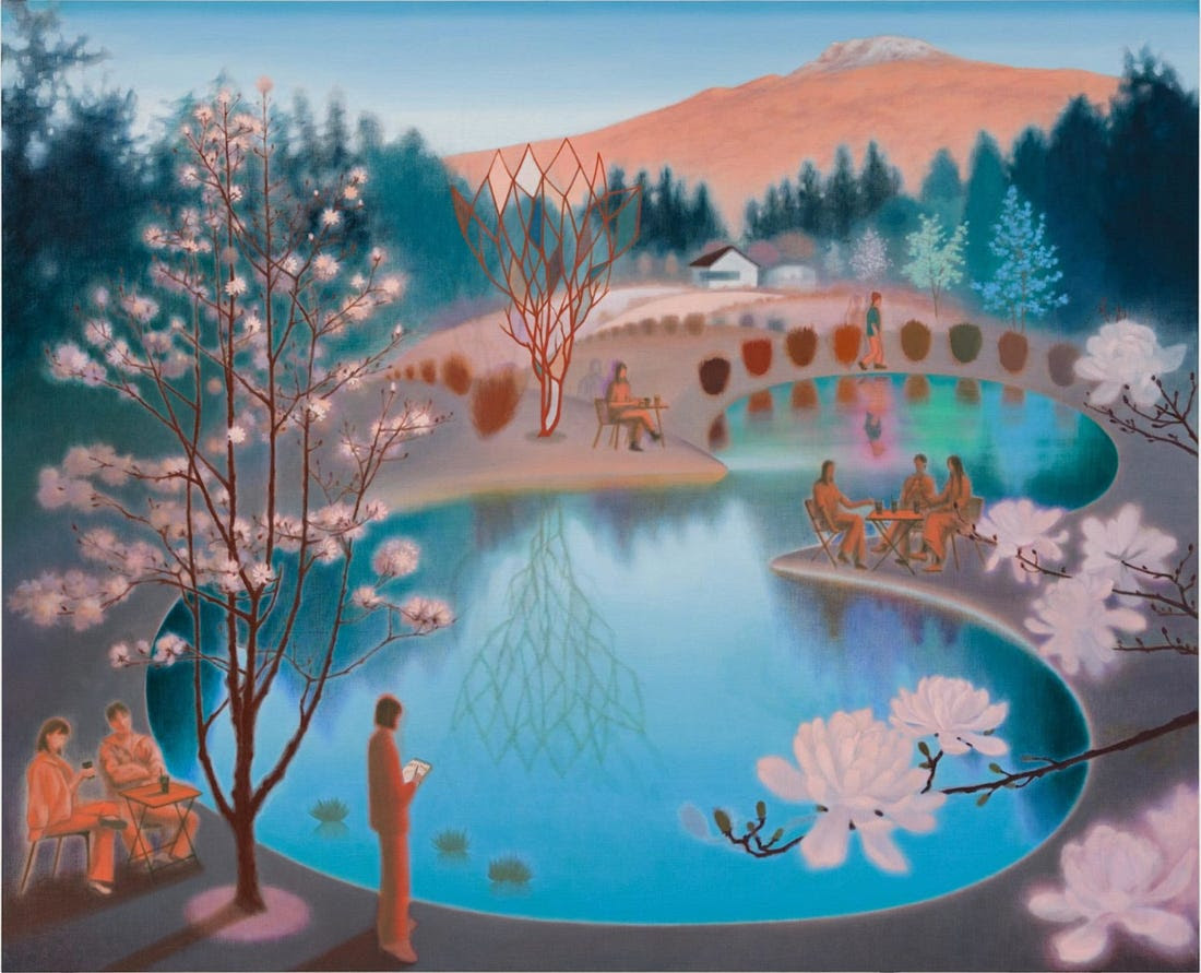
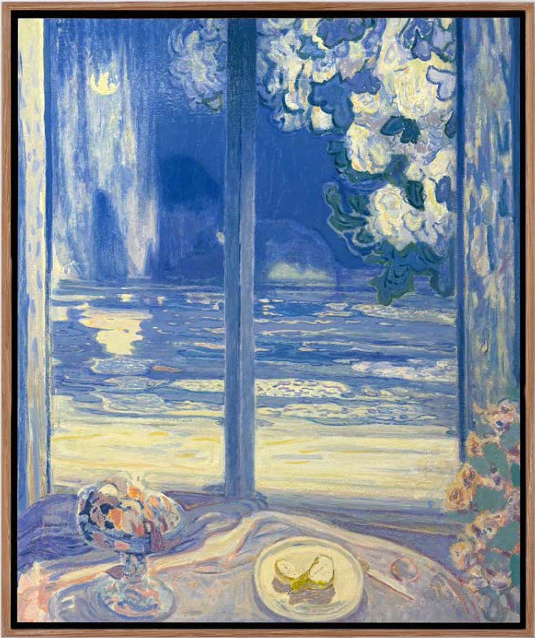
Barry McGlashan, Moonlight, 2025, oil on panel, 23 5/8 x 19 3/4 in, $8,500
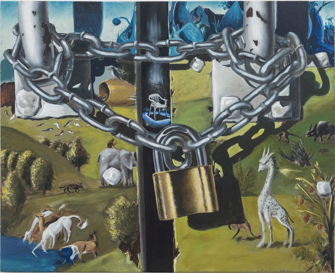
Elbert Joseph Perez, Mail Just Piles Up, 2025, oil on canvas, 26 x 32 in, $10,000
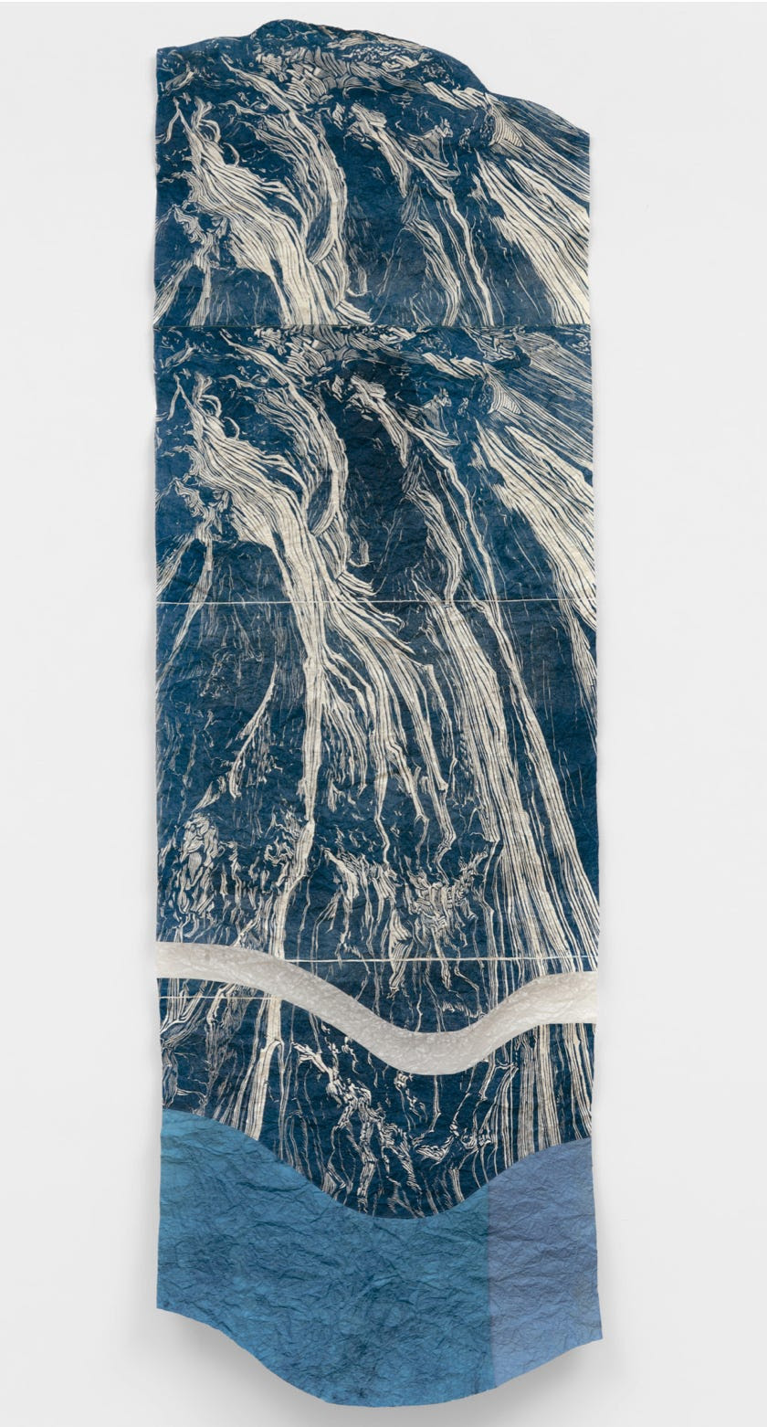
Alexa Kumiko Hatanaka, reflection, 2025, linocut print, indigo ink, vintage washi from Kashiki Seishi, Konnyaku, 70 × 22 in, $8,000
EXPO Recap: Trojan Horses
All Access
It's pretty, it's interesting, and it has something to say...
Another day trip to Chicago for EXPO has come and gone. I, unlike many of my colleagues, am a fan of ye old EXPO. Despite the fact that this fair was purchased by the Frieze folks last year and they did some re-org’ing that had many a panty in a wad, I quite like it. It has a bit of a midwestern feel to it—not too hoity toity, not overdressed, a bit more practical…Geez, I am not a midwesterner but I guess I’ve lived in Cleveland long enough to appreciate the region’s quirky traits. Aaaanywho…
I’ll be honest with yall, the market ain’t great right now. Shocker, I know. Everyone is just tired and no one wants to think about their next 5-figure expense. Add the shipping delays caused by the confusion-inducing tariffs to the mix and you’ve got a recipe for a lackluster market. But, I’ll lean on some good business sense here—the time to grow is in the down times. Moreover, its when times is tough that the best art gets made. Let’s take a jaunt down memory lane.
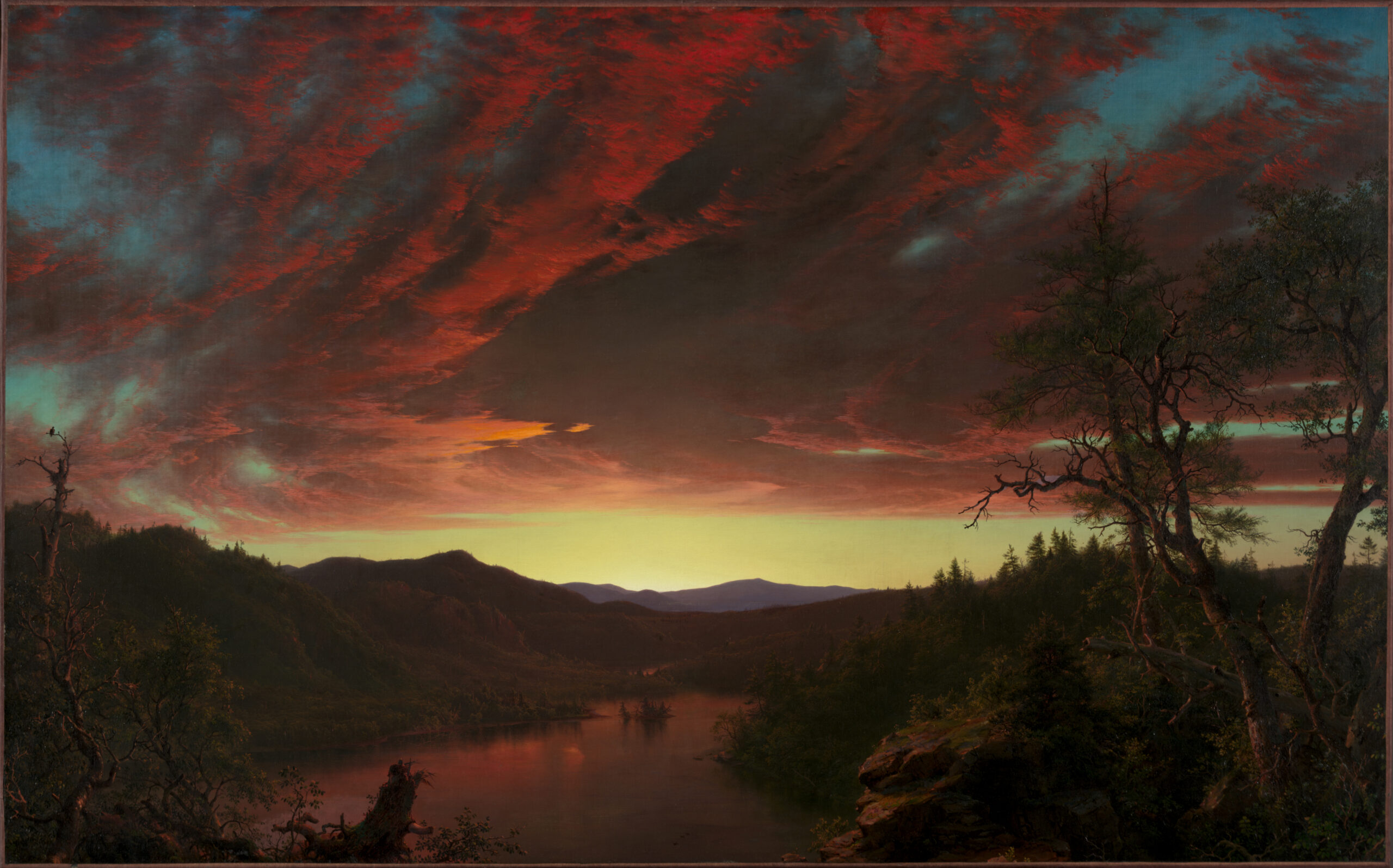
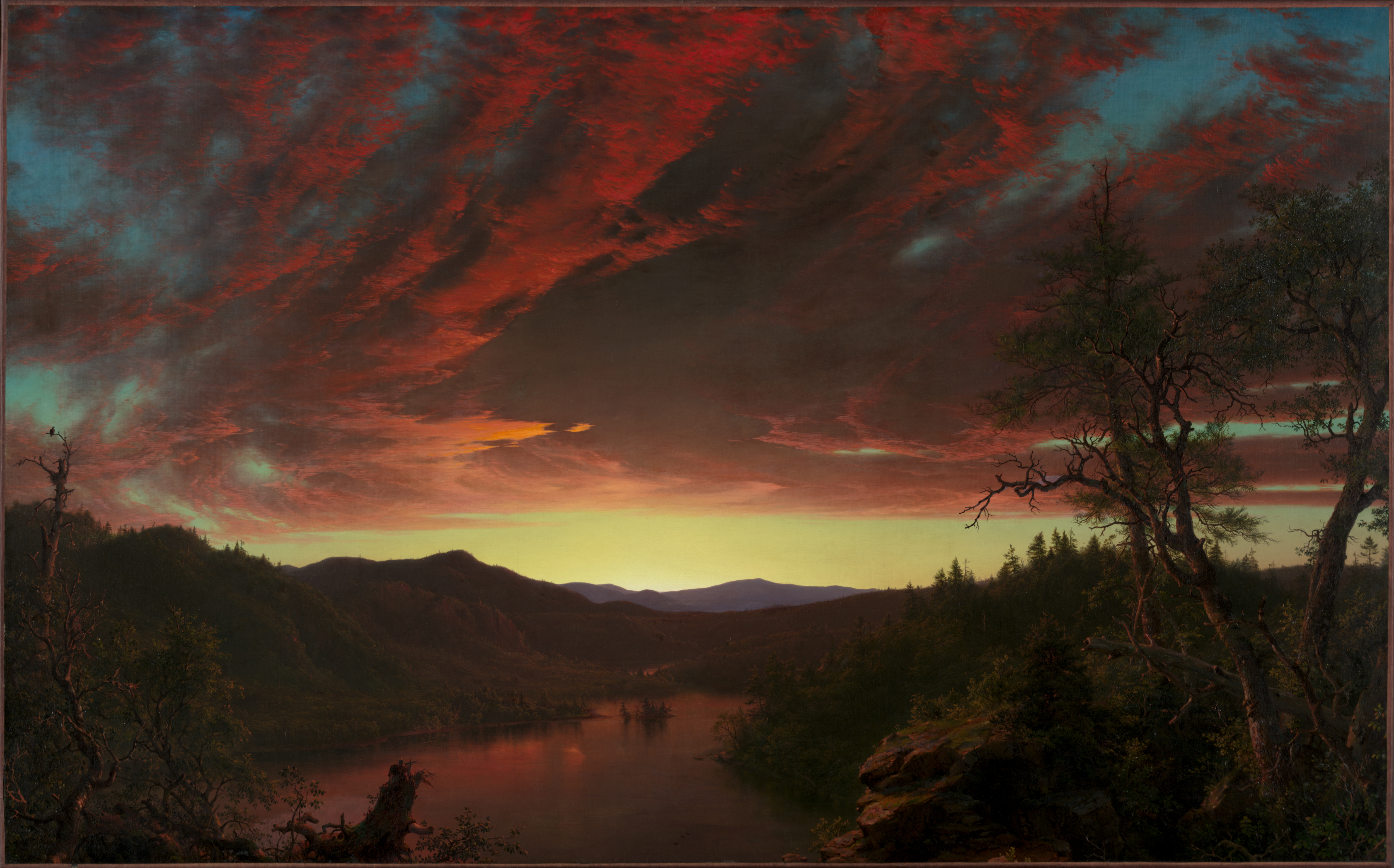
This painting by Frederic Edwin Church is an example. One of the most iconic American landscape paintings was made on the eve of the Civil War. Times were tough.
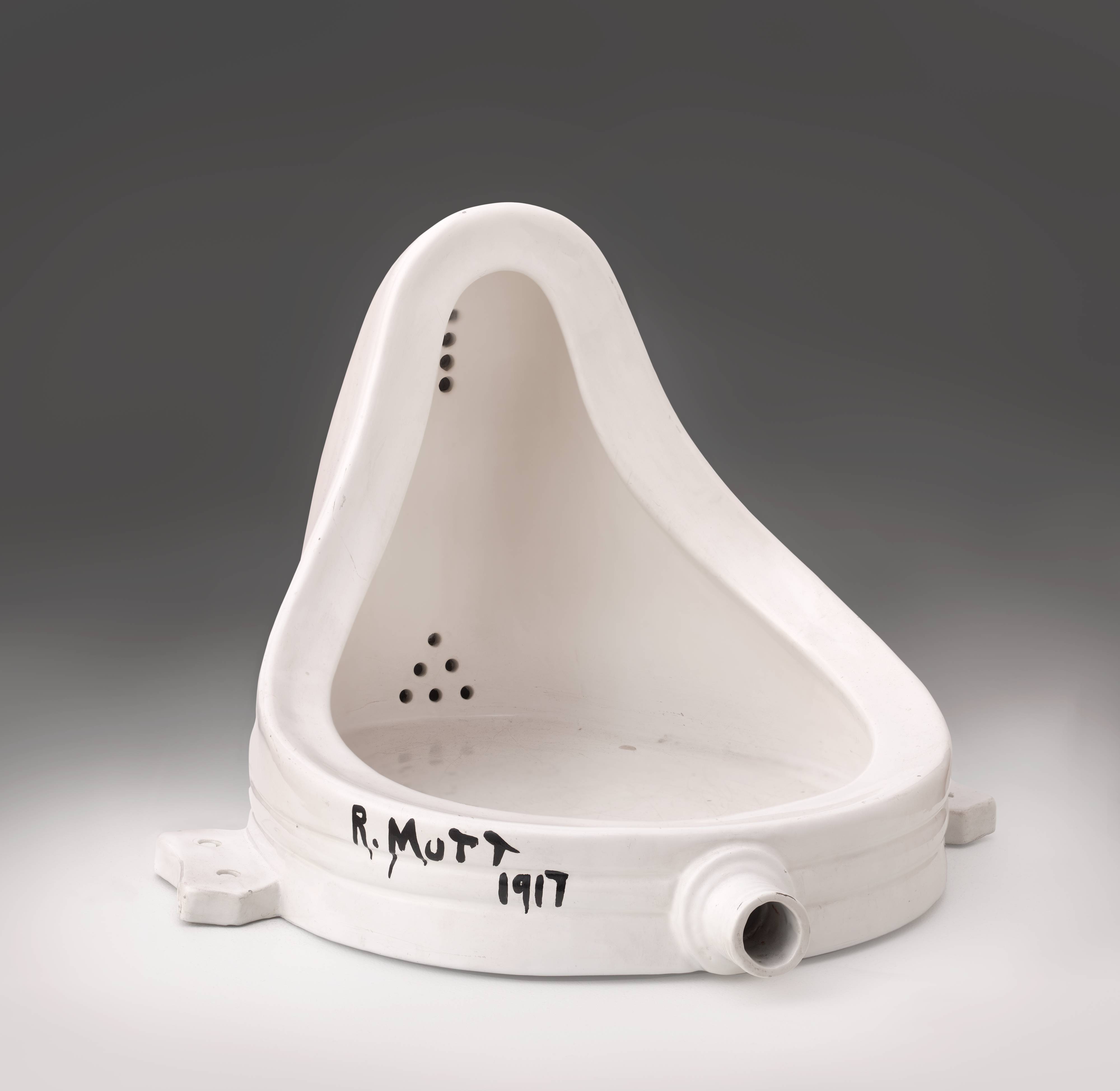
Marcel Duchamp’s Fountain was an artist’s attempt to understand the global chaos around World War 1. Times were tough.
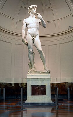
Michelangelo’s David was a show of Florentine strength when the surrounding city-states wanted to conquer it. Times were tough.
In 2025, no matter on what side of the aisle your comfort zone lies, there is so much in this world that needs responding to and the artists shoulder the burden of helping us understand it. So artists are making really meaningful stuff right now and galleries are looking for their next meal, so….I say BUY BUY BUY!
But back to the point of the burden that artists bear in our society. I recently ‘grammed a query to this effect and received some really great responses. The unifying theme was that artists look at the world and provide a perspective usually with a bias. Maybe you share their perspective and it hones your point of view. Maybe you disagree with them but it helps you understand and appreciate an alternative belief. Either way, artists are critical to our society’s survival and future because they help us communicate our differences and, ideally (pie in the sky), work toward a solution that fits everyone.
I understand not everyone wants to live with art that makes them think about current events. Even the fieriest among us don’t want Elon Musk burning in effigy or an homage to Marjorie Taylor Green over their mantle, but we might want work that marks a moment in time and offers perspective on that moment in a subtle way, like all 3 of the aforementioned examples. Here is some work from EXPO that I found particularly relevant to this goal. (Note: None of the work featured today is actually political. Fret not, my friends!)
Here is my list of Trojan Horses, if you will. These are all artworks that are beautiful to look at, interesting to ponder, and make a statement relevant to current events. (Disclaimer: Not all works featured today fall in the sub-$10,000 category.)
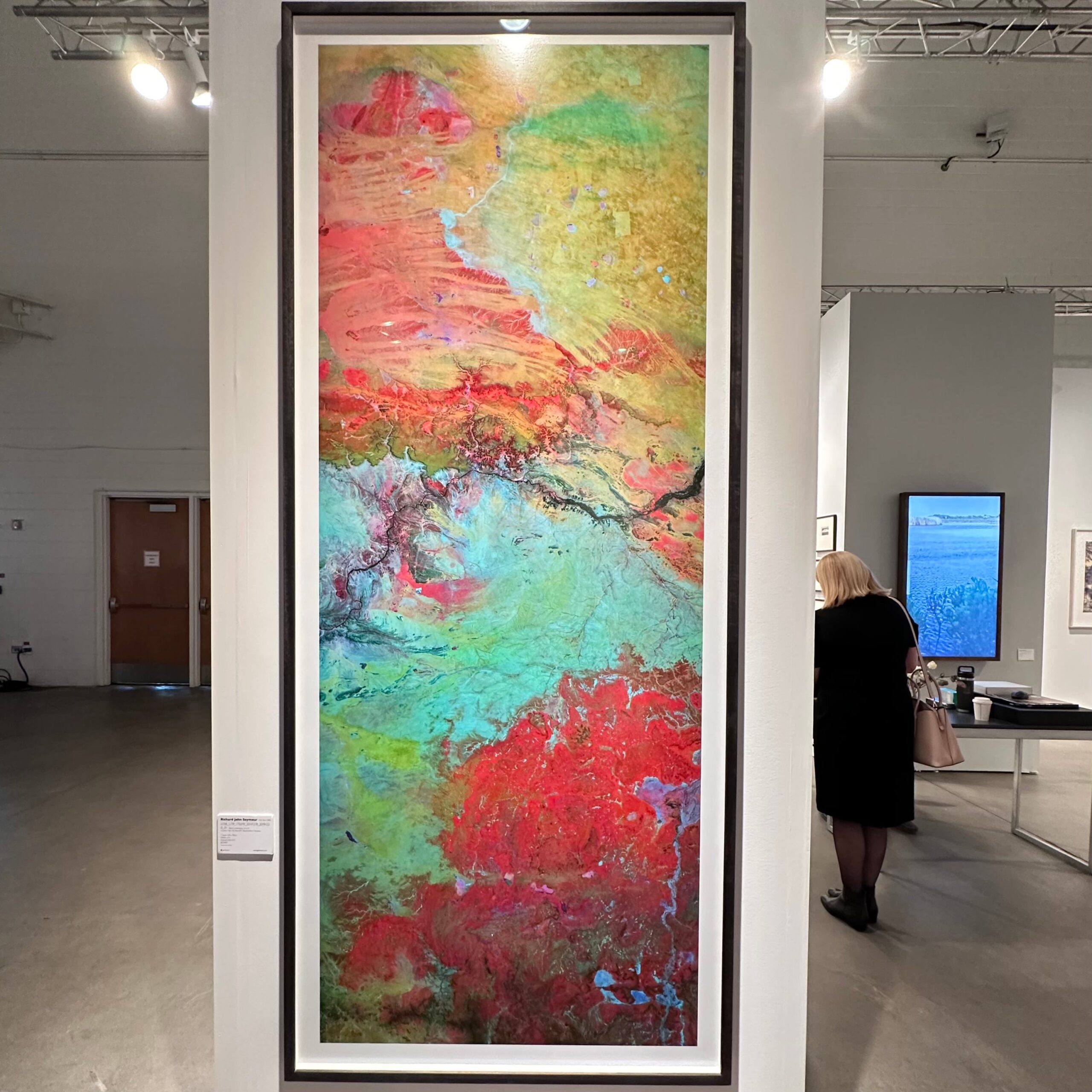
Richard John Seymour (UK, b. 1989)
This was literally the first thing I saw upon entering the fair. There were several works by him and I loved them all. He calls these works his Landsat series, which Seymour describes in the following way:
[this is] a series of large format artworks using the public domain data captured by Landsat 8, borrowing from industrial false-colour imaging techniques that can be used to reveal geological properties of our planet’s surface otherwise invisible to the human eye.
The resulting large format images are at once a statement regarding the role technology plays in the surveillance and subsequent manipulation of our environment, but also an attempt to reveal the sublime through the technological gaze.
If the climate crisis, environmental issues, or nature are important issues, then this work is for you!
Winnie Truong (Canada, b. 1988)
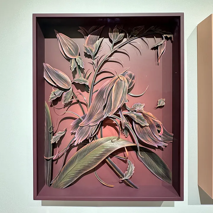
I have been watching Winnie’s work for several years; and, I’m pleased to see how they quality and craftsmanship have arrived at a new level. She seems to have reached a certain comfort level with her medium—colored pencil on paper—such that she can manipulate both the color and the substrate with masterful precision. In my view, the work addresses issues of feminism and the way in which toxic masculinity has had disastrous affect on both women and Mother Nature. But also, her surrealist, almost escapist, dioramas also address the digital age and how we enter and exit these digital alternate universes multiple times per day. How do we exist in two places simultaneously, being more connected and more lonely than ever before?
Rémy Hysbergue (France, b. 1967)
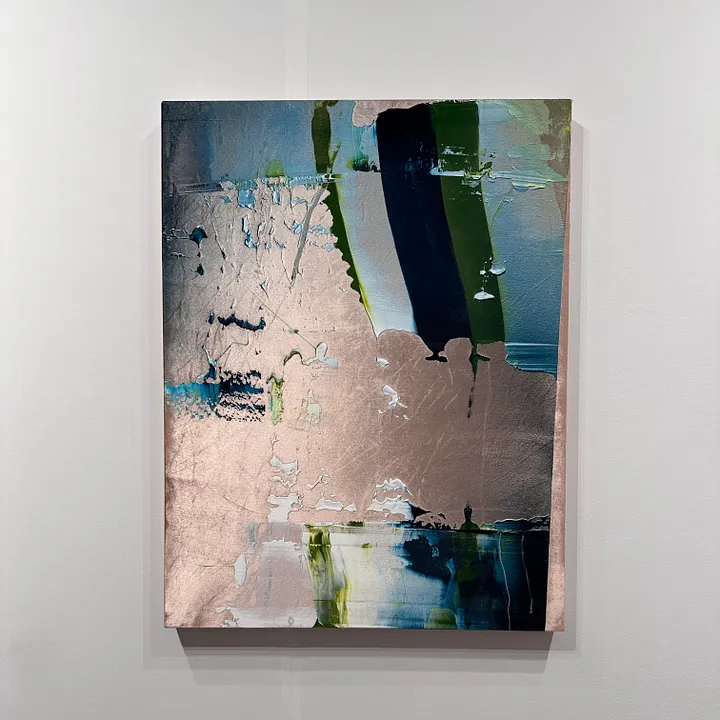
Rémy Hysbergue was among my top favorites of EXPO last year and he continues the streak this year. It is really hard to communicate the depth and luminosity of these works in photographs. They are paintings on silk velvet. Ostensibly, Hysbergue is working against and within the legacy of abstraction, but I find them to be subtly more nuanced. The way he lays down thick swaths of acrylic and adds gentle layers of spray paint on top really plays with the eye. Sometimes there appears to be texture and depth where there is none and sometimes the texture appears flattened when it is actually thickly applied paint. What you see is not always what you get. That mantra can be applied to so many aspects of our contemporary lives that I won’t even begin to count the ways.
Yoo Suntai (Korea, b. 1957)
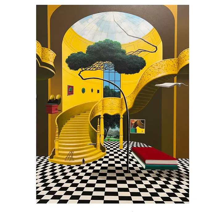
You Suntai is Korean but trained in Paris and these paintings definitely reflect the influence of both of these cultures, which is probably why I am so drawn to them. As an aside, the Koreans CAME TO PLAY at Expo. There were so many Korean galleries showing. Booth after booth I found myself really drawn to the precision and sophistication of these artists. This was not news to me though. I have known about my affinity for Korean contemporary artists for a while. I’m also on a major yellow kick right now and I love Magritte so these works just spoke to me. But the reason they made it on this list is because of the very faint overlay of Korean calligraphy that blankets the composition. You can’t really see it from far away but up close you can see all of those tiny lines. Those are Korean characters. There is not a message but it is just a jumble of words, or so I’m told. You could read the work as a comment on language barriers, or globalization, or mixed messaging, or the way words don’t always capture meaning, or a picture is worth a thousand words. Take your pick.
So, there you have it. Obviously this is not a complete recap of all the art I saw and liked at EXPO but I wanted to keep it tight and thematic. I discovered so many new artists and I will be sharing them with you over the coming weeks and months.
As always, thank you for reading and supporting my work. I’m glad you’re here.

The art is my wife's thing.
All Access
A common refrain we should dig into...err....into which we should dig...
TBH, I was not planning to send a newsletter today. I did not really have anything to write and thought I’d practice restraint rather than clog your inbox with uninspired noise. But, alas, I had the most amazing and satisfying installation this morning and found inspiration in the unlikeliest of sources.
Eric the art handler from Museum Services is an art handler extraordinaire by day and philosopher on the side. I knew my client had hit it off with him during delivery last week because he replied to the group text shortly afterwards letting Eric know he had just bought the book he recommended. But then this morning my client shared another story.
During delivery, Eric asked about the art that was being delivered. My client froze and panicked because he couldn’t remember the name of the artist. Grappling for a response, he said, “The art is more my wife’s thing.” And Eric dropped a truth bomb. Eric responded, “That’s great. Every time you look at it, you can get to know her a little bit better.”
Yeah, I’ll let that sink in for a sec…
In addition to being an art sherpa for my clients, I also serve as a pseudo marriage counselor. I frequently encounter couples whose respective tastes in art are not so simpatico, shall we say. Unfortunately, they do not screen for art taste compatibility in premarital counseling. But, in all seriousness, a big part of my job is bringing all the stakeholders to the table and finding a work or an artist that satisfies the goals and visions of everyone. Sometimes we even throw in an opinionated interior designer for extra fun! It is a wonderful thing when we find a resolution that suits everyone but that often means that everyone has to compromise on something. C’est la vie, n’est pas? Eric has shed some light on another avenue forward though.
For many, many couples, the non-negotiable criterion for any purchase is “we BOTH have to love it.” I generally see the wisdom behind that idea. If it is hanging in OUR house, then we should BOTH love it. And perhaps this is the guiding principle behind the major purchases for the important locations—your mantles, over-the-sofa walls, foyers, etc… But what if sometimes, maybe one party gets to pick something they really love, even if the other partner isn’t so excited about it? And then, and this is the kicker, we don’t view that as one party compromising but rather appreciating an alternative perspective and loving the way that reflects the person with whom they are ostensibly in love. What if we shifted the paradigm a bit so that an art collection that reflects a family means that it reflects who they are as a unit and who they are as individuals??
Instead of viewing these differences of opinion as an obstacle to overcome, what if we looked at them as opportunities for relationship growth. A running joke with so many couples is that “his art” or “her art” gets relegated to an out-of-the-way guest room or an office so that the offended partner does not have to rest their weary gaze upon so disgusting a picture. But what if these artistic divergences became loci of connection? Instead of conversation-starting cards, your art collection could become the topic of the dinner table.
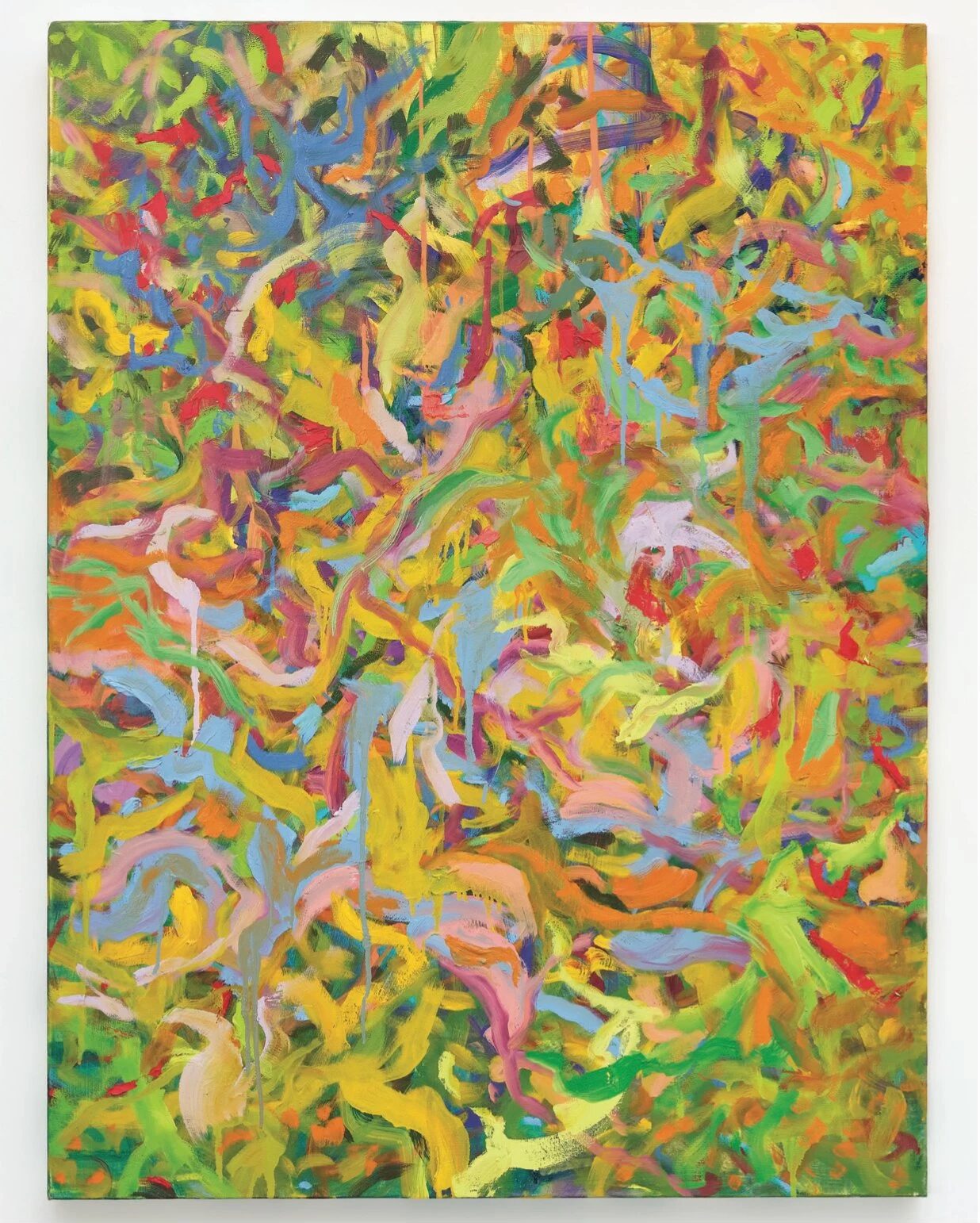
“Mom, tell us why you like that painting of candy-colored squiggles that looks like an overcrowded koi pond?”
“Dad, what is so appealing about that mug and vase that looks like it belongs in your grandmother’s blacklight rave party?”
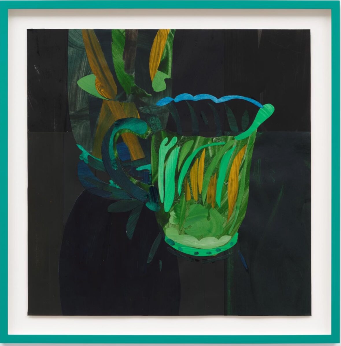
“My lovely daughter, please do enlighten us as to your whim for hard edge jungle scenes!”
I’m not saying that it should be a free-for-all and everyone just gets what they want all the time. Some of the best purchases come when the group members push one another to keep looking for the perfect thing. But I do think we should take a page from Eric’s playbook and rethink our approach to those works that maybe we don’t love but our partner can’t live without!
Thanks for wandering down the path of wisdom with me. Enjoy your weekend everyone!
Air kisses (cuz EXPO is next week and homegirl is outta practice),
Casey
Shara Mays, Plaifa, 2023, oil and acrylic on canvas, 48 x 36 in
Clare Woods, Collage for Small Wins, 2025, oil on paper, 22 1/2 x 22 1/4 in
Mairikke Dau, Water Harvest, oil on linen, 24 x 36 in

A Big Ol' Texas Art Fair
All Access
Ain't nuthin' wrong with pretty!
Howdy folks! It has been a few weeks since my last post. I was spring breaking with my family and then needed a hot second to get re-situated in my routine. And now I’m off again on a little adults-only vacay to celebrate my parents’ 50th wedding anniversary, which means I’m missing Dallas this week/weekend. I loved Dallas last year (both the main Dallas Art Fair as well as the Dallas Invitational happening concurrently) and would highly recommend the trip as good beginner fairs if you are wanting to get on that circuit. It is small enough to not feel overwhelming but expansive enough to get a good taste of a lot of different things that are happening in the art world. Additionally, I say it is a good beginner fair because I feel like it is curated to cater toward the collector who is not buying bananas duct-taped to a wall. Much of the work hits that sweet spot between looking pretty but also having something to say. And the price points span the spectrum so it feels like there is something for everybody. It really is the perfect amuse-bouche to EXPO Chicago at the end of April, which would be the appetizer for Frieze in NYC in May, which would be the main course to Miami Art Week’s dessert course (la grande finale, if you will). Anyway, I’d recommend putting it on your calendar for this time next year. I plan to be there and would love to have some company. (Hint hint, wink wink.)
On the note of looking pretty while having something to say, I would like to take a moment to address the fact that there is nothing wrong with pretty art. It is okay to be a collector of contemporary art and also want that art to be pretty. You don’t have to live with edgy. raunchy, difficult art to appreciate it. Time and place, yall, time and place. And I would say that this is my spec-ee-ality—pretty art that ain’t decorative art.
So for this week’s installment of Art I Saw and Liked, I am going to share some of my favorite pretty-but-also-has-something-to-say art and artists (all under $10k of course) that are showing in Dallas right now. (And just to remind you, the Impressionists were criticized in their own time for being pretty and decorative and it turns out they had much more to say than anyone thought. So, I’ll just leave that nugget with you there…)
As a reminder, if you would like to attend an art fair, let me know! I have plans to be in Chicago April 24-25 and NYC May 6-9 but I can be easily persuaded to visit almost any venue. I will have more fair dates for Q3 and Q4 later on. We can do IRL or FaceTime. Let me know what you’re thinking with the form, a good ol’ fashioned email or send me a message.
Ok, onward to the art, mi amigos!
Tammi Campbell
I am almost positive I have talked about Tammi on this platform before but I like to sing her praises every chance I get. I met her in New York last May on the occasion of her solo show at Anat Ebgi and had the pleasure of an extended conversation with her about her work and practice. She is one of the best in the biz at merging the pretty with the technical with the thematic. And she does so with humor and grace. Some might call her a feminist but I would probably more generally classify her as an activist for canonical inclusion, as if to say, “We should always revere and show gratitude for the (male) luminaries of the mid-century, but now it is time to make space on the wall for a new generation of voices that includes all perspectives.” She’s showing this wonderful bubble-wrapped Andy Warhol with Blouin Division in Dallas this weekend. (This particular one, being quite large, is over $10k but one could easily acquire one of her smaller works for well within this range.)

Sean Weisgerber
Sean Weisgerber is a new-to-me artist and also happens to be showing with Blouin Division in Dallas this week. His work centers on the intersection of art and commerce and commodification of art. It also happens to be really well painted and very cool in any style decor. You can calculate the price for yourself…

Kevin Ford
Kevin Ford asks us to question the very objects before our eyes. In his hands, the process of first looking, then seeing, and finally knowing becomes tenuous. “Ford’s objects (often corporeal, comical, and overlooked) are rendered as barely there- inhabiting space between a glance, observation, and memory. One object bleeds into another, mimicking the visual slippage of internal images. His paintings’ soft focus simultaneously alludes to the atmospheric sfumato of Renaissance pictorial space, the narrow depth of field of photographic images, and the pixelization that occurs as one zooms in on a digital image. Ford draws on a wide range of visual traditions and histories as he explores the very immediate act of looking.” In a time when it is difficult to trust the very institutions we once relied upon for facts, this work feels all the more relevant. Plus he’s got the academic pedigree and CV to back it up. Yale MFA, yall. We call that Context. Kevin Ford is showing in a 3-person presentation with Tops Gallery from Memphis. (BTDubs, this work is V affordable…)

(On the subject of Tops Gallery, they are also presenting Mamie Tinkler who is a perennial favorite. Her colors are positively luminous but some might find the imagery to be difficult, which is why I didn’t include her in the official list. There was a little watercolor of hers at Abattoir in Cleveland a while ago and it was the one that got away. Poor moi.)
Katie Butler
Katie Butler is an Akron-based artist who will be included in the group presentation from Hesse Flatow. Hesse Flatow is a hotbed for great up-and-comers, FYI. Katie’s work is always expertly crafted, fusing tenants of historical genres that boast photographic precision like Dutch still life and Renaissance interiors with other genres that turn these very principles on their head. Think Cubism and Surrealism. Commenting on the financial disparities of American society, Butler’s deeply seeded art historical references allow the work to be both beautiful to look at and to contemplate. It’s brilliant is what it is. (And again, we are comfortably under $10k here.)

As a reminder, I will be attending fairs in Chicago April 24-25 and in New York May 6-9. If you have always wanted to got a fair but would like a chaperone for your maiden voyage, fill out this form or just send me a good ol’ email. I’d love to show you the ropes either IRL or on FaceTime.
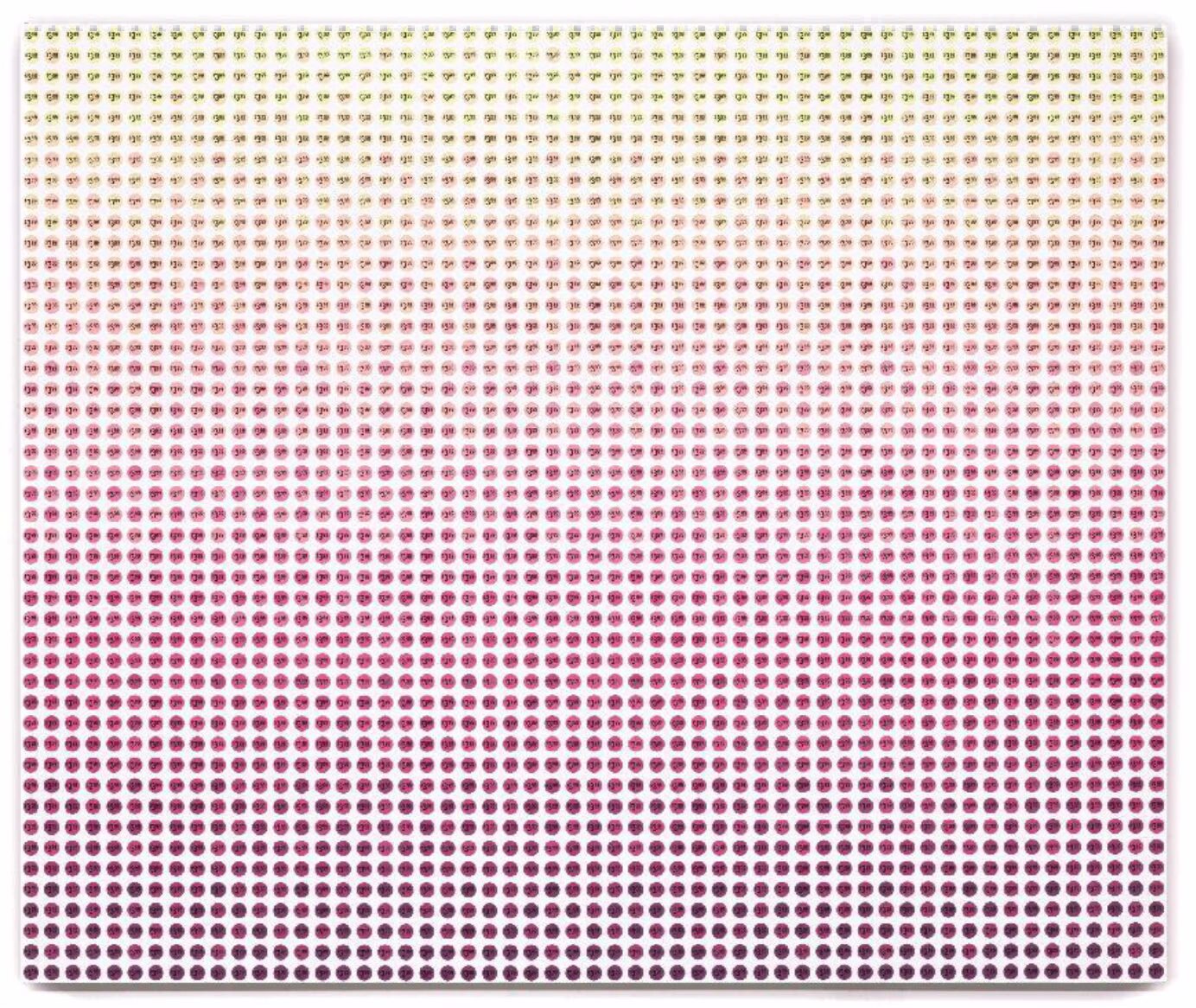
Sean Weisgerber, Price Per Square Inch series, 2023, Acrylic on linen, 46 x 55 in.
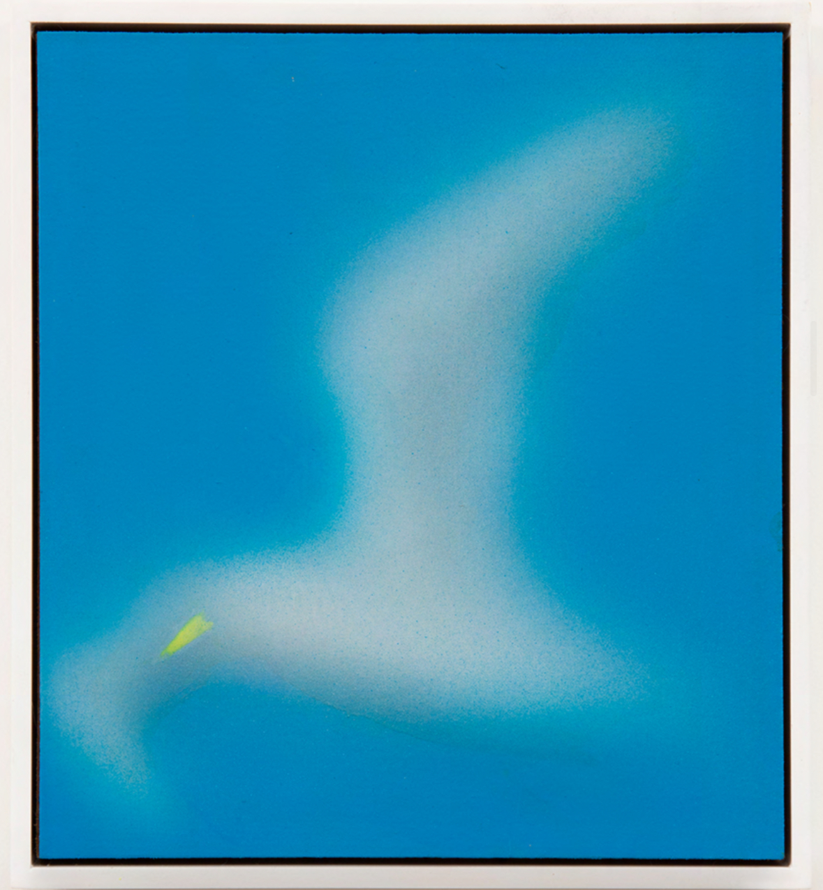
Kevin Ford, Seagull 22, 2025, Acrylic on panel, 10 x 9 in