
What Makes The Cut?
Art Drop #03
Good Sunday, my fellow art-lovers! I had a whole post about a favorite gallerist almost written for this weekend but I never got to finish it because I went to an art and design entrepreneurs retreat last week (a post on art for personal growth forthcoming) and time just got away from me. So, I am going to save that post for next week as I really would like to give her the time she deserves; and instead, this week, I’m going to give you a peek into how I decide what makes it into The Collection.
The headline here is that everything in The Collection is something that I would personally buy for myself or recommend to a client. In essence, every work gets the art advisor’s stamp of approval for one reason or another. If you see something that resonates and decide to pursue an acquisition, you can trust it. That is really what Art I Saw & Liked is all about–it’s about providing a platform for inspiration and discovery outside of the doomscroll as well as accessible art advisory services for a segment of the market that is historically underserved. But that’s the elevator pitch. Let’s dig in to how we get to the rubber stamping.
Quality
Quality is the first and most important criterion. Assigning a quality judgment to a work of art can be subjective, but I look at so much of it that I can instinctively judge if a work stands up or not. What goes into determining quality? Well, it has a lot to do with presentation. Does the work feel ready to be in the world? Do the marks feel intentional? Does the final product look the way it looks because the artist made a concerted decision to make it so? I find that asking these questions helps me keep my evaluation rooted in objectivity rather than if I personally like a work. As an advisor, I have to be able to see through the eyes of clients which requires that I take my personal opinion out of the equation.
Visual Analysis
Secondly and adjacent to quality is visual analysis. This is something we learn as students of art history to help us take an artist’s decision-making into account as we read a work of art. It helps assess intention and objectively evaluate whether or not an image is “working.” We look at the formal components such as line, color, shape, texture, form, and space as well as design elements like composition, balance, movement, emphasis, and proportion. In doing so, we can answer whether or not an artist is doing what they say they are doing. In other words, when I read an artist’s statement and then look at their work, do I see the connection? Do I see why an artist made the choice they did to arrive at a particular conclusion?
I think visual analysis also helps root out talent. Artists are visual storytellers. Some only work in a single language, while great artists are able to translate their stories into a universal language that transcends individual taste or style. I am not saying that every work in The Collection is going to make it to that level, but I do think the artists represented here have some element of transcendent storytelling. Will they all be Picasso or Rothko? No. Do I think they achieve what they ostensibly set out to do according to their statements? Yes.
Background
Finally, I consider an artist’s background. This one can get tricky because some artists are self-taught. You do not want to automatically toss out an artist just because they don’t have a fancy MFA and a CV riddled with big-name galleries. Plus at the sub-$15k end of the market, you are not often going to find the traditional markers of success, yet. When this is the case, you have to rely heavily on your quality assessment. Typically though, an artist in The Collection will have at least a group show at a reputable gallery under their belt or maybe even a solo show. They will have found their way into the company of more established artists somehow. They might not yet have representation but galleries are starting to notice them and see how their work resonates with their audience. This is why it is really important to find gallerists you trust.
To put it into practice, here are the five artists I added to The Collection this week and why:
Mary Finlayson
I like Finlayson’s work because the bright colors and simplified forms harken to nostalgia and memory. As time passes and events become memories we recall, the details fade but the contours remain. Moreover, I find the application of mosaic in some works to be apt to describing the joy in the everyday. The teeny tesserae (art-ese for tiles) are the minutiae that make up the tableau of our lives.
Du Chau
Du Chau ticks all of the boxes of quality, visual analysis, and artist’s background. The work is superbly executed and will withstand tests of time. You might say it is archival quality. Visually, the work stands up to the artist’s objectives of trying to create a quiet and contemplatively charged space. Contemplative and charged are not typically words you find to describe a single work of art and yet here it works.
Eleanor Conover
I have loved this work for several years and I think it is getting better and better. Any work that riffs with Helen Frankenthaler is going to grab my attention. In Conover’s case, she often brings physical dimension to the work making it more sculptural by bowing the stretcher bars and adding pieces of slate or granite to her abstract forms.
Katie Paterson
If you have asked me lately who my favorite artist is, I probably said Katie Paterson. She is a deep thinker and if you try to get on her wavelength, your mind will blow up. Her work invites the viewer to both consider our environmental reality as well as imagine works of art made out of physically impossible materials from that environment. It’s conceptual and abstract but also very much an object in the present that really couldn’t be anything other than what it is.
Madeline Hollander
Madeline Hollander brings her ballet background to bear on her visual art practice. Using her knowledge of movement and choreography, Hollander creates works that invite the viewer to mentally move through time and space and embody the marks of the two-dimensional works.
Make sure to go check out the rest of what I added to The Collection this week! And don’t forget to share the love: invite friends to join Art I Saw & Liked, heart your favorite works in The Collection, and shoot me an email with questions!
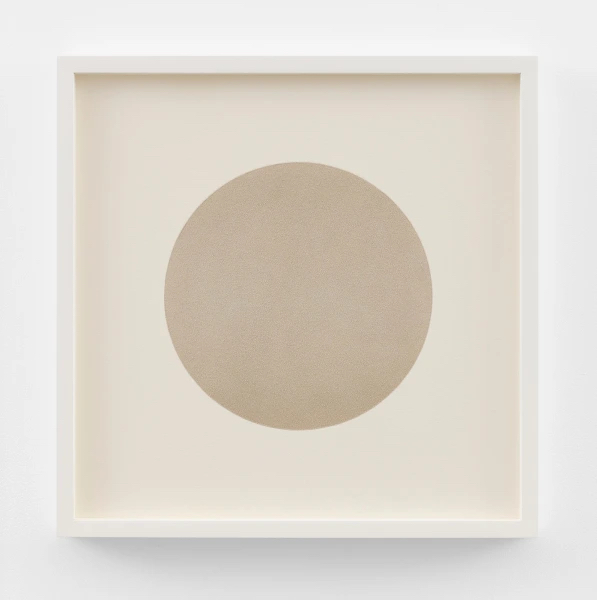
Katie Paterson, O I, Mixed media using pigment ground from the fossilized forms of the first cellular life on earth, 20 1/8 x 20 1/8 in
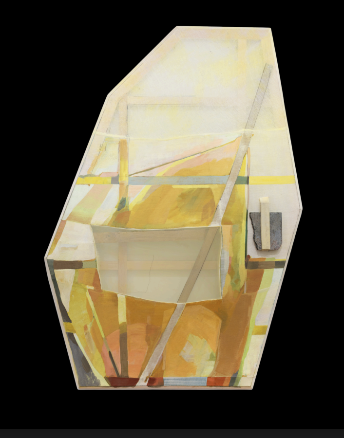
Eleanor Conover, From The Steep Slope, dye, oil, and graphite on sewn linen and polyester with bowed oak, beveled pine, and marble, 63.5 x 43.5 x 4 in
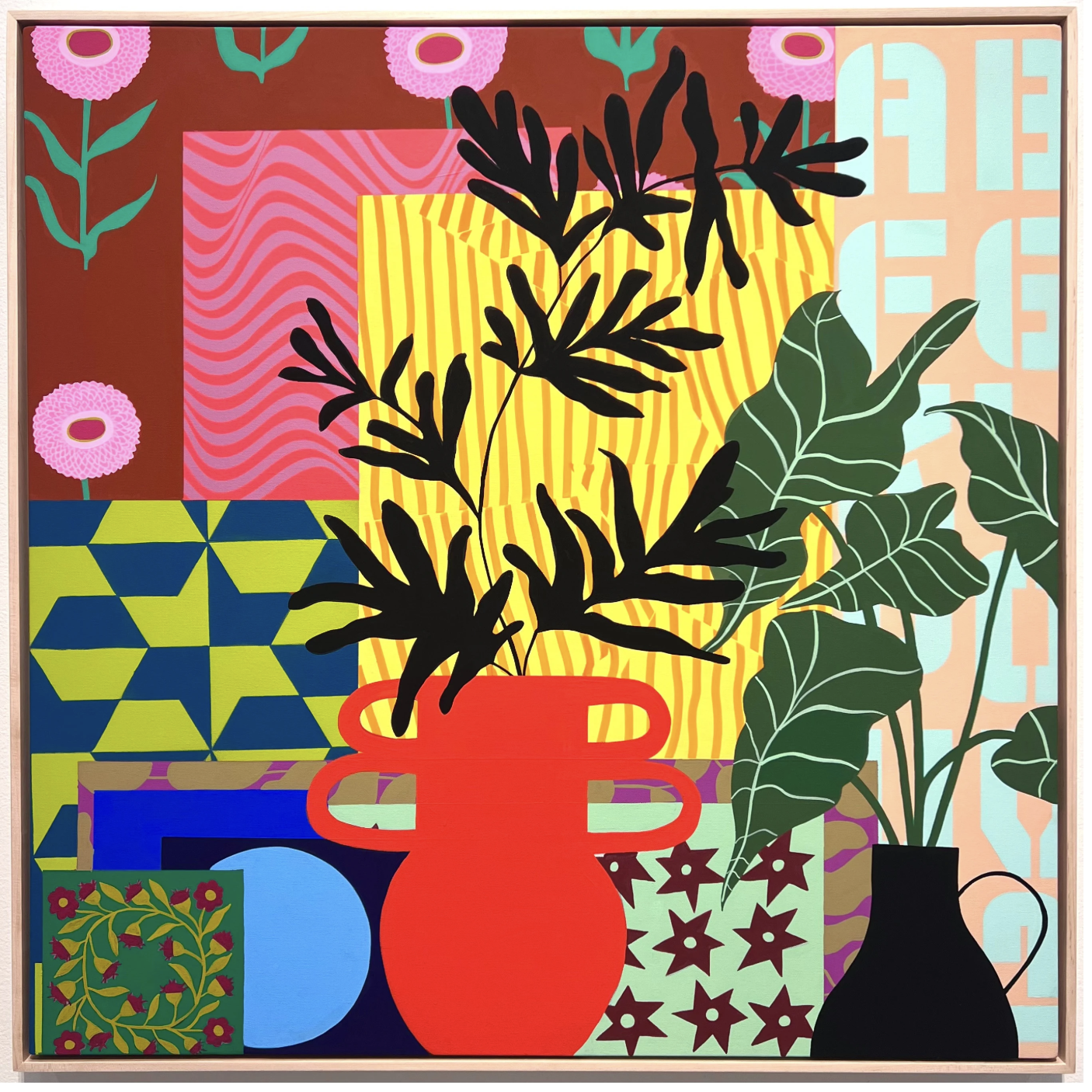
Mary Finlayson, This Must Be the Place, acrylic gouache on canvas, 36 x 36 in
Until Next Week–

Casey Monda | CEO & Art Advisor
Every collector has a type.
A default way of engaging with art — and a default reason they walk away from something they should have bought. Find out yours in two minutes.
Take the Quiz →Already a member? This week's new additions to The Collection are waiting.
Explore The Collection →